Numpad
Basic usage
$(function () {
    // create a numpad control
    $("#numpad").mobiscroll().numpad({
        theme: 'ios',
        preset: 'timespan'
    });
});
<input id="numpad"/>For many more examples - simple and complex use-cases - check out the numpad demos for jquery.
Typescript Types
When using with typescript, the following types are available for the Numpad:
| Type | Description |
|---|---|
| Numpad | Type of the Numpad instance |
| MbscNumpadOptions | Type of the settings object that is used to initialize the component |
Options
| Name | Type | Default value | Description |
|---|---|---|---|
| allowLeadingZero | Boolean | false |
If true, allows value to start with zero. |
| anchor | String, HTMLElement | undefined |
Specifies the anchor element for positioning, if display is set to
'bubble'
.
If undefined, it defaults to the element on which the component was initialized.
|
| animate | String or Boolean | undefined |
Animation to use for show/hide (if display is not inline). Possible values:
false, turns the animation off.
|
| buttons | Array |
['set', 'cancel']
|
Buttons to display. Each item in the array will be a button. A button can be specified as a string, or as a button object.
When the passed array does not contain the predefined 'set' button, the auto-selection will be turned on.
Selecting a value on the UI this way, will be set to the input immediately.
If there are more than one wheels shown, the control will close on overlay tap. Otherwise tapping a value on the wheel will also close the control.
If a string, it must be one of the predefined buttons:
If an object, it may have the following properties:
Predefined and custom buttons example
Predefined button handler example
|
| closeOnOverlayTap | Boolean | true |
If true, the popup is closed on overlay tap/click. |
| context | String, HTMLElement | 'body' |
The DOM element in which the component is appended and positioned (if not inline). Can be a selector string or a DOM element. |
| cssClass | String | undefined |
Applies custom css class to the top level element. |
| deleteIcon | String | 'backspace' |
Delete icon. |
| disabled | Boolean | false |
Initial disabled state of the component. This will take no effect in inline display mode. |
| display | String | 'center' |
Controls the positioning of the component. Possible options:
|
| fill | String | 'rtl' |
Direction of filling the values into the template. Possible options:
|
| focusOnClose | Boolean, String, HTMLElement |
true
|
Element to focus after the popup is closed.
If undefined, the original element will be focused.
If false, no focusing will occur.
|
| focusTrap | Boolean | true |
If not in inline mode, focus won't be allowed to leave the popup. |
| headerText | Boolean, String, Function | false |
Specifies a custom string which appears in the popup header. If the string contains the '{value}' substring, it is replaced with the formatted value of the numpad.If it's set to false, the header is hidden.If a function is passed, it receives the formatted value as parameter and the returned value appears in the header. |
| layout | String | undefined |
Sets the layout of the component. Possible values:
|
| leftKey | Object | undefined |
Defines a custom key on the left side of the 0.
The object has the following properties:
{ampm} variable in the template will display the 'AM' value, and 2 zeroes will be filled into the template (if enough place left).
|
| mask | String | undefined | If specified, the mask character will be displayed instead of the entered numbers. |
| placeholder | String | '0' |
Default character to fill the template's digit values. |
| preset | String | undefined |
Load preset configurations. Availaible presets:
If no preset is specified, the parseValue and formatValue conversion functions must be specified to define a custom behavior. |
| responsive | Object | undefined |
Specify different settings for different container widths, in a form of an object,
where the keys are the name of the breakpoints, and the values are objects containing
the settings for the given breakpoint.
The available width is queried from the container element of the component and not the browsers viewport like in css media queries
There are five predefined breakpoints:
breakpoint
property specifying the min-width in pixels.
Example:
|
| rightKey | Object | undefined |
Defines a custom key on the right side of the 0.
The object has the following properties:
{ampm} variable in the template will display the 'PM' value, and 2 zeroes will be filled into the template (if enough place left).
|
| scrollLock | Boolean | true |
Disables page scrolling on touchmove (if not in inline mode, and popup height is less than window height). |
| showOnFocus | Boolean |
false - on desktop
true - on mobile
|
Pops up the component on element focus. |
| showOnTap | Boolean | true |
Pops up the component on element tap. |
| showOverlay | Boolean | true |
Show or hide overlay. |
| template | String | 'dd.dd' |
Template for the numpad value. 'd' stands for digit, and will be filled with the values entered on the numpad keys. Can contain variables as well, in a format of alphanumeric strings in braces. Optionally a placeholder can also be specified after a ':' character. E.g. 'dd:dd {ampm}' (without placeholder) or 'dd:dd {ampm:--}' (with placeholder). The variables can be filled using custom buttons. Any other character in the template will be handled as literal string. HTML markup is also accepeted. If a preset is specified, the template will be generated by the preset. |
| theme | String | undefined |
Sets the visual appearance of the component.
If it is If the theme for the specific platform is not present, it will default to the Mobiscroll theme. Supplied themes:
Starting from v4.9.0 setting directly the dark version of the theme is deprecated.
Use the themeVariant option instead to control the light / dark appearance of the theme.
Make sure that the theme you set is included in the downloaded package.
|
| themeVariant | String | undefined |
Controls which variant of the theme will be used (light or dark). Possible values:
If not set, only the theme setting will determine which theme to use.
To use the option with custom themes, make sure to create two custom themes,
where the dark version has the same name as the light one, suffixed with
The option will not have any effect if the theme option explicitly
sets the dark version of a theme, e.g.
theme: 'ios-dark'.
|
| touchUi | Boolean | true |
Use Can be used with the responsive option to change the user interface based on viewport width. |
Setting options dynamically
There are two ways to modify options after initalization
-
Using the option method.
The option method always triggers reinitialization. Most of the settings can be updated only this way, updating without initialization has no effect, because the markup is already generated. If the scroller was visible, the reinitialization hides it and it's not shown again automatically (except in inline display mode).
Javascript// Modify options $('#mobiscroll').mobiscroll('option', { theme: 'ios', lang: 'de' });HTML<input id="mobiscroll"/> -
Modify directly the
settingsobject.
Useful when changing dynamic settings, which do not need redraw (e.g. readonly, calendar marked days).
// Get instance and modify a setting
var inst = $('#mobiscroll').mobiscroll('getInst');
inst.settings.readonly = true;

// Modify settings in an event
$('#mobiscroll').mobiscroll({
    onBeforeShow: function (event, inst) {
        inst.settings.readonly = true;
    }
});
Events
| Name | Description | |
|---|---|---|
| onBeforeClose(event, inst) |
Triggered before the component closes. Close can be prevented by returning false from the handler function.
Parameters
Example |
|
| onBeforeShow(event, inst) |
Triggered before the component is shown.
It is useful if you want to modify the settings object before generating the markup.
It can be used also to prevent the showing the control by returning false.
Parameters
Example |
|
| onCancel(event, inst) |
Allows you to define your own event when cancel is pressed.
Parameters
Example |
|
| onClear(event, inst) |
Triggered when the value is cleared.
Parameters
Example |
|
| onClose(event, inst) |
Triggered when the component is closed.
Parameters
Example |
|
| onDestroy(event, inst) |
Triggered when the component is destroyed.
Parameters
Example |
|
| onInit(event, inst) |
Triggered when the component is initialized.
Parameters
Example |
|
| onInput(event, inst) |
Triggered when a value is entered or deleted.
Parameters
Example |
|
| onMarkupReady(event, inst) |
Triggered when the html markup of the component is generated, but it is not yet shown.
It is useful, if you want to make modifications to the markup (e.g. add custom elements), before the positioning runs.
Parameters
Example |
|
| onPosition(event, inst) |
Triggered when the component is positioned (on initial show and resize / orientation change).
Useful if dimensions needs to be modified before the positioning happens, e.g. set a custom width or height. Custom positioning can also be implemented here, in this case, returning false from the handler
function will prevent the built in positioning.
Parameters
Example |
|
| onSet(event, inst) |
Triggered when a value is set.
Parameters
Example |
|
| onShow(event, inst) |
Triggered when the component is shown.
Parameters
Example |
|
| validate(data, inst) |
Gets called on initialization and on every button tap, can be used to validate the selected values.
Parameters
Example |
|
Methods
| Name | Description | |
|---|---|---|
| cancel() |
Hides the numpad and also invokes the onCancel event.
ExampleMethods can be called on an instance. For more details see calling methods |
|
| clear() |
Clears the numpad value.
ExampleMethods can be called on an instance. For more details see calling methods |
|
| disable() |
Disables the numpad.
ExampleMethods can be called on an instance. For more details see calling methods |
|
| enable() |
Enables the numpad.
ExampleMethods can be called on an instance. For more details see calling methods |
|
| getArrayVal([temp]) | Returns the selected value as an array of digits.
Parameters
Returns: Array
ExampleMethods can be called on an instance. For more details see calling methods |
|
| getInst() |
Returns the object instance.
Returns: Object
ExampleMethods can be called on an instance. For more details see calling methods |
|
| getVal([temp]) | Returns the selected numpad value.
Parameters
Returns: String
ExampleMethods can be called on an instance. For more details see calling methods |
|
| hide([ prevAnim ] [, btn ]) |
Hides the component.
Parameters
ExampleMethods can be called on an instance. For more details see calling methods |
|
| isVisible() |
Returns a boolean indicating whether the component is visible or not.
Returns: Boolean
ExampleMethods can be called on an instance. For more details see calling methods |
|
| option(options) |
Sets one or more options for the component.
Parameters
ExampleMethods can be called on an instance. For more details see calling methods |
|
| position([check]) |
Recalculates the position of the component (if not inline).
Parameters
ExampleMethods can be called on an instance. For more details see calling methods |
|
| select() |
Hides the numpad and also invokes the
onSet
event.
ExampleMethods can be called on an instance. For more details see calling methods |
|
| setVal(value [, fill ] [, change ] [, temp ] [, time ]) |
Sets the numpad value.
Parameters
ExampleMethods can be called on an instance. For more details see calling methods |
|
| show([ prevAnim ] [, prevFocus ]) |
Shows the component.
Parameters
ExampleMethods can be called on an instance. For more details see calling methods |
|
| tap(el, handler) |
Attaches the handler function to the tap event of element el.
Parameters
ExampleMethods can be called on an instance. For more details see calling methods |
|
Localization
| Name | Type | Default value | Description |
|---|---|---|---|
| cancelText | String | 'Cancel' |
Text for Cancel button. |
| clearText | String | 'Clear' |
Text for the clear button. |
| lang | String | 'en-US' |
Language of the component. Based on the language string the component loads the language based default settings from the
language modules.
Supported languages:
|
| rtl | Boolean | false |
Right to left display. |
| setText | String | 'Set' |
Text for Set button. |
Presets
Decimal
| Name | Type | Default value | Description |
|---|---|---|---|
| decimalSeparator | String | '.' |
Separates the integer part from the fractional part of the numeric value. |
| defaultValue | Number | 0 | Initial value. |
| entryMode | 'template' or 'freeform' |
'template' |
Controls how the number is entered. In template mode the digits follow a template with fixed number of decimal places that is set by the scale setting.In freeform mode any number of digits can be entered for the whole and fractional part of the number as well. The maximum number of decimal places can be controlled by the maxScale setting.
|
| invalid | Array | undefined | Array of numbers which values are unselectable. |
| scale | Number | 2 |
Number of decimal places (precision). |
| maxScale | Number | 4 |
It sets the maximum number of digits that can be entered after the decimal separator when entryMode is set to freeform. |
| min | Number | 0 |
Minimum selectable value. |
| max | Number | 99.99 |
Maximum selectable value. |
| prefix | String | '' |
Prefix for the numeric value, e.g. '$'. |
| returnAffix | Boolean | false |
If true, the formatted value will also contain the prefix and suffix, otherwise the number only. |
| suffix | String | '' |
Suffix for the numeric value, e.g. '€'. |
| thousandsSeparator | String | ',' |
The character displayed at each separation of the numeric value. |
Timespan
Time
Date
Conversion functions
| Name | Parameters | Description |
|---|---|---|
| formatValue | function(numbers, variables, inst) |
Receives the entered values as an array, the variable names and values as key-value pairs
(if the template contains variables) and the mobiscroll instance.
Must return a string which will be set as the value of the associated input element. Example: |
| parseValue | function(valueText) |
Receives a string as parameter and must return an array containing the entered numpad values. Must return an array value! Numpad presets implement their own parseValue function.
Example:
|
Customizing the appearance
While the provided pre-built themes are enough in many use cases, most of the times on top of adapting to a specific platform, you'd also like to match a brand or color scheme. Mobiscroll provides various ways to achieve this:
- Create custom themes using the theme builder - the custom themes can be also built using out theme builder, on a graphical user interface, without any coding, or the need for Sass support in your project.
- Create custom themes using Sass - use this, if you need multiple themes with different color variatons, in case you have pages with different colors, or you'd like to users to customize the colors of your app.
- Override the Sass color variables - the straightforward way to change the colors in one place throughout the application.
Override the Sass Color Variables
A convenient way to customize the colors of the Mobiscroll components is to override the Sass color variables.
Let's say your branding uses a nice red accent color, and you'd like that color to appear on the Mobiscroll components as well,
while still using platform specific themes (e.g. ios on iOS devices, material on Android devices, and mobiscroll on desktop).
You can override the accent color for every theme:
$mbsc-ios-accent: #e61d2a;
$mbsc-material-accent: #e61d2a;
$mbsc-mobiscroll-accent: #e61d2a;

@import "~@mobiscroll/JQuery/dist/css/mobiscroll.jquery.scss"
You can also customize the colors on many levels:
- Theme specific variables (ex.
$mbsc-material-background,$mbsc-ios-dark-text) are applied to all components in a theme. Complete list of variables here. - Component specific global variables (ex.
$mbsc-card-background-light,$mbsc-listview-text-dark) are applied to all themes for a specific component. - Component and theme specific variables (ex.
$mbsc-ios-dark-form-background,$mbsc-material-input-text) are applied to a specific theme and a specific component.
Global variables
These variables are applied to all base themes: iOS, material, windows and mobiscroll.
They all come in pairs. One for the light and one for the dark variant in each theme.
| Variable name | Description |
|---|---|
| $mbsc-frame-background-light | Sets the background color of the Numpad |
| $mbsc-frame-background-dark | |
| $mbsc-frame-text-light | Sets the text color of the Numpad |
| $mbsc-frame-text-dark | |
| $mbsc-frame-accent-light | Sets the accent color of the Numpad |
| $mbsc-frame-accent-dark | |
| $mbsc-frame-overlay-light | Sets the color of the overlay, when the Numpad is shown as a modal |
| $mbsc-frame-overlay-dark |
If you really want to get sophisticated or if a color doesn't look good on a specific theme and you want to overwrite it, you can fine tune all of the above variables individually for each theme. Below are the complete list of variables broken down to themes:
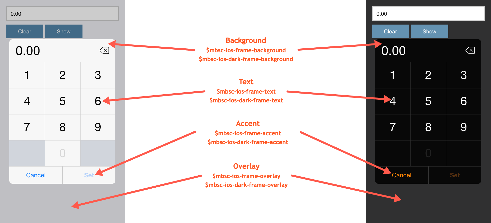
iOS theme
| Variable name | Default value | Description |
|---|---|---|
| $mbsc-ios-frame-background | #ffffff | The Numpad background color |
| $mbsc-ios-frame-text | #000000 | The Numpad text color |
| $mbsc-ios-frame-accent | #007bff | The Numpad accent color |
| $mbsc-ios-frame-overlay | rgba(0, 0, 0, 0.2) | Sets the color of the overlay, when the Numpad is shown as a modal |
iOS Dark theme
| $mbsc-ios-dark-frame-background | #0f0f0f | The Numpad background color |
| $mbsc-ios-dark-frame-text | #ffffff | The Numpad text color |
| $mbsc-ios-dark-frame-accent | #ff8400 | The Numpad accent color |
| $mbsc-ios-dark-frame-overlay | rgba(255, 255, 255, .1) | Sets the color of the overlay, when the Numpad is shown as a modal |

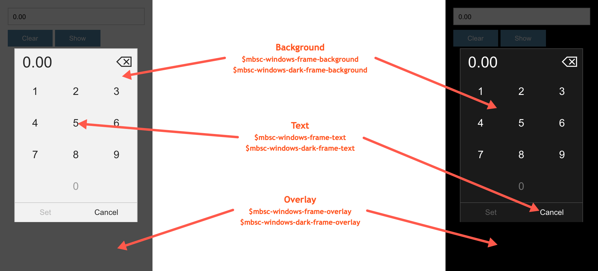
Windows theme
| Variable name | Default value | Description |
|---|---|---|
| $mbsc-windows-frame-background | #1a1a1a | The Numpad background color |
| $mbsc-windows-frame-text | #262626 | The Numpad text color |
| $mbsc-windows-frame-accent | #0078d7 | The Numpad accent color |
| $mbsc-windows-frame-overlay | rgba(0, 0, 0, .7) | Sets the color of the overlay, when the Numpad is shown as a modal |
Windows Dark theme
| Variable name | Default value | Description |
|---|---|---|
| $mbsc-windows-dark-frame-background | #191919 | The Numpad background color |
| $mbsc-windows-dark-frame-text | #ffffff | The Numpad text color |
| $mbsc-windows-dark-frame-accent | #0078d7 | The Numpad accent color |
| $mbsc-windows-dark-frame-overlay | rgba(0, 0, 0, .7) | Sets the color of the overlay, when the Numpad is shown as a modal |

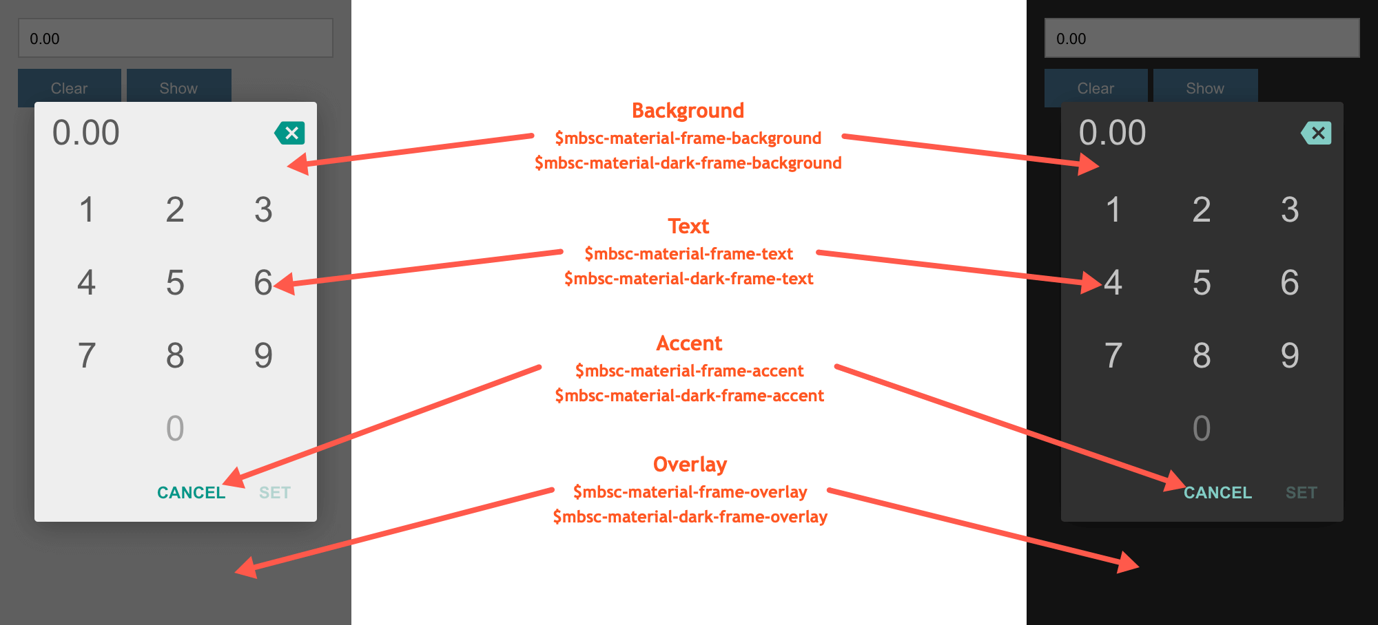
Material theme
| Variable name | Default value | Description |
|---|---|---|
| $mbsc-material-frame-background | #eeeeee | The Numpad background color |
| $mbsc-material-frame-text | #5b5b5b | The Numpad text color |
| $mbsc-material-frame-accent | #009688 | The Numpad accent color |
| $mbsc-material-frame-overlay | rgba(0, 0, 0, .6) | Sets the color of the overlay, when the Numpad is shown as a modal |
Material Dark theme
| Variable name | Default value | Description |
|---|---|---|
| $mbsc-material-dark-frame-background | #303030 | The Numpad background color |
| $mbsc-material-dark-frame-text | #c2c2c2 | The Numpad text color |
| $mbsc-material-dark-frame-accent | #81ccc4 | The Numpad accent color |
| $mbsc-material-dark-frame-overlay | rgba(0, 0, 0, .6) | Sets the color of the overlay, when the Numpad is shown as a modal |

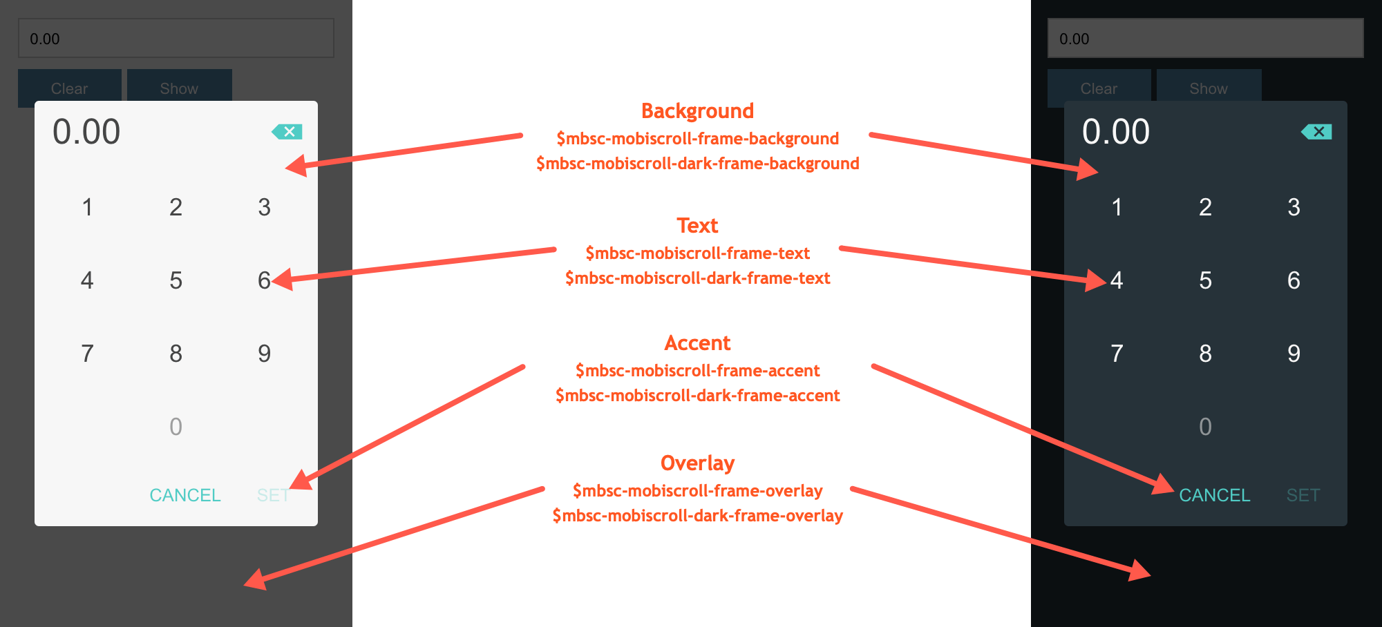
Mobiscroll theme
| Variable name | Default value | Description |
|---|---|---|
| $mbsc-mobiscroll-frame-background | #f7f7f7 | The Numpad background color |
| $mbsc-mobiscroll-frame-text | #454545 | The Numpad text color |
| $mbsc-mobiscroll-frame-accent | #4eccc4 | The Numpad accent color |
| $mbsc-mobiscroll-frame-overlay | rgba(0, 0, 0, .7) | Sets the color of the overlay, when the Numpad is shown as a modal |
Mobiscroll Dark theme
| Variable name | Default value | Description |
|---|---|---|
| $mbsc-mobiscroll-dark-frame-background | #263238 | The Numpad background color |
| $mbsc-mobiscroll-dark-frame-text | #f7f7f7 | The Numpad text color |
| $mbsc-mobiscroll-dark-frame-accent | #4fccc4 | The Numpad accent color |
| $mbsc-mobiscroll-dark-frame-overlay | rgba(0, 0, 0, .7) | Sets the color of the overlay, when the Numpad is shown as a modal |
