Event Calendar
Basic usage
The following example will create an event calendar with the default options.
import { Eventcalendar } from '@mobiscroll/react';

const App = () => {
  return <Eventcalendar />;
}
For many more examples - simple and complex use-cases - check out the event calendar demos for react.
Data binding
The event calendar accepts an array of event objects through the data option of the component. The event array can be either a local static array, or populated on demand with remote requests.
Local data
To bind local data to the event calendar, you can simply assign a JavaScript array of objects to the data option of the component.
import { Eventcalendar } from '@mobiscroll/react';

const App = () => {
  const [events, setEvents] = useState([{
    start: new Date(2020, 2, 18, 8, 0),
    end: new Date(2020, 2, 18, 17, 0),
    title: 'My First Event'
  }, {
    start: new Date(2020, 2, 18, 9, 0),
    end: new Date(2020, 2, 20, 13, 0),
    title: 'My Second Event'
  }]);
  return <Eventcalendar data={events} />;
}
Remote data
You can load the data through an external request and assign it to the data option of the component.
import { Eventcalendar, getJson } from '@mobiscroll/react';

const App = () => {
  const [events, setEvents] = useState([]);

  useEffect(() => {
    getJson('https://example.com/events/', (events) => {
      setEvents(events);
    });
  }, []);

  return <Eventcalendar data={events} />;
}
Load on demand
Use the onPageLoading event to load the data relevant to the currently active view. The event fires every time the date range of the view changes, for example when someone navigates the event calendar. Getting the events in real time as the user interacts with the UI improves load performance and always serves the most recent data.
You can pass the view variables - like month and year - in the URL and handle the filtering inside the API implmentation.
import { Eventcalendar, getJson } from '@mobiscroll/react';

const App = () => {
  const [events, setEvents] = useState([]);

  const onPageLoading = useCallback((event, inst) => {
    const fromDay = event.firstDay.toISOString();
    const toDay = event.lastDay.toISOString();

    getJson('https://example.com/events?from=' + fromDay + '&to=' + toDay), (events) => {
      setEvents(events);
    });
  }, []);

  return <Eventcalendar data={events} onPageLoading={onPageLoading} />;
}
Recurrence
For the data, colors, labels, marked, and invalid options it's possible to specify recurrence rules. The rule can be an object or a string in RRULE format.
Supported properties:
-
repeatString - The frequency of the recurrence. String equivalent:FREQ.-
'daily'- Daily repeat -
'weekly'- Weekly repeat -
'monthly'- Monthly repeat -
'yearly'- Yearly repeat
-
-
dayNumber - The day of the month in case of monthly and yearly repeat. String equivalent:BYMONTHDAY.
Negative numbers are calculated from the end of the month,-1meaning the last day of the month.Specifying multiple days for the rule is currently not supported.Rules like every first/second/third/fourth week day of month are currently not supported. -
monthNumber - Specify the month in case of yearly repeat. String equivalent:BYMONTH.Specifying multiple months for the rule is currently not supported. -
weekDaysString - Comma separated list of the week days ('SU', 'MO', 'TU', 'WE', 'TH', 'FR', 'SA') for the occurrences. String equivalent:BYDAY. -
weekStartString - Specifies the first day of the week ('SU', 'MO', 'TU', 'WE', 'TH', 'FR', 'SA'). Default is'MO'. String equivalent:WKST. -
countNumber - The number of occurrences. String equivalent:COUNT. -
fromDate, String, Object - The start date of the occurrences. String equivalent:DTSTART. -
until:Date, String, Object - The end date of the occurrences. String equivalent:UNTIL. -
intervalNumber - The time interval for the rule, e.g. every 3 days, or every 2 weeks. This depends on therepeatproperty. String equivalent:INTERVAL.
In string format the specified properties are separated by the ';' character.
recurring: {
  repeat: 'daily',
  count: 5,
  interval: 2
}recurring: 'FREQ=DAILY;COUNT=5;INTERVAL=2'Examples
import { Eventcalendar } from '@mobiscroll/react';

const App = () => {
    const [events, setEvents] = useState([{
        start: new Date(2020, 2, 18, 9, 0),
        end: new Date(2020, 2, 18, 17, 0),
        title: 'Repeat every 2 days 5 times',
        recurring: {
            repeat: 'daily',
            count: 5,
            interval: 2
        }
    }, {
        start: new Date(2020, 2, 17, 20, 0),
        end: new Date(2020, 2, 17, 22, 0),
        title: 'Football training every Monday and Wednesday',
        recurring: 'FREQ=WEEKLY;UNTIL=2020-06-17;BYDAY=MO,WE'
    }, {
        title: 'Pay the bills - on every first Friday of the months',
        recurring: {
            repeat: 'monthly',
            pos: 1,
            weekDays: 'FR',
        }
    }]);
    return <Eventcalendar data={events} />;
}
Recurring exceptions
In case you would like to skip some dates from your rule, that's when the recurring exception come in handy.
You can either set specific dates and/or a recurring rule as an exception, using the
recurringException and the recurringExceptionRule properties.
import { Eventcalendar } from '@mobiscroll/react';

const App = () => {
    const [events, setEvents] = useState([{
        start: '2021-06-01',
        allDay: true,
        title: 'Repeat every day until the end of 2021, except every month\'s 15th',
        recurring: {
            repeat: 'daily',
            until: '2021-12-31'
        },
        // exact dates as exceptions
        recurringException: ['2021-07-10', '2021-07-11'],
        // recurring rule as an exception
        recurringExceptionRule: {
            repeat: 'monthly',
            day: 15
        }
    }, {
        start: '08:30',
        end: '10:00',
        title: 'Meeting every Monday and Friday, except every second month\'s 3rd',
        recurring: 'FREQ=WEEKLY;UNTIL=2021-06-01;BYDAY=MO,FR',
        recurringExceptionRule: 'FREQ=MONTHLY;BYMONTHDAY=3;INTERVAL=2'
    }]);
    return <Eventcalendar data={events} />;
}CRUD actions
The event calendar is bound to an array of events. Since the React component only compares the props by reference, when you are modifying the events (create, update, delete), you need to pass a new array which contains the updated data.
Here's an example for adding, removing, and updating an event.
import { Eventcalendar } from '@mobiscroll/react';

let guid = 0;

const App = () => {
  const [events, setEvents] = useState([{
    start: new Date(2020, 2, 18, 8, 0),
    end: new Date(2020, 2, 18, 17, 0),
    title: 'My First Event'
  }, {
    start: new Date(2020, 2, 18, 9, 0),
    end: new Date(2020, 2, 20, 13, 0),
    title: 'My Second Event'
  }]);

  const addEvent = useCallback(() => {
    const newEvent = {
      id: guid++,
      start: new Date(2020, 2, 18, 9, 0),
      end: new Date(2020, 2, 20, 13, 0),
      title: 'My New Event,
    };
    setEvents([...events, newEvent]);
  }, []);

  const deleteEvent = useCallback((eventId) => {
    // Create a copy of the event array
    const newEvents = [...events];
    // Find the index of the event to be deleted
    const index = events.indexOf(events.filter(event => event.id === eventId)[0]);
    // Remove the event from the array
    newEvents.splice(index, 1);
    // Pass the new array to the calendar
    setEvents(newEvents);
  }, []);

  const updateEvent = useCallback((updatedEvent) => {
    const index = events.indexOf(events.filter(event => event.id === updatedEvent.id)[0]);
    events[index] = updatedEvent;
    // Create a copy of the event array
    setEvents([...events]);
  }, []);

  return <Eventcalendar data={events} />;
}
In case you would like to edit a recurring event, you can use the updateRecurringEvent helper function.
See the Recurring event editor as an example.
Views
The event calendar supports three different views for three different jobs: the calendar view, schedule view and agenda view. These three can be combined and configured in a couple of different ways.
Calendar view
Use the event calendar as a traditional month view or combine it with an agenda as a week view. The events can be rendered as labels or in a pop-over that is shown on day click.
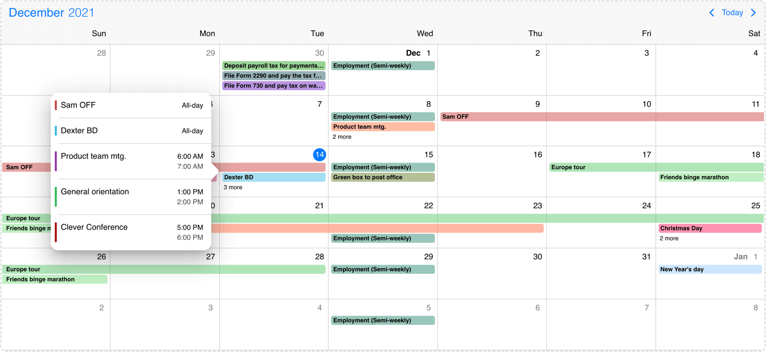
Desktop calendar with labels and popover
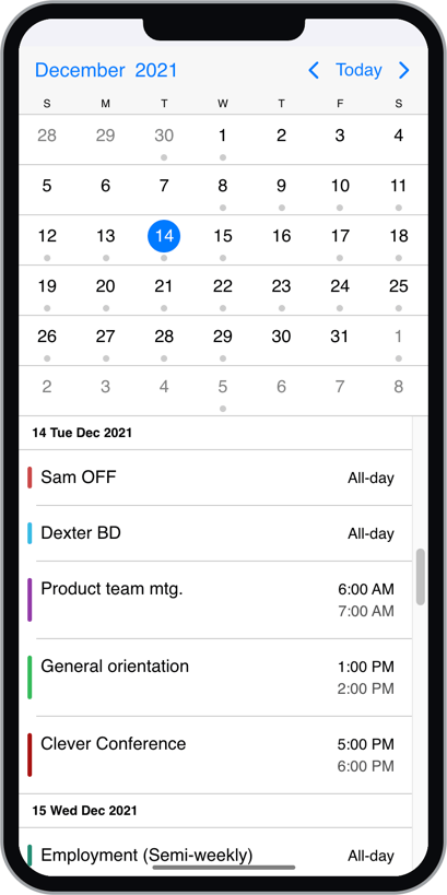
Mobile month view with agenda
Schedule view
The scheduler displays a time grid with its related events. It can be configured as a daily or weekly schedule. Work hours and work days along with disabled time-spans, breaks can be added. Use it to for advanced scheduling tasks with built-in drag & drop.
The displayed week days can be modified with the startDay and endDay properties of the schedule view option.
The displayed hours can be modified with the startTime and endTime properties of the schedule view option. With these properties both hours and minutes can be specified.
view: {
  schedule: {
    type: 'week',
    startDay: 1, // Monday
    endDay: 5, // Friday
    startTime: '07:30',
    endTime: '18:30',
  }
}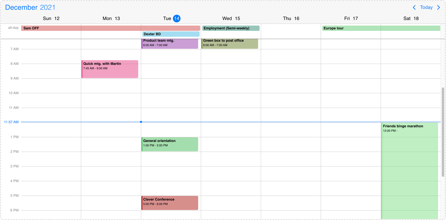
Desktop weekly schedule
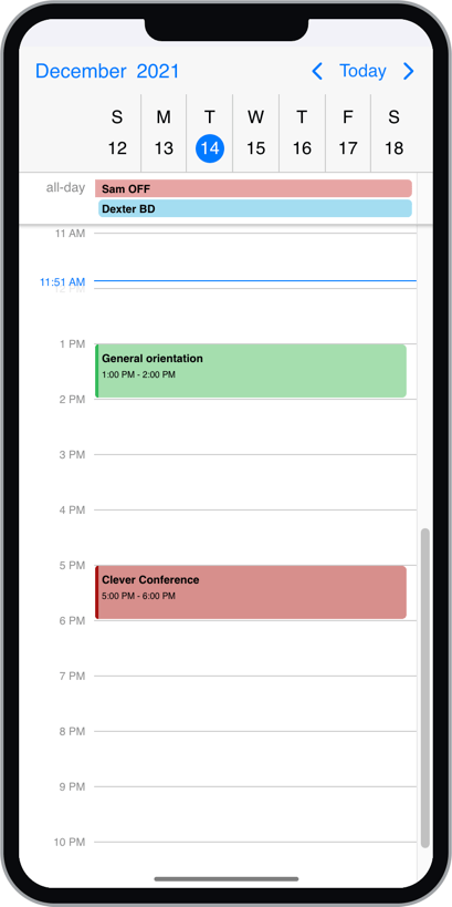
Mobile daily schedule
There might be cases when you would like to change the height of the schedule cell. You can use the following CSS classes for this purpose:
.mbsc-schedule-time-wrapper,
.mbsc-schedule-item {
  height: 20px;
}
Timeline view
The timeline view displays a timeline with its related events. It can be configured as a daily or weekly timeline. Work hours and work days along with disabled time-spans, breaks can be added. Use it to for advanced scheduling tasks with built-in drag & drop.
The displayed week days can be modified with the startDay and endDay properties of the timeline view option.
The displayed hours can be modified with the startTime and endTime properties of the timeline view option. With these properties both hours and minutes can be specified.
view: {
  timeline: {
    type: 'week',
    startDay: 1, // Monday
    endDay: 5, // Friday
    eventList: false,
    startTime: '07:30',
    endTime: '18:30'
  }
}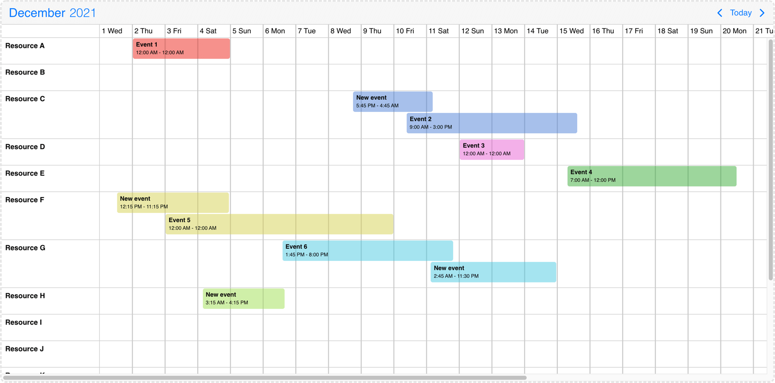
Desktop monthly timeline
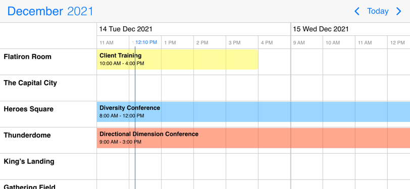
Mobile daily timeline
By default timeline rows will have variable height and will expand to accommodate the displayed events.
This can be controlled by the rowHeight property of the timeline view option.
If it is set to 'equal', the rows will have equal heights, and overlapping events will be distributed evenly to fit in the row.
The eventList property transforms the event display into a daily listing mode. This view represents a daily summary rather than an hour-by-hour layout, similar to the event calendar where labels are printed under the appropriate day for the appropriate resource one after the other. The events have an exact height and the resource rows will expand automatically if more events are displayed than the minimum height.
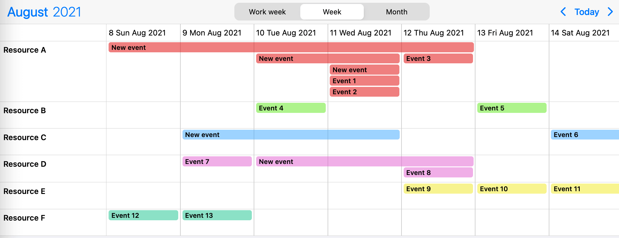
Timeline event listing
Agenda view
The agenda calendar displays a list of events for a given period of time (year, month, week or day). It can be used as a stand-alon component or in combination with the calendar.
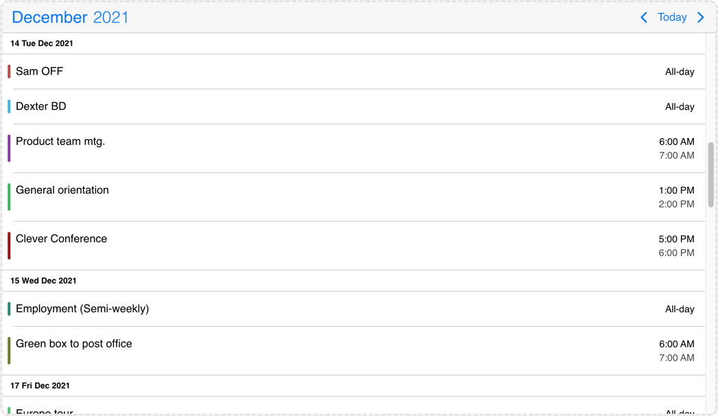
Desktop agenda
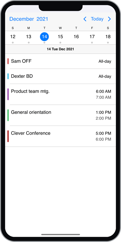
Mobile agenda
The three views can be used alone or combined with each-other. e.g. a week calendar combined with a daily agenda, listing the events for the selected day.
For the available configuration options see the view setting.
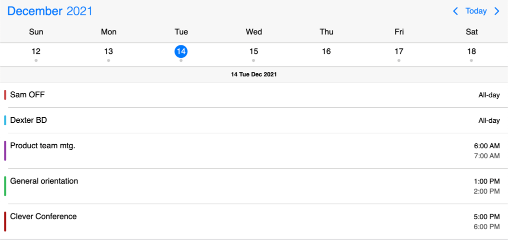
Weekly calendar view with daily agenda
import { Eventcalendar } from '@mobiscroll/react';

const App = () => {
  const [events, setEvents] = useState([/*...*/]);
  const view = useMemo(() => {
    return {
      calendar: { type: 'week' },
      agenda: { type: 'day' }
    };
  });

  return <Eventcalendar data={events} view={view} />;
}
Setting the initial view
By default the initial view of the calendar displays the current date. Depending on the view type, this might be the current day, week, month or year. For views, where time is also displayed, the view will be scrolled to the current time as well.
Changing the initial view to another date can be done either in a controlled or uncontrolled way.
Controlled component
To set the initial date of the event calendar in a controlled way (meaning that your component, which renders the calendar controls its selected date), use the selectedDate option to pass the date and the onSelectedDateChange handler to update the state when the date is changed from the calendar, e.g. using the navigation arrows.
import { Eventcalendar } from '@mobiscroll/react';

const App = () => {
  const [events, setEvents] = useState([/*...*/]);
  const [selectedDate, setSelectedDate] = useState(new Date(2020, 2, 18));

  const onSelectedDateChange = useCallback((args) => {
    setSelectedDate(args.date);
  }, []);

  return <>
    <Eventcalendar data={events} selectedDate={selectedDate} onSelectedDateChange={onSelectedDateChange} />
  </>;
}
Uncontrolled component
To only set the inital selected date, without the need of tracking later changes to the selected date, you can use it in an uncontrolled way (meaning that the calendar tracks the selected date in its own internal state) with the help of the defaultSelectedDate option.
import { Eventcalendar } from '@mobiscroll/react';

const App = () => {
  const [events, setEvents] = useState([/*...*/]);

  const myDate = useMemo(() => new Date(2020, 2, 18), []);

  return <Eventcalendar data={events} defaultSelectedDate={myDate} />;
}
For views, where time is also displayed, the view will be scrolled to the specified time. If the time part is not explicitly specified, it defaults to the start of the day.
When multiple days, weeks, months or years are displayed, the position of the specified date on the view (first, second, third, etc. day/week/month/year) is determined by the refDate option.
Navigating to a date and time
You can navigate to another view programatically any time, by changing the selectedDate option.
This will navigate the calendar to the view containing the specified date. For views, where time is also displayed, the view will be scrolled to the specified time. If the time part is not explicitly specified, it defaults to the start of the day.
When multiple days, weeks, months or years are displayed, the position of the specified date on the view (first, second, third, etc. day/week/month/year) is determined by the refDate option.
import { Eventcalendar } from '@mobiscroll/react';

const App = () => {
  const [events, setEvents] = useState([/*...*/]);
  const [selectedDate, setSelectedDate] = useState(new Date(2020, 2, 18));

  const onSelectedDateChange = useCallback((args) => {
    setSelectedDate(args.date);
  }, []);

  const setDate = useCallback(() => {
    // Set a specific date
    setSelectedDate(new Date(2020, 3, 19));
  }, []);

  return <>
    <Eventcalendar data={events} selectedDate={selectedDate} onSelectedDateChange={onSelectedDateChange} />
    <button onClick={setDate}>Set date</button>
  </>;
}
Events drag/resize/create
The calendar and schedule view events can be moved and resized with mouse/touch interactions. The dragToMove and dragToResize options enable the events drag and drop and resize functionality. With the dragTimeStep option the minimum amount of drag/resize step can be specified in minutes.
With the dragToCreate option enabled events can be created by dragging on the empty areas of the calendar and schedule view. On a desktop environment a new event can also be created with the clickToCreate option.
To customize the newly created event use the extendDefaultEvent option.
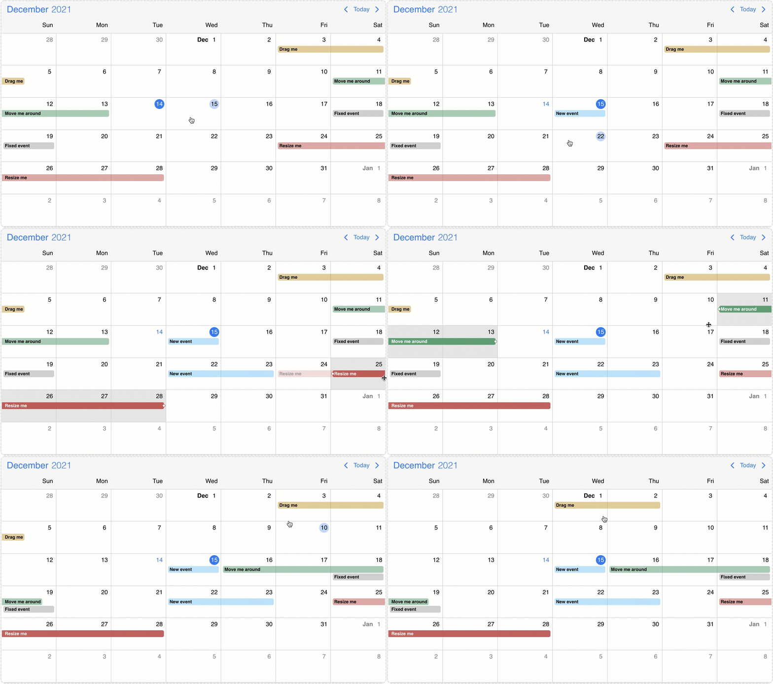
Event calendar move, resize and create
External drag & drop
Drag & drop events onto the calendar
There is a possibility to drag & drop any external element into your calendar.
In order to achieve this, first you need to grant permission to your calendar to accept this behavior.
You can do that easily by setting the externalDrop option to true.
As a second step, you'll have to create your external draggable element and pass a skeleton event definition through the dragData
option which will be added to the event calendar on drop. If omitted, a default event will be created.
You can initialize the draggable containers by using the <Draggable/> component and reference the draggable container in the element option.
const [draggable, setDraggable] = React.useState();

const setDrag = React.useCallback((event) => {
    setDraggable(event);
}, []);

const myNewEvent = {
    title: 'My new event',
    // the event will be 3 hours long
    start: new Date(2021, 03, 10, 12),
    end: new Date(2021, 03, 10, 15),
    color: 'green'
};
<div ref={setDrag}>Drag me to the calendar></div>
<Draggable dragData={myNewEvent} element={draggable} />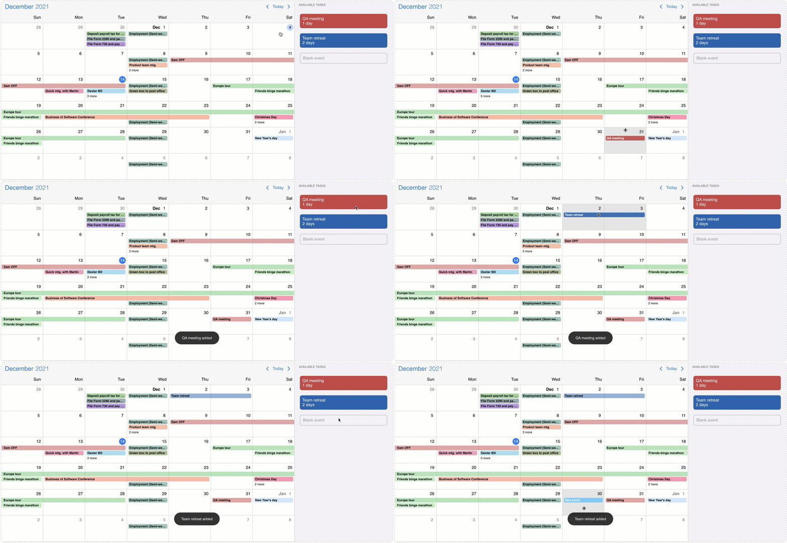
Event calendar external drag and drop
Resources
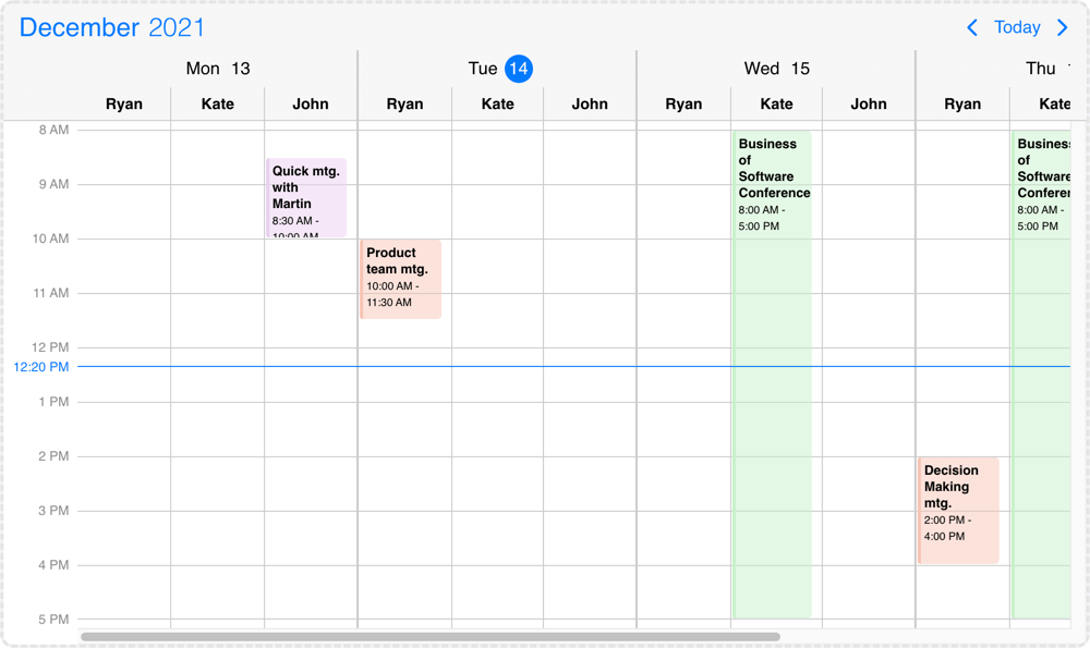
Resources grouped by date
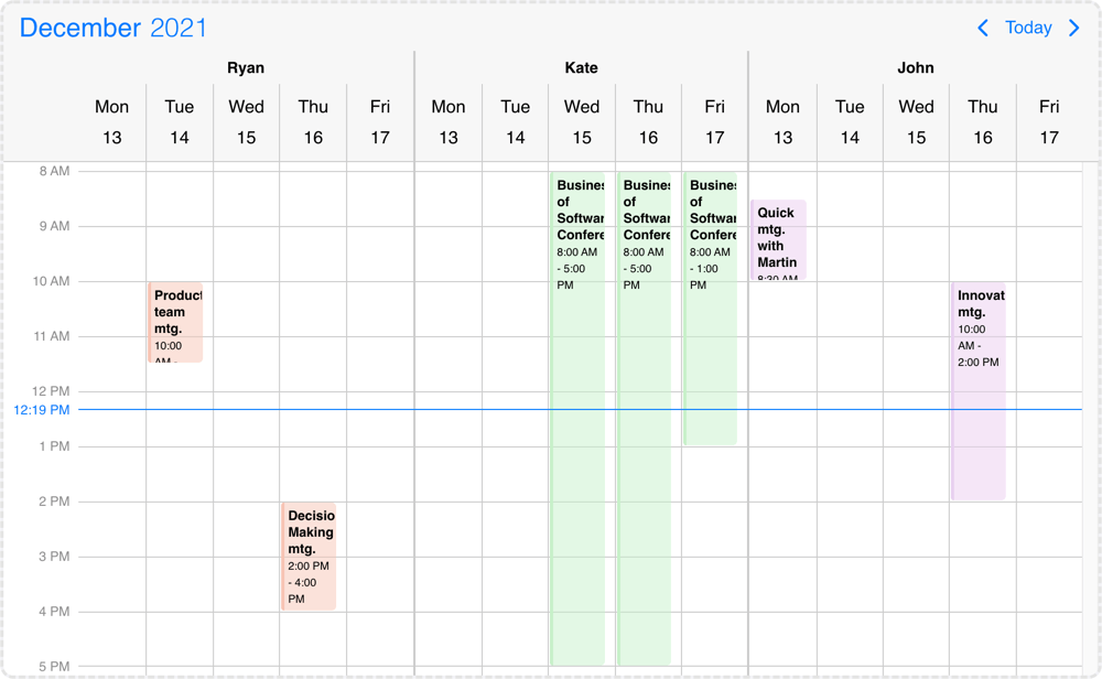
Resources grouped by resource
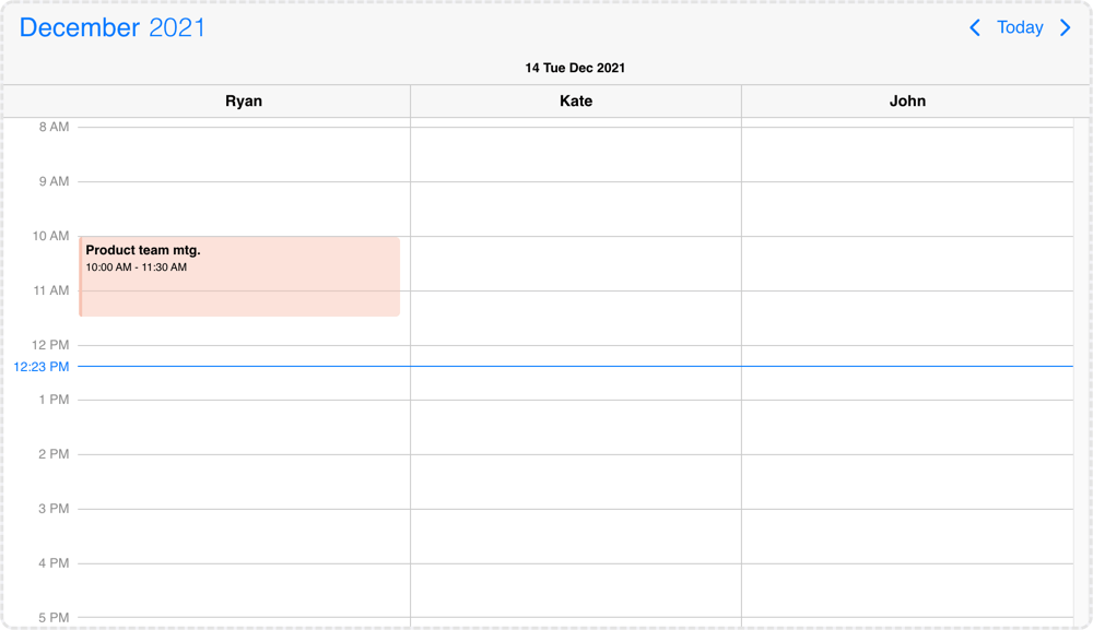
Resources grouped by day view
The scheduler view can display multiple resources inside a single instance. By default the displayed resources will be grouped by the given resources and the grouping can be changed with the groupBy option, which also supports date grouping.
  resources: [{
    id: 1,
    name: 'Ryan',
    color: '#f7c4b4'
  }, {
    id: 2,
    name: 'Kate',
    color: '#c6f1c9'
  }, {
    id: 3,
    name: 'John',
    color: '#e8d0ef'
  }],
  groupBy: 'date'
The color property controls the default event color of the resource. If an event doesn't have a specified color it will inherit from the resource. The agenda and calendar view events and labels will also inherit the resource color.
Events, colors, invalids can be tied to a single or multiple resources. This can be done with the resource property of the objects, where the id of the resource should be passed.
It can be a single value and the element would be linked to a single resource or in case of an array the element will show up at the specified resources. If no resource property is specified to the color/event/invalid object then the element will show up in every resource group.
  invalid: [{
    start: '13:00',
    end: '12:00',
    resource: 1, // this invalid will be displayed only in resource group where id is 1
    recurring: { repeat: 'weekly', weekDays: 'MO,TU,WE,TH,FR' },
    title: 'Lunch break'
  }],
  data: [{
    start: new Date(2021, 5, 23),
    end: new Date(2021, 5, 30),
    title: 'Conference',
    allDay: true,
    resource: [2, 3] // this event will be displayed in resource groups where id is 2 and 3
  }],
  colors: [{
    // this color will display at every resource group
    start: new Date(2021, 5, 12, 16),
    end: new Date(2021, 5, 12, 17),
    color: 'green'
  }]
Resource grouping & hierarchy
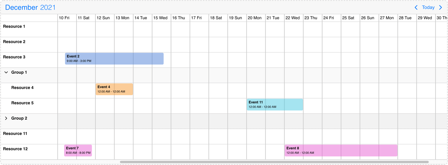
The timeline view supports resource hierarchy. Hierarchy groups can be defined with the children property of the resource object and child objects have the same properties as the main level resources. By default every resource group will be displayed and this can be modified with the collapsed attribute of the parent objects.
It supports multiple levels of hierarchy, child resources can have their own children. Both parent and child rows can contain events and those can be moved between any rows.
Child or parent rows can be disabled by creating an invalid rule which repeats daily and it is tied to the specific resources. Example: { recurring: { repeat: 'daily' }, resource: [/* resource id(s) */] }
In case of the schedule view child resources will display only on one level, each parent will be followed by their children.
resources: [{
  color: '#f7c4b4',
  id: 1,
  name: 'Carl',
}, {
  color: '#c6f1c9',
  id: 2,
  collapsed: false,
  name: 'Sharon',
  children: [
    {
      color: 'red',
      id: 21,
      name: 'Child 1 of Sharon',
    },
    {
      color: 'blue',
      id: 22,
      name: 'Child 2 of Sharon',
      collapsed: true,
      children: [
        {
          color: 'ef0011',
          id: 210,
          name: 'Grandchild 1 of Sharon',
        },
        {
          color: 'ef0011',
          id: 220,
          name: 'Grandchild 2 of Sharon',
        },
      ]
    }
  ]
}]
Timeline view resource grouping & hierarchy
Resource templating
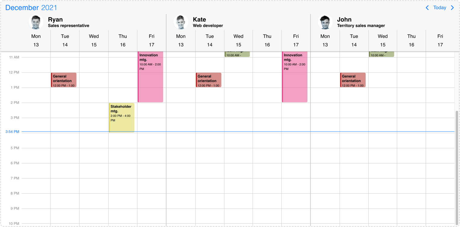
To customize the display of the resources, the renderResource and, in case of the timeline, renderResourceHeader options can be used.
In case of the timeline view the width of the resource column is fixed, but it can be overwritten from CSS if needed:
.mbsc-timeline-resource-col {
  width: 200px;
}

/* For sticky event labels */
@supports (overflow:clip) {
    .mbsc-timeline.mbsc-ltr .mbsc-schedule-event-inner {
        left: 200px;
    }

    .mbsc-timeline.mbsc-rtl .mbsc-schedule-event-inner {
        right: 200px;
    }
}
Scheduler resource templating
Slots
Besides the resources which are grouping data for the whole date range, slots introduce a horizontal level daily grouping in case of the timeline view. Slots can be used alongside resources.
When slots are used the timeline view will display in daily listing mode and only the dragToMove event iteraction will be available. The dragToCreate and dragToResize interactions will be truned off.
The renderSlot option can be used to customize the slot template of the timeline view.
  slots: [{
    id: 1,
    name: 'Morning shift',
  }, {
    id: 2,
    name: 'Afternoon shift',
  }]
Timeline slots
Blocked out dates
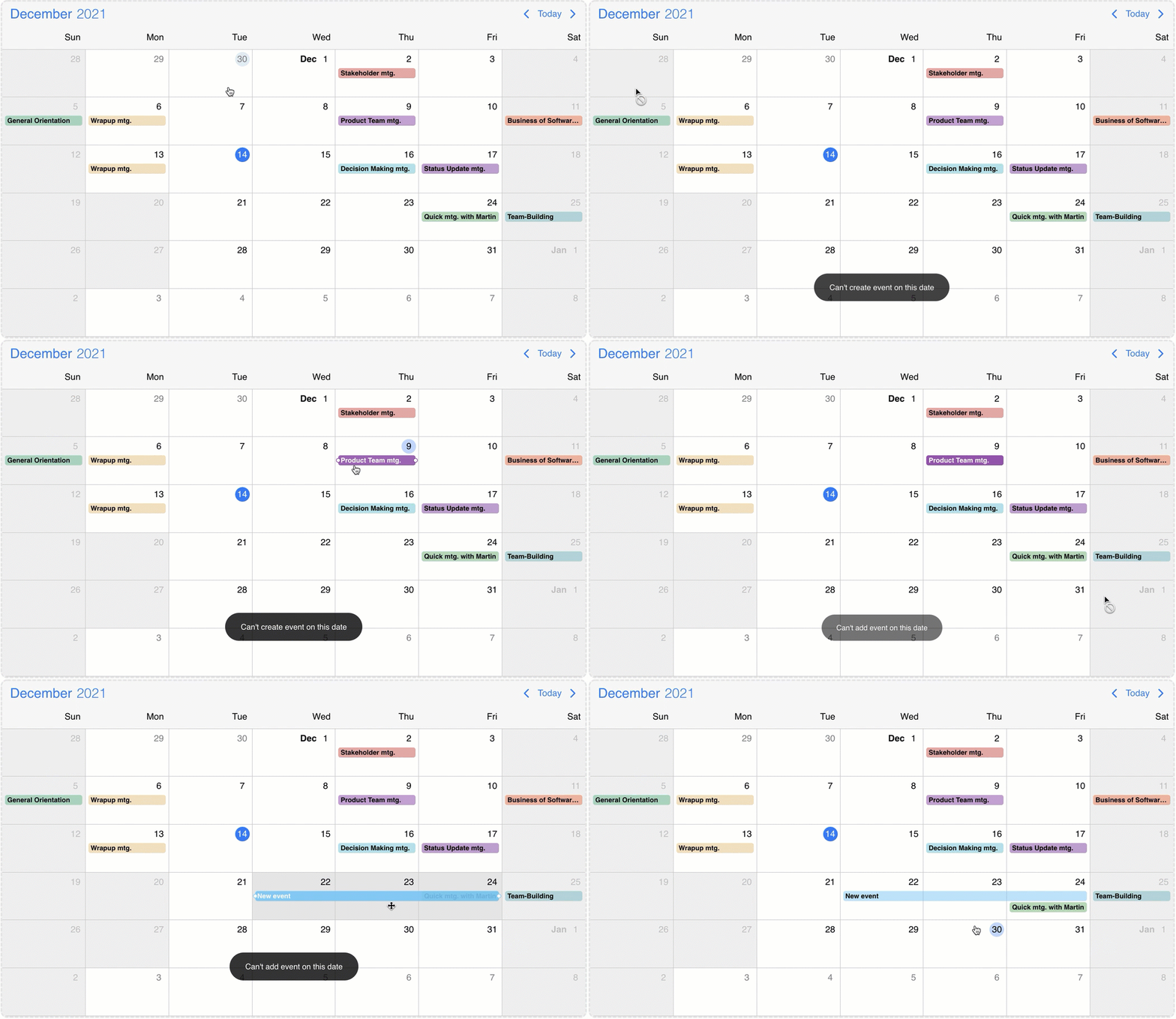
You can show blocked out time ranges with the invalid option. By default the events and the blocked out dates will be displayed on the view even if there is collision.
The invalid option supports the following formats: JavaScript Date objects, 8601 strings , or moment object. These formats can be passed directly to the array in this case the whole day will be disabled or as an object where the blocked out ranges can be customized with the following properties: allDay/start/end/title/recurring.
Custom properties can also be passed to the invalid object which will also be passed to the life-cycle events and this can help with the identification/validation of the invalids.
If an event interacts with an invalid range the event will be reverted to it's original position and the onEventUpdateFailed event will be fired. (If the dragToMove or the dragToResize options were used.)
If a newly created event collide with a blocked out date the event won't be created and the onEventCreateFailed event will be fired. (If the dragToCreate option was used)
invalid: [
    /* Passing exact dates will block out the entire day */
     new Date(2021, 1, 7), // Date object
    '2021-10-15T12:00', // string
     moment("2020-12-25"), // moment object

    /* Block out date range passed as an object */
    {
      // multi day range with date string
      start: '2021-10-15T12:00',
      end: '2021-10-18T13:00',
      title: 'Company 10th anniversary',
      type: 'day-off' // custom property
    },
    {
     // multi day range with date object
      allDay: true,
      start: new Date(2021, 2, 7, 10, 10),
      end: new Date(2021, 2, 9, 20, 20),
      title: 'Conference for the whole team',
      type: 'conference' // custom property
    },
    {
      // multi day time range with recurring and time string
      start: '13:00',
      end: '12:00',
      recurring: { repeat: 'weekly', weekDays: 'MO,TU,WE,TH,FR' },
      title: 'Lunch break',
      type: 'lunch' // custom property
    }
];
Event calendar blocked out dates
Customizing the events
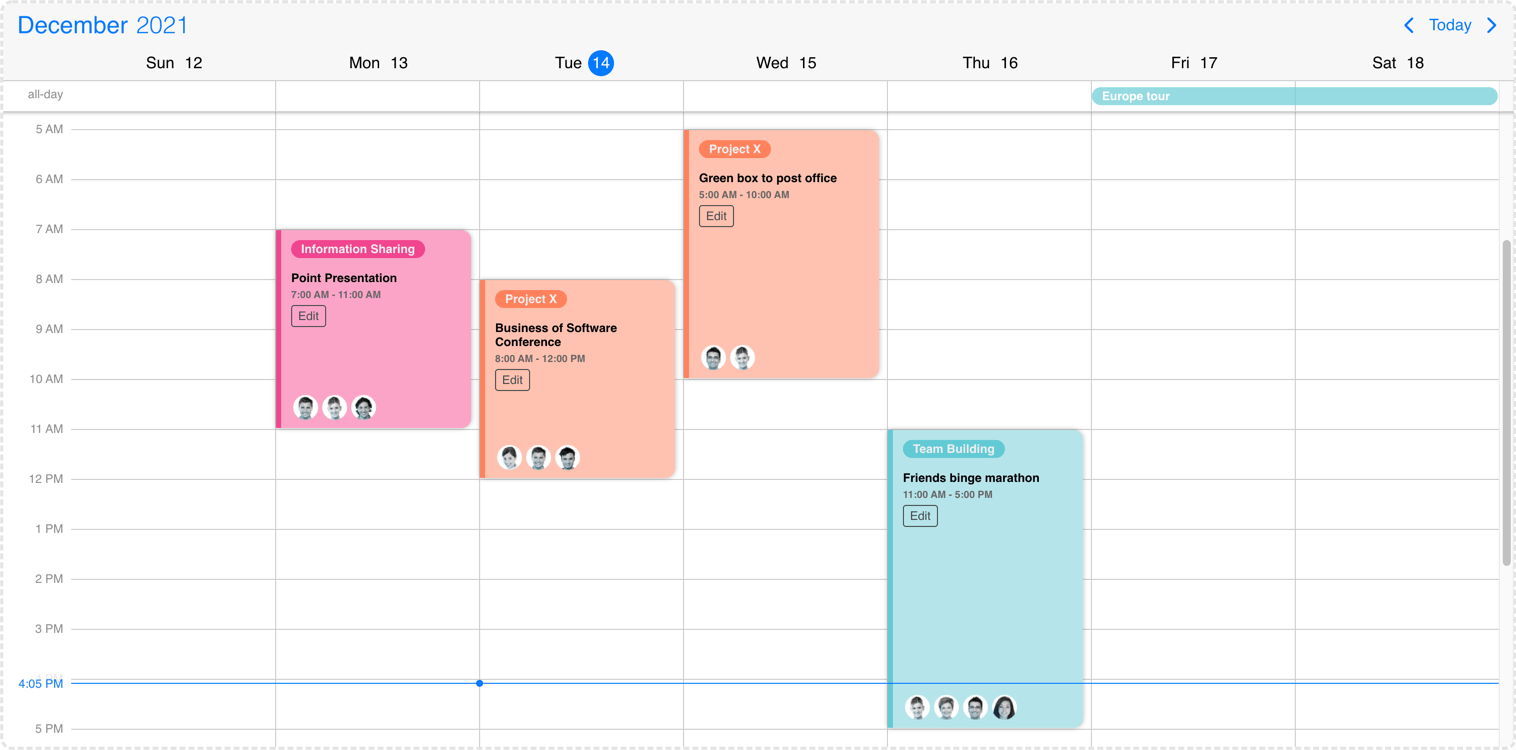
You can customize the events by writing custom rendering functions. Depending on what your goal is, you have two options:
- Customize the full event - Mobiscroll takes care of rendering the events in the correct order, but everything else comes form the rendering function you write.
- Customize the event content - Mobiscroll takes care of rendering the events in the correct order and also prints basic fields, like
start/end, whether it is anallDayevent or not and also takes care of coloring the event appropriately. Everything else comes from the custom rendering function.
Customize the full event
Whenever there is an event (in the agenda, scheduler, timeline, labels or popover) your custom rendering function will be used for instead the default render. Mobiscroll will position your component to the right place, but anything else you want to show is up to you... like a title, description, color the background or show any content.
- For the agenda and popover - use the
renderEventoption for the custom function - For event labels in the calendar and all-day events in the scheduler - use the
renderLabeloption for the custom function - For the scheduler and timeline - use the
renderScheduleEventoption for the custom function
Event calendar event customization
Customize the event content
In most cases you only want to customize the content section of the event. In this case your render function will be used for rendering the content of the event. Mobiscroll will position the event to the right place and will render essential information like the color of the event, the time and if it's an all day event or not. The title, description and any other fields you want to show (like participants, an avatar...) will be coming from your custom function.
- For the agenda and popover - use the
renderEventContentoption for the custom function - For event labels in the calendar and all-day events in the scheduler - use the
renderLabelContentoption for the custom function - For the scheduler and timeline - use the
renderScheduleEventContentoption for the custom function
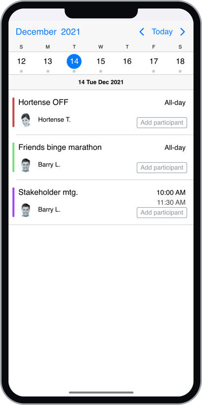
Agenda content customization
Examples
import { Eventcalendar } from '@mobiscroll/react';

const App = () => {
  const [events, setEvents] = useState([/*...*/]);

  const renderEvent = useCallback((data) => {
    return <>
      <div className="my-start">{data.start}</div>
      <div className="my-end">{data.end}</div>
      <div className="my-title">{data.title}</div>
      <div className="my-custom-field">{data.original.description}</div>
      <div className="my-custom-field">{data.original.location}</div>
    </>
  });

  return <Eventcalendar data={events} renderEvent={renderEvent} />;
}import { Eventcalendar } from '@mobiscroll/react';
const App = () => {
const [events, setEvents] = useState([/*...*/]);
const renderEventContent = useCallback((data) => {
return <>
<div className="my-title">{data.title}</div>
<div className="my-custom-field">{data.original.description}</div>
<div className="my-custom-field">{data.original.location}</div>
</>
});
return <Eventcalendar data={events} renderEventContent={renderEventContent} />;
}Taking over the listing
When the agenda view is displayed, you can take full control of the rendering, using the renderAgenda option. The renderer function will receive the event data as parameter, grouped by days.
If you'd like to keep the scroll to day functionality, when clicking a day on the calendar, make sure to add the rendered days to the dayRefs
object, which is also passed to the renderer function, with the timestamp of the day as key, and the DOM element as value.
import { Eventcalendar } from '@mobiscroll/react';

const App = () => {
  const [events, setEvents] = useState([/*...*/]);

  const myView = useMemo(() => {
    return {
      calendar: { type: 'week' },
      agenda: { type: 'day' }
    };
  });

  const renderAgenda = useCallback((data, options, dayRefs) => {
    return <div className="custom-event-list">
      {data.map((day) =>
        <ul className="custom-event-group" ref={(el) => {dayRefs[day.timestamp] = el;}} key={day.timestamp}>
          <li className="custom-event-day">{day.date}</li>
          {day.events.map((event) =>
            <li key={event.id} className="custom-event">{event.title}</li>,
          )}
        </ul>,
      )}
    </div>;
  });

  return <Eventcalendar data={events} renderAgenda={renderAgenda} view={myView} />;
}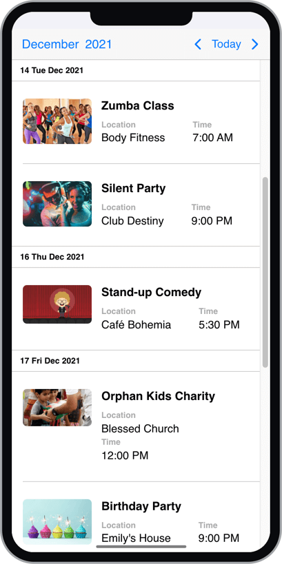
Agenda full event customization
Customizing the header
The header of the calendar can be fully customized to one's needs. This can be achieved by passing a function that returns the custom header to the renderHeader option.
const customTemplate = () => {
    return <>
        <p>Any <strong>Title</strong> you want here or</p>
        <YourCustomComponent yourProp="yourPropValue" />
    </>
}
<Eventcalendar renderHeader={customTemplate} />
While fully customizing the header is very usefull, sometimes it's desireable to customize only parts of it.
In this case you can take advantage of the default header's building blocks. These components let you put toghether the header you want,
while you don't have to worry about the functionality behind them.
For example you can leave out parts from the default header, change the order the default buttons appearance or add custom components between them.
Here's the list of the built in components of the default header:
<CalendarPrev />- Previous button component, that navigates to the previous month.<CalendarNext />- Next button component, that navigates to the next month.<CalendarToday />- Today button component, that navigates to the current date.<CalendarNav />- The title navigation button component, that opens the year/month navigation.
The above components can be used inside of the custom header. The following example will render the prev and next buttons and then a custom title that is set from a custom variable (myTitle variable).
const myTitle = 'My Awesome title';
const customWithNavButtons = () => {
    return <>
        <CalendarPrev />
        <CalendarNext />
        <div className="my-custom-title">{myTitle}</div>
    </>;
}

<Eventcalendar renderHeader={customWithNavButtons} />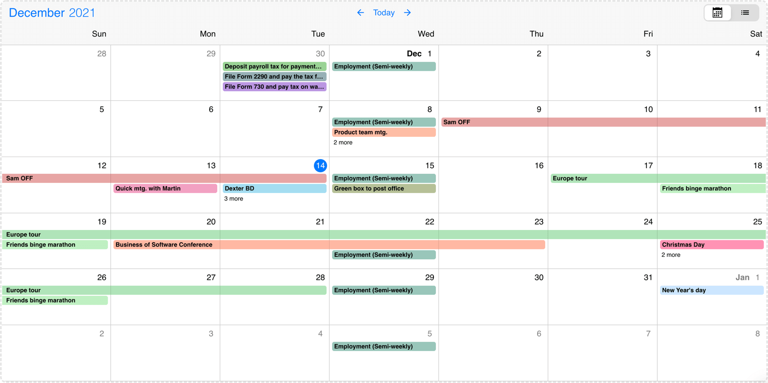
Event calendar header customization
Timezones
By default the Eventcalendar uses the local timezone of the browser to show event data. If you want to show the data or interpret it in a different timezone, you will need an external library to handle the timezone conversions. There are two libraries that Mobiscroll supports: moment-timezone and luxon.
Library Install
To setup the library, first you have to install it on your page. In this guide we'll assume you are using npm to install packages, but you can consult the installation guide on the libraries official pages (moment-timezone install page, luxon install page) for more options on how to install them.
The Moment-Timezone library
To install the moment-timezone library with npm you will need to run the following commands:
$ npm install moment-timezoneAfter the library is installed, you will have to import it with the momentTimezone object from mobiscroll:
import moment from 'moment-timezone';
import { momentTimezone } from '@mobiscroll/react';
Then set the mobiscroll's reference to the imported library:
momentTimezone.moment = moment;After that, you can pass the momentTimezone object to the Eventcalendar's timezonePlugin option.
The Luxon library
To install the luxon library with npm you will need to run the following commands:
$ npm install luxonIn case you are using typescript you can also consider installing the types, because they come separately:
$ npm install --save-dev @types/luxonAfter the library is installed, you will have to import it with the luxonTimezone object from mobiscroll:
import * as luxon from 'luxon';
import { luxonTimezone } from '@mobiscroll/react';
Then set the mobiscroll's reference to the imported library:
luxonTimezone.luxon = luxon;After that, you can pass the luxonTimezone object to the Eventcalendar's timezonePlugin option.
Using timezones
When working with timezones, you usually have your data stored in one timezone, and display it in a different timezone. A common scenario is storing the data in UTC, and displaying it in the user's local timezone. You can set this using the dataTimezone and displayTimezone options.
import moment from 'moment-timezone';
import { momentTimezone, Eventcalendar } from '@mobiscroll/react';

// setup the reference to moment
momentTimezone.moment = moment;

function App() {
    return <Eventcalendar timezonePlugin={momentTimezone} dataTimezone="utc" displayTimezone="Europe/Berlin" />;
}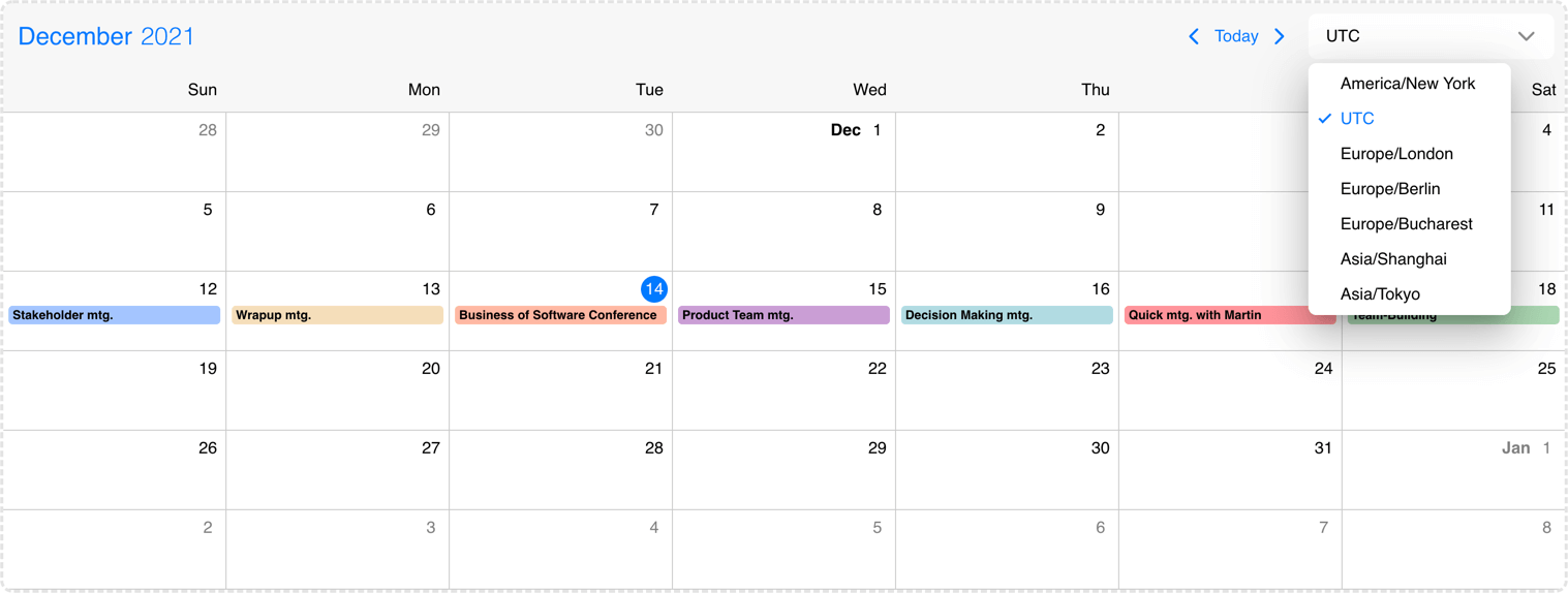
Event calendar changing the timezones
Exclusive end dates
In version 5.7.0 we introduced support for exclusive end dates. This means that the last moment of a given range is not actually part of the range.
Many of existing calendaring solutions (e.g. Google Calendar) and standards (e.g. iCalendar) are working with exclusive end dates, so this makes interoperabiliy with our Eventcalendar UI simpler.
With the introduction of timezone support, this also became a necessity, e.g. if you have an event with
start: '2021-07-09T20:00Z' and end: '2021-07-09T21:00Z', defined in UTC,
when displayed in Europe/Bucharest timezone, the end becomes '2021-07-10T00:00+03:00'.
With inclusive end dates the event will show up on 10th of July as well, which is unexpected.
The exclusive end dates mode can be enabled using the exclusiveEndDates option. When timezones are used (displayTimezone and/or dataTimezone is set), exclusive end dates are automatically enabled.
start: '2021-07-09' and end: '2021-07-10' will show as a two day event
on the calendar view, expanded over 9th and 10th of July. With exclusive end dates the event will be a single day event,
showing up only on 9th of July.
Print Module
The Print Module is an optional module, that includes styles and functions for printing. It can be installed and used with other Mobiscroll Components as described below.
Installing the Print Module
When your Mobiscroll package is created with the Download Builder and you have access to the Print Module, you can choose to include it in the built package. In this case you will need make sure you checked the print module before downloading the package from the download page. After installing your downloaded package, the Print Module will be available for import. In case it was downloaded with the download builder, the Print Module needs to be imported from the generated package.
When you're using the full Mobiscroll package from NPM, then you have the possibility to install the Print Module as an additional package (also from NPM). In this case, after successfully using
the Mobiscroll CLI to configure the project, you will have to install the @mobiscroll/print package from npm. Use the following command:
$ npm install @mobiscroll/printImporting the Print Module
The Print Module consists of print specific styles, that need to be loaded into the document. Also, there's a javascript part, that needs to be imported and passed to the component via
the modules option.
Stylesheets
In the case of the package built by the download builder, there's no additional stylesheet. It is already bundled into the same file all the other component files are.
For the NPM package, styles can be found at the dist/css/ folder inside the package.
// importing the css
import '@mobiscroll/print/dist/css/mobiscroll.min.css';

// importing the SASS - if you are using SASS
import '@mobiscroll/print/dist/css/mobiscroll.scss';
JavaScript
The print module can be imported from the installed package and passed to the component using the modules option. Here's an example:
import { print } from '@mobiscroll/print';

const MY_MODULES = [print];

function App(props) {
    return <Eventcalendar modules={MY_MODULES} />;
}
Printing
Printing only the eventcalendar contents can be done, using the print method of the eventcalendar instance. Calling this method will create a new window containing only the eventcalendar and will invoke the print function of the browser. After the printing is done, the window should close automatically.
The new window created by the print method will include all the styles and links to stylesheets from the original page. These styles will be copied over automatically, but in case you are using relative
urls, the base url of the new window might not match yours. In this case, the print method can be passed a config object, with your custom baseUrl, to make the
relative paths work. By default, the baseUrl will be the original page's origin.
import { print } from '@mobiscroll/print';

const MY_MODULES = [print];

function App(props) {
    const [inst, setInst] = React.useState(null);

    const myPrint = () => {
        inst.print();
    }

    return <>
        <Eventcalendar modules={MY_MODULES} ref={setInst} />
        <Button onClick={myPrint}>Print Eventcalendar</Button>
    </>
When you want to include more than just the eventcalendar in your print, you can invoke the print screen of your browser. You don't have to worry about the printing styles for the eventcalendar, they will be applied in this case as well.
For many more examples - simple and complex use-cases - check out the event calendar demos for react.
Options
| Name | Type | Default value | Description |
|---|---|---|---|
| actionableEvents | Boolean | true |
Defines if the events on the agenda and inside the calendar popover are actionable or not.
If actionable, the event items will have hover and active states, and pointer cursor.
Set to false when custom event rendering is used
and the event list items contain other actionable elements, e.g. buttons.
|
| calendarSystem | Object | undefined |
Specify the calendar system to be used.
|
| clickToCreate | Boolean, String | undefined |
Enable new event creation on click. If true or 'double' a new event will be created only with a double click and with the 'single' value the event will be created instantly with a single click. This option will only work on desktop environment where mouse events are fired.It will also allow deleting of the focused events using the Delete or Backspace key. In touch environment a long tap should be used to create a new event and it is controlled with the dragToCreate option. Using the extendDefaultEvent option extra properties can be set for the created event. |
| colors | Array | undefined |
Change the color of certain dates on the calendar. Must be an array of objects with the following properties:
The colored range will be considered all-day if:
The dates can be specified as Javascript Date objects, ISO 8601 strings, or moment objects.
Example
|
| context | String, HTMLElement | 'body' |
The DOM element in which the popups (event popover, year and month picker) are rendered. Can be a selector string or a DOM element. |
| cssClass | String | undefined |
Applies custom css class to the top level element. |
| data | Array | undefined |
Events for the calendar, as an array of event objects. The event object supports the following properties:
The dates can be specified as Javascript Date objects, ISO 8601 strings, or moment objects.
The event objects may have additional custom properties as well.
The custom properties are not used by the eventcalendar, but they are kept and will be available anywhere
the event objects are used.
E.g. the
onEventClick
event will receive the event object as argument, containing the custom properties as well.
Use the getEvents method to get the events between two dates.
Example
|
| dataTimezone | String | defaults to displayTimezone |
The timezone in which the data is interpreted.
If the data contain timezone information (when the ISO string has a timezone offset ex.
When using timezones, the exclusiveEndDates option is also turned on by default.
When using anything other than the default, a timezone plugin must be also passed to the component.
Possible values are:
|
| defaultSelectedDate | Date, String, Object | undefined |
Specifies the initial selected date on the calendar, when used as an uncontrolled component.
For controlled usage use the selectedDate option instead.
For views, where time is also displayed, the view will be scrolled to the specified time. If the time part is not explicitly specified, it defaults to the start of the day. |
| displayTimezone | String | 'local' |
The timezone in which the data is displayed.
When using anything other than the default ('local'), a timezone plugin must be also passed to the component.
Possible values are:
|
| dragTimeStep | Number | 15 |
Specify the steps in minutes for the schedule events during drag. |
| dragToCreate | Boolean | undefined |
If true, dragging on an empty cell will create a new event. It will also allow deleting of the focused events using the Delete or Backspace key.
The title of the new event can be specified with the newEventText option.
Using the extendDefaultEvent option extra properties can be set for the created event. |
| dragToMove | Boolean | undefined |
If true, the events will be move-able. |
| dragToResize | Boolean | undefined |
If true, the events will be resize-able. |
| eventOrder | Function | undefined |
Determines the ordering of the events within the same day. Can be a function that accepts two event objects as arguments and should return -1 or 1.
If not specified, the default order is:
|
| exclusiveEndDates | Boolean | undefined |
If true, the Eventcalendar will work in exclusive end dates mode,
meaning that the last moment of the range (event, invalid, colors, etc.) is not part of the range.
E.g. end: '2021-07-03T00:00' means that the event ends on 2nd of July and will not be shown on 3rd of July.
|
| extendDefaultEvent | Function | undefined |
Use this option to set properties to the new event created with click or drag. This event creation is handled by the clickToCreate and dragToCreate options. It takes a function that should return the properties for the new event. The object passed to this function has the following properties:
Example
|
| externalDrop | Boolean | undefined |
If true, external drag & drop is allowed.
|
| groupBy | String | 'resource' |
Groups the given schedule resources based on the specified 'date' or 'resource'. |
| height | Number, String | undefined |
Sets the height of the component. The height of the calendar view impacts the number of labels that fit into a table cell. A show more label will be displayed for events that don't fit. |
| invalid | Array | undefined |
An array containing the invalid values.
Can contain dates (Javascript Date objects, ISO 8601 strings, or moment objects), or objects with the following properties:
Use the getInvalids method to get the invalids between two dates.
Example
|
| invalidateEvent | String | 'strict' |
Configures how to validate events against invalid ranges on create/move/resize: When set to When set to |
| labels | Array | undefined |
Specify labels for calendar days. A label object can have the following properties:
The dates can be specified as Javascript Date objects, ISO 8601 strings, or moment objects.
Example
|
| marked | Array | undefined |
Mark certain dates on the calendar. Must be an array containing dates (Javascript Date objects, ISO 8601 strings, or moment objects),
or objects with the following properties:
The dates can be specified as Javascript Date objects, ISO 8601 strings, or moment objects.
Example
|
| max | Date, String, Object | undefined |
Maximum date and time. The calendar cannot be navigated beyond the specified maximum date.
If navigation is needed, but event creation should not be allowed after a specific date, use the
invalid option with daily recurrence starting from the specific date.
|
| min | Date, String, Object | undefined |
Minimum date and time. The calendar cannot be navigated beyond the specified minimum date.
If navigation is needed, but event creation should not be allowed before a specific date, use the
invalid option with daily recurrence until the specific date.
|
| refDate | Date, String, Object | undefined |
Specifies the reference date for the view calculation, when multiple days, weeks, months or years are displayed.
If not specified, for the scheduler and timeline views will be today's date, for the calendar and agenda views will be 1970/01/01. It denotes the reference point when calculating the pages going in the future and in the past. For example if the view type is day, the view size is 3, and the current date is 01/16/2024,
the pages are calculated from this date, so the initial page will contain [01/16/2024, 01/16/2024, 01/17/2024],
the next page [01/18/2024, 01/19/2024, 01/20/2024] and so on.
In case of day view, the reference point will be exactly the specified date. For week, month and year views the reference point will be the start of the week, month or year of the specified day. Changing the reference date will not navigate the calendar to the specified date, it only recalculates the pages from the new reference date. To navigate the view to a specified date and time, use the selectedDate option. |
| renderAgenda | Function | undefined |
A render function to customize the agenda template.
Should return the markup of an event list, to be used in the agenda listing.
It receives the the following parameters:
|
| renderDay | Function | undefined |
You can use the renderDay option to customize the day cells of the calendar view and the header date container in case of schedule view. It takes a function that should return the desired markup. The Eventcalendar will take care of the positioning, but everything else (like background color, hover effect, etc.) is left to you. If you are looking to customize only the content and don't want to bother with the styling of the event, in case of calendar and schedule view you can use the renderDayContent option. The render function will receive an object as parameter. This data can be used to show day specific things on the Eventcalendar. The object passed to the function has the following properties:
Example
|
| renderDayContent | Function | undefined |
You can use the renderDayContent option to customize the day content of the Eventcalendar. It takes a function that should return the desired markup. The Eventcalendar will take care of styling and you can focus on what you show beside the day number a.k.a the content. If you are looking to fully customize the day (ex. add custom hover effects) you will need to use the renderDay option. In that case you will only get the positioning done by the Eventcalendar and everything else is up to you. The render function will receive an object as parameter. This data can be used to show day specific things on the Eventcalendar. The object passed to the template has the following properties:
Example
|
| renderEvent | Function | undefined |
You can use the renderEvent option to customize the events that appear on the agenda and the popover. It should return the markup of the event. The Eventcalendar will take care of the positioning, but everything else (like background color, hover effect, etc.) is left to you. If you are looking to customize only the content (ex. add custom elements) and don't want to bother with the styling of the event, you can use the renderEventContent option. For customizing the events on other part of the Eventcalendar check out the customizing the events section The render function will receive an event object as parameter. This data can be used to show event specific things on the agenda and popover. The object passed to the function has computed properties, as well as a reference to the original event it comes from:
|
| renderEventContent | Function | undefined |
You can use the renderEventContent option to customize the event content that appears on the agenda and the popover. It should return the markup that is added to the event. The Eventcalendar will take care of styling and you can focus on what you show inside of the event a.k.a the content. If you are looking to fully customize the event (ex. add custom hover effects) you will need to use the renderEvent option. In that case you will only get the positioning done by the Eventcalendar and everything else is up to you. For customizing the events on other part of the Eventcalendar check out the customizing the events section. The render function will receive an event object as parameter. This data can be used to show event specific things on the agenda and popover. The object passed to the function has computed properties, as well as a reference to the original event it comes from:
|
| renderHeader | Function | undefined |
Use this option to customize the header of the Eventcalendar. It takes a function that should return the desired markup. In the returned markup, you can use custom html as well as the built in header components of the calendar. Check out the customizing the header section for a more detailed description on built in components. Example with built in components
|
| renderLabel | Function | undefined |
You can use the renderLabel option to fully customize the labels that appear on the calendar. It should return the markup of the event. The Eventcalendar will take care of the positioning, but everything else (like background color, hover effect, etc.) is left to you. If you are looking to customize only the content (ex. add custom elements) and don't want to bother with the styling of the label, you can use the renderLabelContent option. For customizing the events on other part of the Eventcalendar check out the customizing the events section The render function will receive an event object as parameter. This data can be used to show event specific things on the calendar. The object passed to the function has computed properties, as well as a reference to the original event it comes from:
|
| renderLabelContent | Function | undefined |
You can use the renderLabelContent option to customize the label contents, that appears on the calendar. It should return the markup that is added to the label. The Eventcalendar will take care of styling and you can focus on what you show inside of the label a.k.a the content. If you are looking to fully customize the label (ex. add custom hover effects) you will need to use the renderLabel option. In that case you will only get the positioning done by the Eventcalendar and everything else is up to you. For customizing the events on other part of the Eventcalendar check out the customizing the events section The render function will receive an event object as parameter. This data can be used to show event specific things on the calendar. The object passed to the function has computed properties, as well as a reference to the original event it comes from:
|
| renderResource | Function | undefined |
Use this option to customize the resource template of the Scheduler. It takes a function that should return the desired markup. In the returned markup, you can use custom html as well. Example
|
| renderResourceHeader | Function | undefined |
Use this option to customize the empty cell content above the resource column. It takes a function that should return the desired markup. In the returned markup, you can use custom html as well. Example
|
| renderScheduleEvent | Function | undefined |
You can use the renderScheduleEvent option to customize the events that appear on the scheduler and timeline. It should return the markup of the event. The Eventcalendar will take care of the positioning, but everything else (like background color, hover effect, etc.) is left to you. If you are looking to customize only the content (ex. add custom elements) and don't want to bother with the styling of the event, you can use the renderScheduleEventContent option. For customizing the events on other part of the Eventcalendar check out the customizing the events section The render function will receive an event object as parameter. This data can be used to show event specific things on the scheduler. The object passed to the function has computed properties, as well as a reference to the original event it comes from:
|
| renderScheduleEventContent | Function | undefined |
You can use the renderScheduleEventContent option to customize the event content that appears on the scheduler and timeline. It should return the markup that is added to the event. The Eventcalendar will take care of styling and you can focus on what you show inside of the event a.k.a the content. If you are looking to fully customize the event (ex. add custom hover effects) you will need to use the renderScheduleEvent option. In that case you will only get the positioning done by the Eventcalendar and everything else is up to you. For customizing the events on other part of the Eventcalendar check out the customizing the events section The render function will receive an event object as parameter. This data can be used to show event specific things on the scheduler. The object passed to the function has computed properties, as well as a reference to the original event it comes from:
|
| renderSlot | Function | undefined |
Use this option to customize the slot template of the Timeline view. It takes a function that should return the desired markup.
In the returned markup, you can use custom html as well.
Example
|
| resources | Array | undefined |
The scheduler can handle multiple resources inside a single instance. Resource grouping can be modified with the help of the groupBy option.
If set The timeline view can render multiple levels of hierachy groups. Levels can be added wiht the help of the
The resource object has the following properties:
Example of a resource array
|
| responsive | Object | undefined |
Specify different settings for different container widths, in a form of an object,
where the keys are the name of the breakpoints, and the values are objects containing
the settings for the given breakpoint.
The available width is queried from the container element of the component and not the browsers viewport like in css media queries
There are five predefined breakpoints:
breakpoint
property specifying the min-width in pixels.
Example:
|
| selectedDate | Date, String, Object | undefined |
Specifies the selected date on the calendar.
This can be changed programmatically and when changed the calendar will automatically navigate to the specified date.
For views, where time is also displayed, the view will be scrolled to the specified time. If the time part is not explicitly specified, it defaults to the start of the day. You also need to pass a handler for the onSelectedDateChange event for a controlled usage, otherwise use the defaultSelectedDate option instead. This does not change the reference date that defines the reference point of the navigation pages. To change the reference point for the navigation (e.g. start the paging from the newly selected date) use the refDate option. |
| showControls | Boolean | true |
Shows or hides the calendar header controls: the previous and next buttons, and the current view button together with the year and month picker. |
| showEventTooltip | Boolean | true |
If false, it will hide the native tooltip that shows up when hovering over the event.
|
| slots | Array | undefined |
The slots besides the resources introduce a horizontal(daily) level of data grouping to the Timeline view.
If set The slot object has the following properties:
Example of a resource array
|
| theme | String | undefined |
Sets the visual appearance of the component.
If it is
Make sure that the theme you set is included in the downloaded package.
|
| themeVariant | String | undefined |
Controls which variant of the theme will be used (light or dark). Possible values:
To use the option with custom themes, make sure to create two custom themes,
where the dark version has the same name as the light one, suffixed with |
| timezonePlugin | Object | undefined |
Specifies the timezone plugin, which can handle the timezone conversions.
By default the Eventcalendar uses the local timezone of the browser to show event data.
If you want to show the data or interpret it in a different timezone, you will need an
external library to handle the timezone conversions.
There are two supported libraries:
moment-timezone and luxon. You can specify either the dataTimezone or the displayTimezone or both. Depending on which externa library you use you can pass either the
Example
|
| view | Object | { calendar: { type: 'month', popover: true } } |
Configures the event calendar view elements.
Properties
Example |
| width | Number, String | undefined |
Sets the width of the popup container. This will take no effect in inline display mode. |
Setting options dynamically
To make an option dynamic, you can pass a variable as option value. Whenever the value of the variable changes, the component will be re-rendered.
const App = () => {

  const [myTheme, setMyTheme] = useState('ios');

  const changeTheme = useCallback(() => {
    // Changes the theme to Material
    setMyTheme('material');
  }, []);

  return <div>
    <Eventcalendar theme={myTheme} />
    <button onClick={changeTheme}>Change theme</button>
  </div>;
};
Events
| Name | Description | |
|---|---|---|
| onCellClick(event, inst) |
Triggered when a cell is clicked on the calendar
scheduler, or timeline grid
.
Parameters
Example |
|
| onCellDoubleClick(event, inst) |
Triggered when a cell is double-clicked on the calendar
scheduler, or timeline grid
. This event will only trigger on desktop environment where mouse events are fired.
Parameters
Example |
|
| onCellHoverIn(event, inst) |
Triggered when the mouse pointer hovers a day on the calendar.
(does not apply for agenda, schedule and timeline views).
Parameters
Example |
|
| onCellHoverOut(event, inst) |
Triggered when the mouse pointer leaves a day on the calendar.
(does not apply for agenda, schedule and timeline views).
Parameters
Example |
|
| onCellRightClick(event, inst) |
Triggered when a cell is right-clicked on the calendar
scheduler, or timeline grid
.
Parameters
Example |
|
| onDestroy(event, inst) |
Triggered when the component is destroyed.
Parameters
Example |
|
| onEventClick(event, inst) |
Triggered when an event is clicked.
Parameters
Example |
|
| onEventCreate(event, inst) |
Triggered when an event is about to create. Event creation can be prevented by returning false from the handler function.
Parameters
Example |
|
| onEventCreated(event, inst) |
Triggered when an event is created is rendered in its position.
Parameters
Example |
|
| onEventCreateFailed(event, inst) |
Triggered when an event is interacted with a blocked out date during the creation.
Parameters
Example |
|
| onEventDelete(event, inst) |
Triggered when an event is about to be deleted. Event deletion can be performed with delete and backspace button on an active event. Deletion can be prevented by returning false from the handler function.
Parameters
Example |
|
| onEventDeleted(event, inst) |
Triggered when an event is deleted and it is removed from it's position.
Parameters
Example |
|
| onEventDoubleClick(event, inst) |
Triggered when an event is double-clicked. This event will only trigger on desktop environment where mouse events are fired.
Parameters
Example |
|
| onEventHoverIn(event, inst) |
Triggered when the mouse pointer hovers an event on the calendar.
Parameters
Example |
|
| onEventHoverOut(event, inst) |
Triggered when the mouse pointer leaves an event on the calendar.
Parameters
Example |
|
| onEventRightClick(event, inst) |
Triggered when an event is right-clicked.
Parameters
Example |
|
| onEventUpdate(event, inst) |
Triggered when an event is about to update. Update can be prevented by returning false from the handler function.
Parameters
Example |
|
| onEventUpdated(event, inst) |
Triggered when an event is updated and is rendered in its new position. This is where you update the event in your database or persistent storage.
Parameters
Example |
|
| onEventUpdateFailed(event, inst) |
Triggered when an event is interacted with a blocked out date at drop or resize.
Parameters
Example |
|
| onInit(event, inst) |
Triggered when the component is initialized.
Parameters
Example |
|
| onLabelClick(event, inst) |
Triggered when a label on the calendar is clicked.
Parameters
Example |
|
| onPageChange(event, inst) |
Triggered when the calendar page is changed (month or week, with buttons or swipe).
Parameters
Example |
|
| onPageLoaded(event, inst) |
Triggered when the calendar page is changed (month or week, with buttons or swipe) and the animation has finished.
Parameters
Example |
|
| onPageLoading(event, inst) |
Triggered before the markup of a calendar page (month or week) is starting to render.
Parameters
Example |
|
| onSelectedDateChange(event, inst) |
Triggered when the selected date is changed, e.g. by clicking on a day on a calendar view, or by using the navigation arrows.
You can use this in conjunction with the selectedDate option when used as a
controlled component.
Parameters
Example |
|
Methods
| Name | Description | |
|---|---|---|
| getEvents([startDate, endDate]) |
Returns the event data between two dates. If startDate and endDate are not specified, it defaults to the start and end days of the current view.
If endDate is not specified, it defaults to startDate + 1 day.
Parameters
Returns: Array
ExampleMethods can be called on an instance. For more details see calling methods |
|
| getInvalids([startDate, endDate]) |
Returns the invalids between two dates. If startDate and endDate are not specified, it defaults to the start and end days/times of the current view.
If endDate is not specified, it defaults to startDate + 1 day.
Parameters
Returns: Array
Example |
|
| print(config) |
Prints the Eventcalendar, when the print module is properly set up. The Print Module is an optional module, that includes styles and functions for printing. It can be installed and used with the Eventcalendar as described in the Print Module section. ParametersThe print method can be passed a config object as parameter, that supports the following properties:
|
|
Localization
| Name | Type | Default value | Description |
|---|---|---|---|
| allDayText | String | 'All-day' |
Text for all day events. |
| amText | String | 'am' |
Text for AM. |
| dateFormat | String |
'MM/DD/YYYY'
|
The format for parsed and displayed dates.
|
| dateFormatFull | String | 'DDDD, MMMM D, YYYY' |
Human readable date format, used by screen readers to read out full dates. Characters have the same meaning as in the dateFormat option. |
| dateFormatLong | String | 'D DDD MMM YYYY' |
Long date format, used by the agenda view day headers. Characters have the same meaning as in the dateFormat option. |
| dayNames | Array | ['Sunday', 'Monday', 'Tuesday', 'Wednesday', 'Thursday', 'Friday', 'Saturday'] |
The list of long day names, starting from Sunday, for use as requested via the dateFormat setting. |
| dayNamesMin | Array | ['S', 'M', 'T', 'W', 'T', 'F', 'S'] |
The list of minimal day names, starting from Sunday, for use as requested via the dateFormat setting. |
| dayNamesShort | Array | ['Sun', 'Mon', 'Tue', 'Wed', 'Thu', 'Fri', 'Sat'] |
The list of abbreviated day names, starting from Sunday, for use as requested via the dateFormat setting. |
| eventsText | String | 'events' |
Text for the events word (plural). |
| eventText | String | 'event' |
Text for the event word. |
| firstDay | Number | 0 |
Set the first day of the week: Sunday is 0, Monday is 1, etc. |
| locale | Object | undefined |
Sets the language of the component.
The locale option is an object containing all the translations for a given language.
Mobiscroll supports a number of languages listed below. If a language is missing from the list, it can also be provided by the user. Here's a guide on
how to write language modules.
Supported languages:
In some cases it's more convenient to set the locale using the language code string.
You can do that by using the
The
locale object is not tree-shakeable, meaning that all translations present in the object
will end up in the application bundle, whether it's being used or not.
|
| monthNames | Array | ['January', 'February', 'March', 'April', 'May', 'June', 'July', 'August', 'September', 'October', 'November', 'December'] |
The list of full month names, for use as requested via the dateFormat setting. |
| monthNamesShort | Array | ['Jan', 'Feb', 'Mar', 'Apr', 'May', 'Jun', 'Jul', 'Aug', 'Sep', 'Oct', 'Nov', 'Dec'] |
The list of abbreviated month names, for use as requested via the dateFormat setting. |
| moreEventsPluralText | String | undefined |
Text for the "more" label on the calendar, when there's not enough space to display all the labels for the day,
and there are more than one extra labels.
The {count} inside the string will be replaced with the number of extra labels.
When not specified, the moreEventsText setting is used for both plural and singular form.
|
| moreEventsText | String | '{count} more' |
Text for the "more" label on the calendar, when there's not enough space to display all the labels for the day.
The {count} inside the string will be replaced with the number of extra labels.
Use the moreEventsPluralText as well, if the plural form is different.
|
| newEventText | String | New Event |
Title text for the newly created event with the dragToCreate action. |
| noEventsText | String | 'No events' |
Text for empty event list. |
| pmText | String | 'pm' |
Text for PM. |
| rtl | Boolean | false |
Right to left display. |
| timeFormat | String |
'hh:mm A'
|
The format for parsed and displayed dates
|
| todayText | String | 'Today' |
Label for the "Today" button. |
| weekText | String | 'Week {count}' |
Text for week numbers in the timeline header. The {count} inside the string will be replaced with the number of the current week. |
Customizing the appearance
While the provided pre-built themes are enough in many use cases, most of the times on top of adapting to a specific platform, you'd also like to match a brand or color scheme. Mobiscroll provides various ways to achieve this:
- Create custom themes using the theme builder - the custom themes can be also built using out theme builder, on a graphical user interface, without any coding, or the need for Sass support in your project.
- Create custom themes using Sass - use this, if you need multiple themes with different color variatons, in case you have pages with different colors, or you'd like to users to customize the colors of your app.
- Override the Sass color variables - the straightforward way to change the colors in one place throughout the application.
Override the Sass Color Variables
A convenient way to customize the colors of the Mobiscroll components is to override the Sass color variables.
Let's say your branding uses a nice red accent color, and you'd like that color to appear on the Mobiscroll components as well,
while still using platform specific themes (e.g. ios on iOS devices, material on Android devices, and mobiscroll on desktop).
You can override the accent color for every theme:
$mbsc-ios-accent: #e61d2a;
$mbsc-material-accent: #e61d2a;
$mbsc-mobiscroll-accent: #e61d2a;

@import "~@mobiscroll/React/dist/css/mobiscroll.react.scss"
You can also customize the colors on many levels:
- Theme specific variables (ex.
$mbsc-material-background,$mbsc-ios-dark-text) are applied to all components in a theme. Complete list of variables here. - Component specific global variables (ex.
$mbsc-card-background-light,$mbsc-listview-text-dark) are applied to all themes for a specific component. - Component and theme specific variables (ex.
$mbsc-ios-dark-form-background,$mbsc-material-input-text) are applied to a specific theme and a specific component.
Global variables
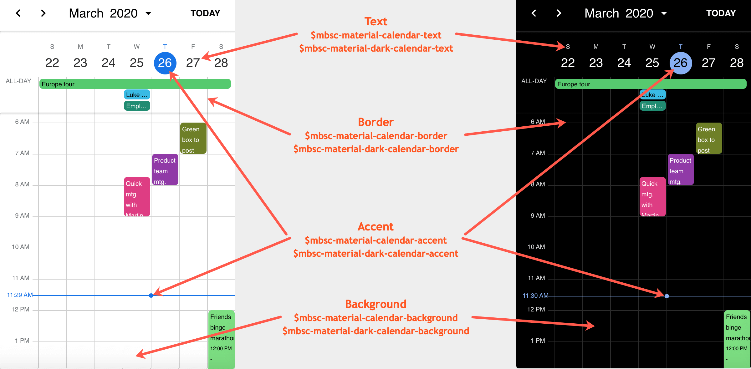
These variables are applied to all base themes: iOS, material, windows and mobiscroll.
They all come in pairs. One for the light and one for the dark variant in each theme.
| Variable name | Description |
|---|---|
| $mbsc-calendar-background-light | Sets the background color of the Eventcalendar |
| $mbsc-calendar-background-dark | |
| $mbsc-calendar-text-light | Sets the text color of the Eventcalendar |
| $mbsc-calendar-text-dark | |
| $mbsc-calendar-accent-light | Sets the accent color of the Eventcalendar |
| $mbsc-calendar-accent-dark | |
| $mbsc-calendar-border-light | Sets the color of the border |
| $mbsc-calendar-border-dark | |
| $mbsc-calendar-mark-light | Sets the default color of the mark on marked days |
| $mbsc-calendar-mark-dark |
If you really want to get sophisticated or if a color doesn't look good on a specific theme and you want to overwrite it, you can fine tune all of the above variables individually for each theme. Below are the complete list of variables broken down to themes:
iOS theme
| Variable name | Default value | Description |
|---|---|---|
| $mbsc-ios-calendar-background | #f7f7f7 | The Eventcalendar background color |
| $mbsc-ios-calendar-text | #000000 | The Eventcalendar text color |
| $mbsc-ios-calendar-accent | #007bff | The Eventcalendar accent color |
| $mbsc-ios-calendar-border | #cccccc | Sets the color of the border |
| $mbsc-ios-calendar-mark | #cccccc | Sets the default color of the mark on marked days |
iOS Dark theme
| $mbsc-ios-dark-calendar-background | ##000000 | The Eventcalendar background color |
| $mbsc-ios-dark-calendar-text | #ffffff | The Eventcalendar text color |
| $mbsc-ios-dark-calendar-accent | #ff8400 | The Eventcalendar accent color |
| $mbsc-ios-dark-calendar-border | #333333 | Sets the color of the border |
| $mbsc-ios-dark-calendar-mark | #333333 | Sets the default color of the mark on marked days |
Calendar view
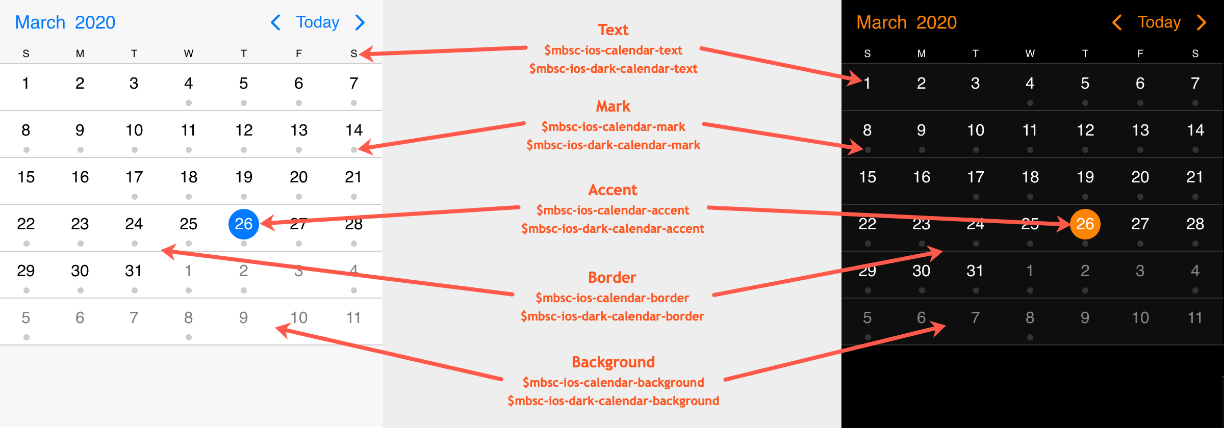
Agenda view
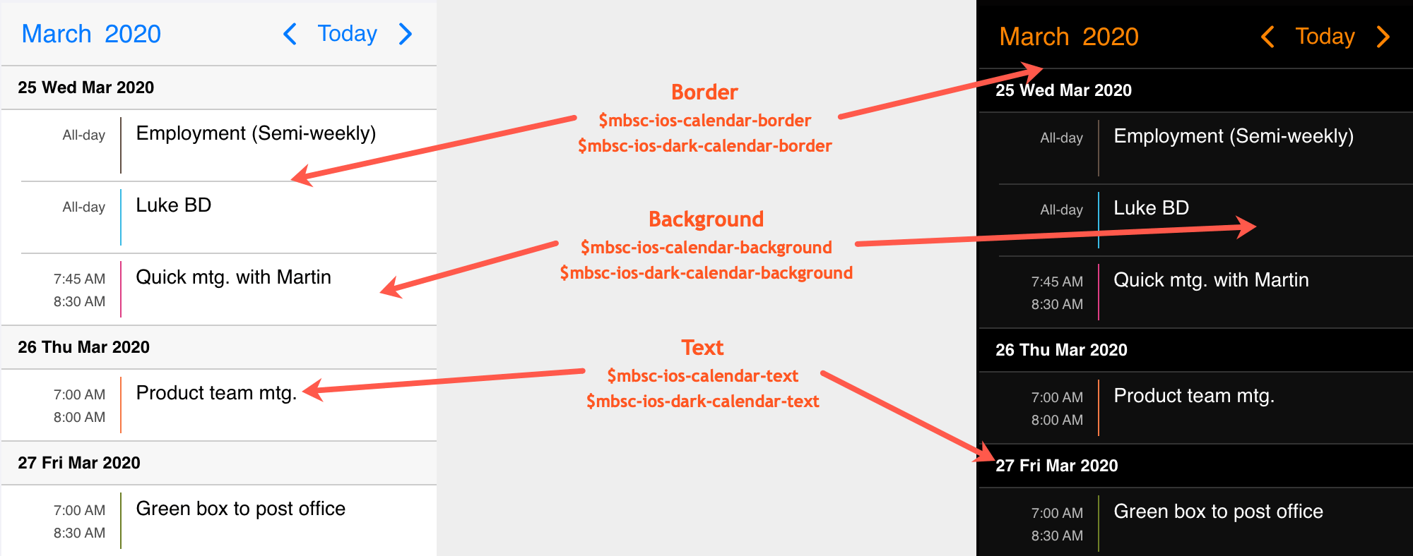
Schedule view
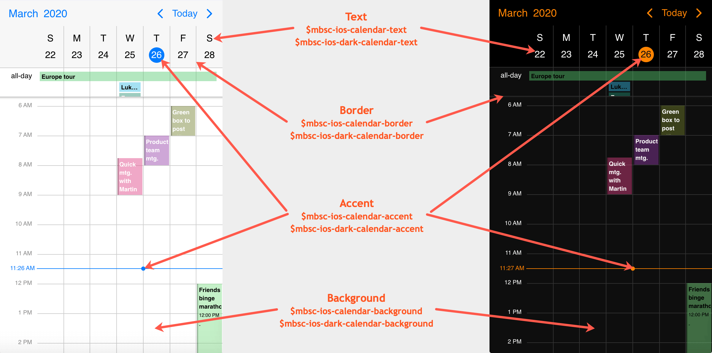
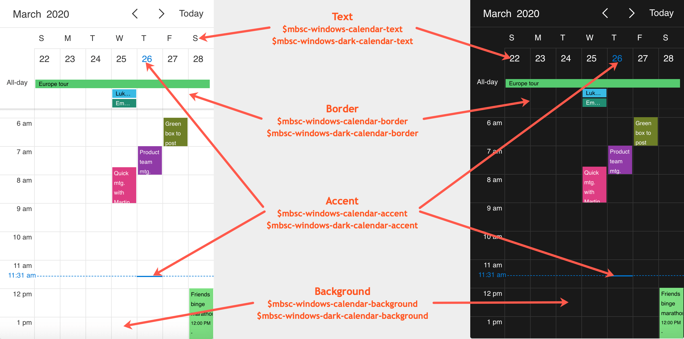
Windows theme
| Variable name | Default value | Description |
|---|---|---|
| $mbsc-windows-calendar-background | #ffffff | The Eventcalendar background color |
| $mbsc-windows-calendar-text | #333333 | The Eventcalendar text color |
| $mbsc-windows-calendar-accent | #0078d7 | The Eventcalendar accent color |
| $mbsc-windows-calendar-border | #e6e6e6 | Sets the color of the border |
| $mbsc-windows-calendar-mark | rgba(51, 51, 51, 0.5); | Sets the default color of the mark on marked days |
Windows Dark theme
| Variable name | Default value | Description |
|---|---|---|
| $mbsc-windows-dark-calendar-background | #1a1a1a | The Eventcalendar background color |
| $mbsc-windows-dark-calendar-text | #ffffff | The Eventcalendar text color |
| $mbsc-windows-dark-calendar-accent | #0078d7 | The Eventcalendar accent color |
| $mbsc-windows-dark-calendar-border | #343434 | Sets the color of the border |
| $mbsc-windows-dark-calendar-mark | rgba(255, 255, 255, 0.5); | Sets the default color of the mark on marked days |
Calendar view

Agenda view
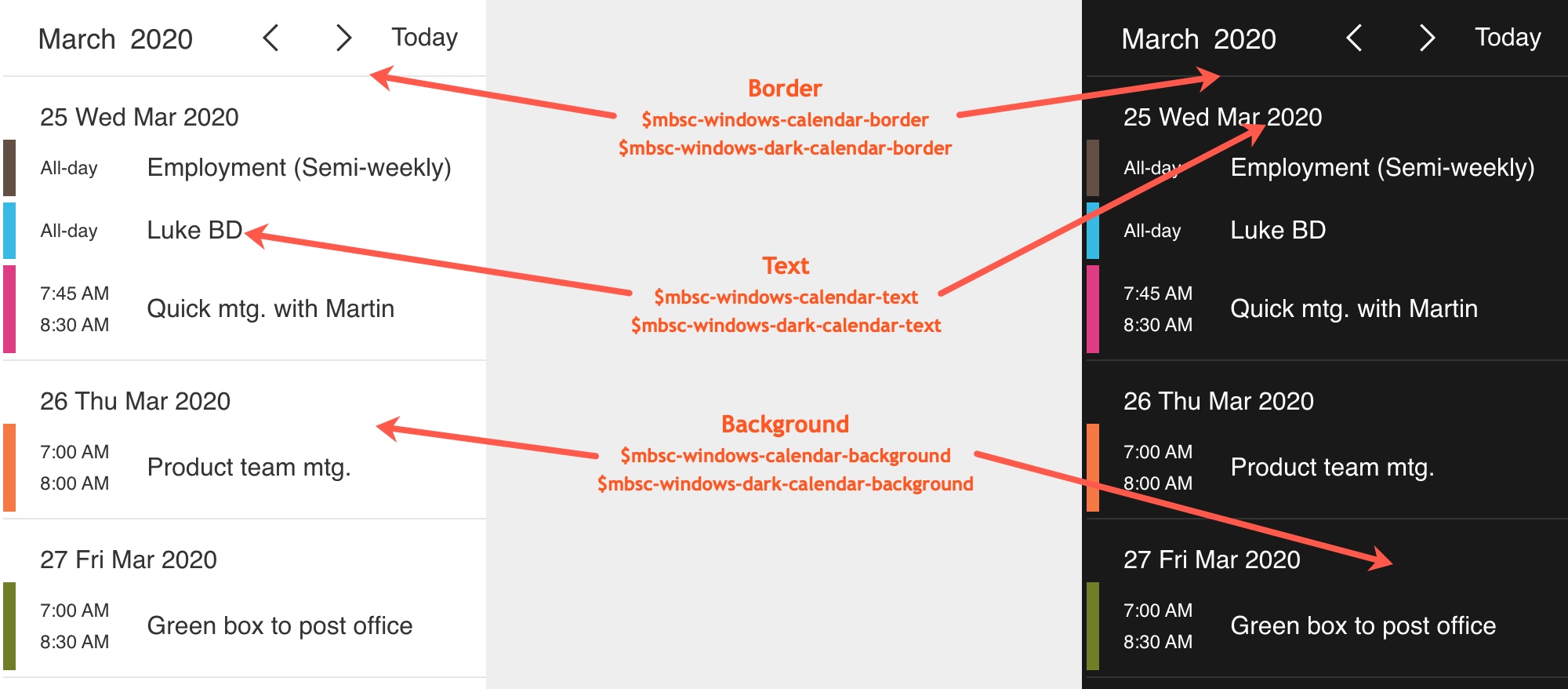
Schedule view
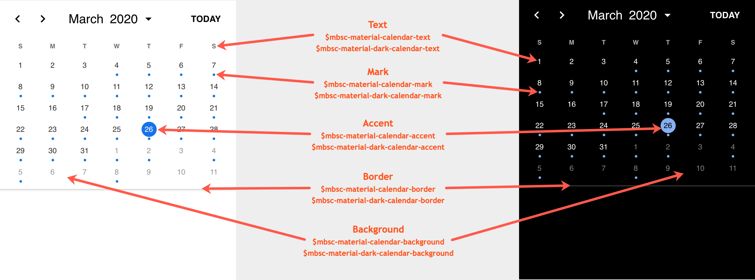
Material theme
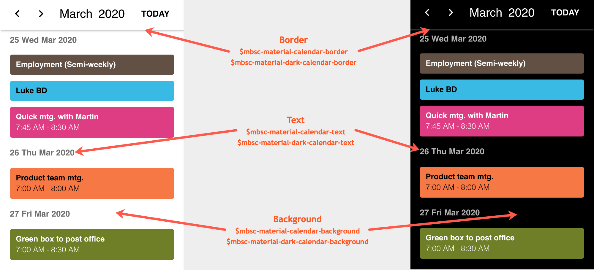
| Variable name | Default value | Description |
|---|---|---|
| $mbsc-material-calendar-background | #ffffff | The Eventcalendar background color |
| $mbsc-material-calendar-text | #303030 | The Eventcalendar text color |
| $mbsc-material-calendar-accent | #1a73e8 | The Eventcalendar accent color |
| $mbsc-material-calendar-border | #cfcfcf | Sets the color of the border |
| $mbsc-material-calendar-mark | ##1a73e8 | Sets the default color of the mark on marked days |
Material Dark theme
| Variable name | Default value | Description |
|---|---|---|
| $mbsc-material-dark-calendar-background | #000000 | The Eventcalendar background color |
| $mbsc-material-dark-calendar-text | #ffffff | The Eventcalendar text color |
| $mbsc-material-dark-calendar-accent | #87b0f3 | The Eventcalendar accent color |
| $mbsc-material-dark-calendar-border | #2b2b2b | Sets the color of the border |
| $mbsc-material-dark-calendar-mark | #87b0f3 | Sets the default color of the mark on marked days |
Calendar view
Agenda view
Schedule view
