Customizing the Look and Feel
Introduction
Mobiscroll components are shipped with a ready-to-use, carefully crafted design, with the ability to adapt to the platform where they are being used. The available themes are:
iosandios-dark- theme matching the iOS platform look & feelmaterialandmaterial-dark- theme matching the Material Design specificationwindowsandwindows-dark- theme matching the Universal Windows platform look & feel
The Mobiscroll package is shipped with a pre-built css file, once it's added to your project, the bundled themes can be used right away. The packages also contain scss files, for theme customizations and tree shaking solutions.
While the provided pre-built themes are enough in many use cases, most of the times on top of adapting to a specific platform, you'd also like to match a brand or color scheme. Mobiscroll provides various ways to achieve this:
- Override the Sass color variables - the straightforward way to change the colors in one place throughout the application.
- Create custom themes using Sass - use this, if you need multiple themes with different color variatons, in case you have pages with different colors, or you'd like to users to customize the colors of your app.
- Create custom themes using the theme builder - the custom themes can be also built using out theme builder, on a graphical user interface, without any coding, or the need for Sass support in your project.
To work with the first two methods, you need to have Sass support configured for your project.
If you're not using the tools above, you can use any existing Sass tooling to compile the scss file into css (such as gulp-sass or grunt-sass).
The simplest approach is to use the node-sass CLI - you simply run:
$ node-sass src/my-theme.scss dist/my-theme.css
Once Sass support is set up, instead of the pre-built css file, you need to import the provided scss file.
If using the mobiscroll npm package:
@import "~@mobiscroll/jquery/dist/css/mobiscroll.scss"@import "./path/to/mobiscroll/css/mobiscroll.scss"Tree Shaking for styles
Tree shaking is a term commonly used in web development and particularly in JavaScript for unused code removal. Since websites are served (mostly) over the network, loading times depend on content size, so minification and unused content elimination plays a major role in making webapps fluid.
For the JavaScript part, popular frameworks already have the treeshaking built in, so the components that are not used will be left out from the built project.
Eliminating unused styles
In case of the styles, leaving out the unused rules is not as straight forward.
The overarching idea is that CSS selectors match elements in the DOM, and those elements in the DOM come from all sorts of places:
your static templates, dynamic templates based on server-side state, and of course, JavaScript, which can manipulate the DOM in
any way at all, including pull things from APIs and third parties.
Sass variables to the rescue
The Mobiscroll Library comes with a modular SASS bundle, that can be configured which component styles and which themes to leave in and out for the compiled css file.
Every component and theme has a SASS variable that can be turned on or off. If the variable is falsy the styles that it needs will not be added to the bundle.
// include the ios theme
$mbsc-ios-theme: true;

// include the components:
$mbsc-datepicker: true;
$mbsc-eventcalendar: true;

@import "@mobiscroll/jquery/dist/css/mobiscroll.modular.scss"
In the above example the styles needed for the eventcalendar and datepicker will be included and only for the ios theme. All other components (like select or grid-layout) and all other themes will be left out from the bundle.
Here's the complete list of the components and themes that can be used:
$mbsc-datepicker$mbsc-eventcalendar$mbsc-forms$mbsc-grid-layout$mbsc-popup$mbsc-select
$mbsc-ios-theme$mbsc-material-theme$mbsc-windows-theme
For example if you don't want to include the form components (input, button, segmented, etc...), but you are using the select component, the styles for the mobiscroll buttons, will still be in, because of the dependency.
Override the Sass Color Variables
A convenient way to customize the colors of the Mobiscroll components is to override the Sass color variables.
Let's say your branding uses a nice red accent color, and you'd like that color to appear on the Mobiscroll components as well,
while still using platform specific themes (e.g. ios on iOS devices, material on Android devices, and mobiscroll on desktop).
You can override the accent color for every theme:
$mbsc-ios-accent: #e61d2a;
$mbsc-material-accent: #e61d2a;
$mbsc-mobiscroll-accent: #e61d2a;

@import "~@mobiscroll/jquery/dist/css/mobiscroll.jquery.scss"
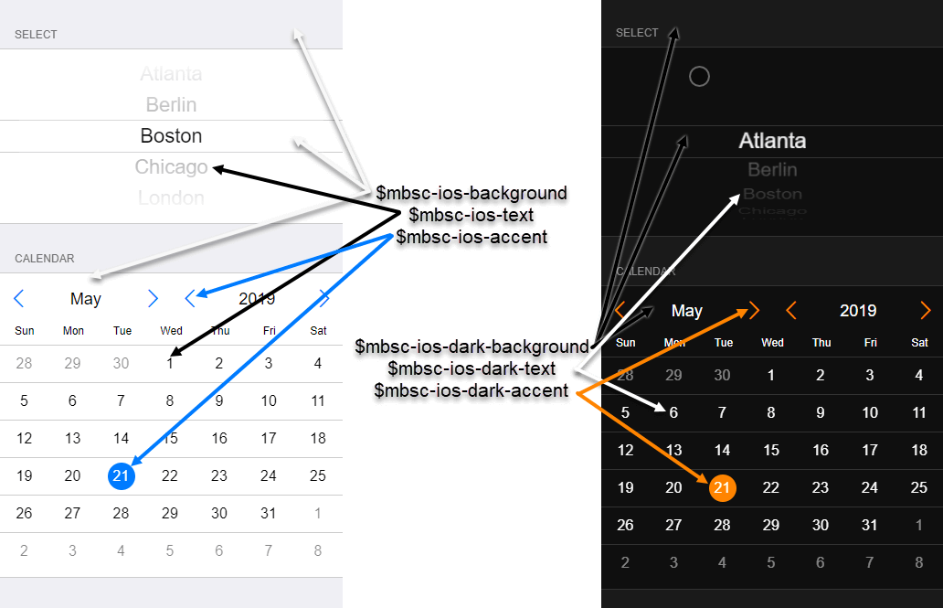
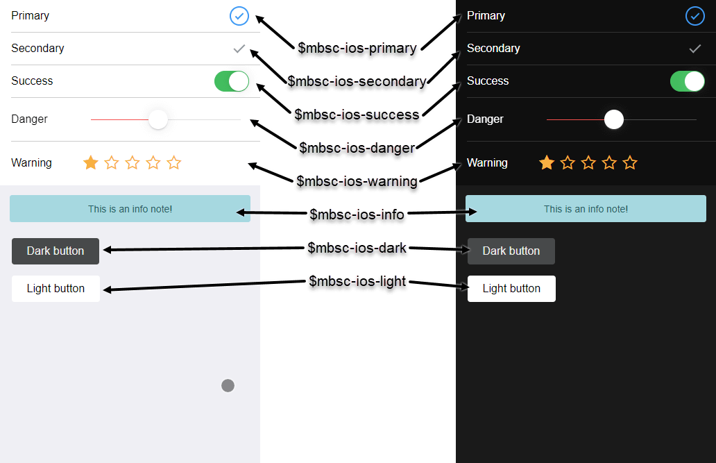
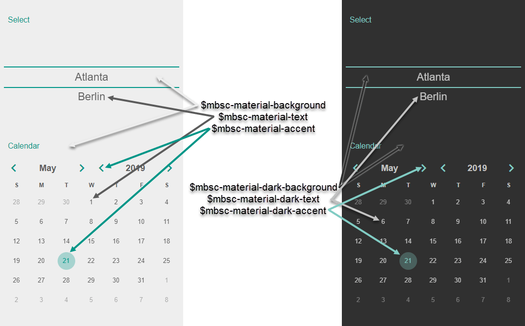
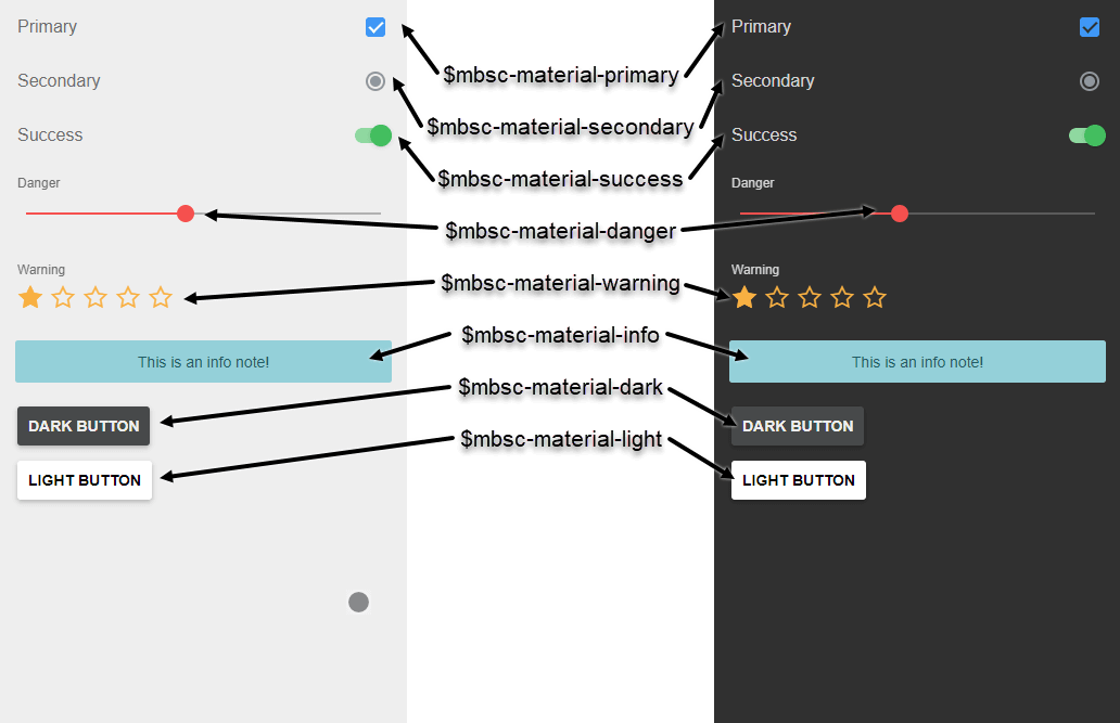
Of course you can customize more than just the accent, like background, text, primary, secondary colors, etc. Here's the complete list of the Sass variables being used:
iOS Theme
| Variable name | Default value | Description |
|---|---|---|
| $mbsc-ios-accent | #007bff | Accent color |
| $mbsc-ios-background | #f7f7f7 | Background color |
| $mbsc-ios-text | #000000 | Text color |
| $mbsc-ios-dark-accent | #ff8400 | Accent color for dark version |
| $mbsc-ios-dark-background | #000000 | Background color for dark version |
| $mbsc-ios-dark-text | #ffffff | Text color for dark version |
|
||
| Variable name | Default value | Description |
| $mbsc-ios-primary | #3f97f6 | Primary color |
| $mbsc-ios-secondary | #90979E | Secondary color |
| $mbsc-ios-success | #43BE5F | Success color |
| $mbsc-ios-danger | #f5504e | Danger color |
| $mbsc-ios-warning | #f8b042 | Warning color |
| $mbsc-ios-info | #5BB7C5 | Info color |
| $mbsc-ios-light | #ffffff | Light color |
| $mbsc-ios-dark | #47494A | Dark color |
|
||
Material Theme
| Variable name | Default value | Description |
|---|---|---|
| $mbsc-material-accent | #009688 | Accent color |
| $mbsc-material-background | #eeeeee | Background color |
| $mbsc-material-text | #5b5b5b | Text color |
| $mbsc-material-dark-accent | #81ccc4 | Accent color for dark version |
| $mbsc-material-dark-background | #303030 | Background color for dark version |
| $mbsc-material-dark-text | #c2c2c2 | Text color for dark version |
|
||
| Variable name | Default value | Description |
| $mbsc-material-primary | #3f97f6 | Primary color |
| $mbsc-material-secondary | #90979E | Secondary color |
| $mbsc-material-success | #43BE5F | Success color |
| $mbsc-material-danger | #f5504e | Danger color |
| $mbsc-material-warning | #f8b042 | Warning color |
| $mbsc-material-info | #5BB7C5 | Info color |
| $mbsc-material-light | #ffffff | Light color |
| $mbsc-material-dark | #47494A | Dark color |
|
||
Mobiscroll Theme
| Variable name | Default value | Description |
|---|---|---|
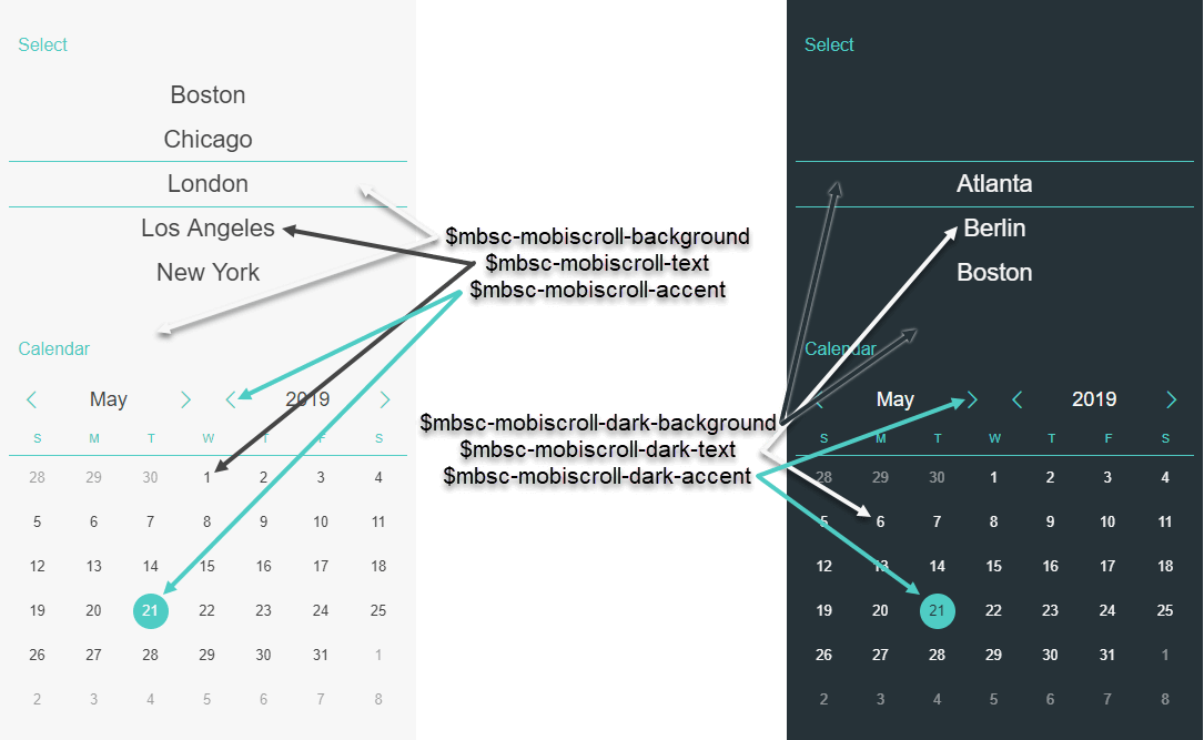
| $mbsc-mobiscroll-accent | #4eccc4 | Accent color |
| $mbsc-mobiscroll-background | #f7f7f7 | Background color |
| $mbsc-mobiscroll-text | #454545 | Text color |
| $mbsc-mobiscroll-dark-accent | #4fccc4 | Accent color for dark version |
| $mbsc-mobiscroll-dark-background | #263238 | Background color for dark version |
| $mbsc-mobiscroll-dark-text | #f7f7f7 | Text color for dark version |
|
||
| Variable name | Default value | Description |
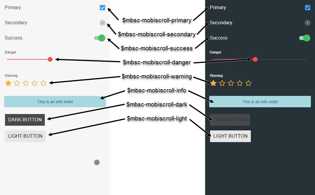
| $mbsc-mobiscroll-primary | #3f97f6 | Primary color |
| $mbsc-mobiscroll-secondary | #90979E | Secondary color |
| $mbsc-mobiscroll-success | #43BE5F | Success color |
| $mbsc-mobiscroll-danger | #f5504e | Danger color |
| $mbsc-mobiscroll-warning | #f8b042 | Warning color |
| $mbsc-mobiscroll-info | #5BB7C5 | Info color |
| $mbsc-mobiscroll-light | #ffffff | Light color |
| $mbsc-mobiscroll-dark | #47494A | Dark color |
|
||
Windows Theme
| Variable name | Default value | Description |
|---|---|---|
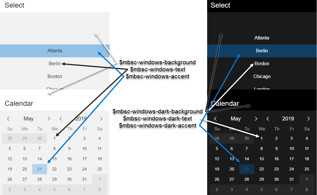
| $mbsc-windows-accent | #0078d7 | Accent color |
| $mbsc-windows-background | #f2f2f2 | Background color |
| $mbsc-windows-text | #262626 | Text color |
| $mbsc-windows-dark-accent | #0078d7 | Accent color for dark version |
| $mbsc-windows-dark-background | #1a1a1a | Background color for dark version |
| $mbsc-windows-dark-text | #ffffff | Text color for dark version |
|
||
| Variable name | Default value | Description |
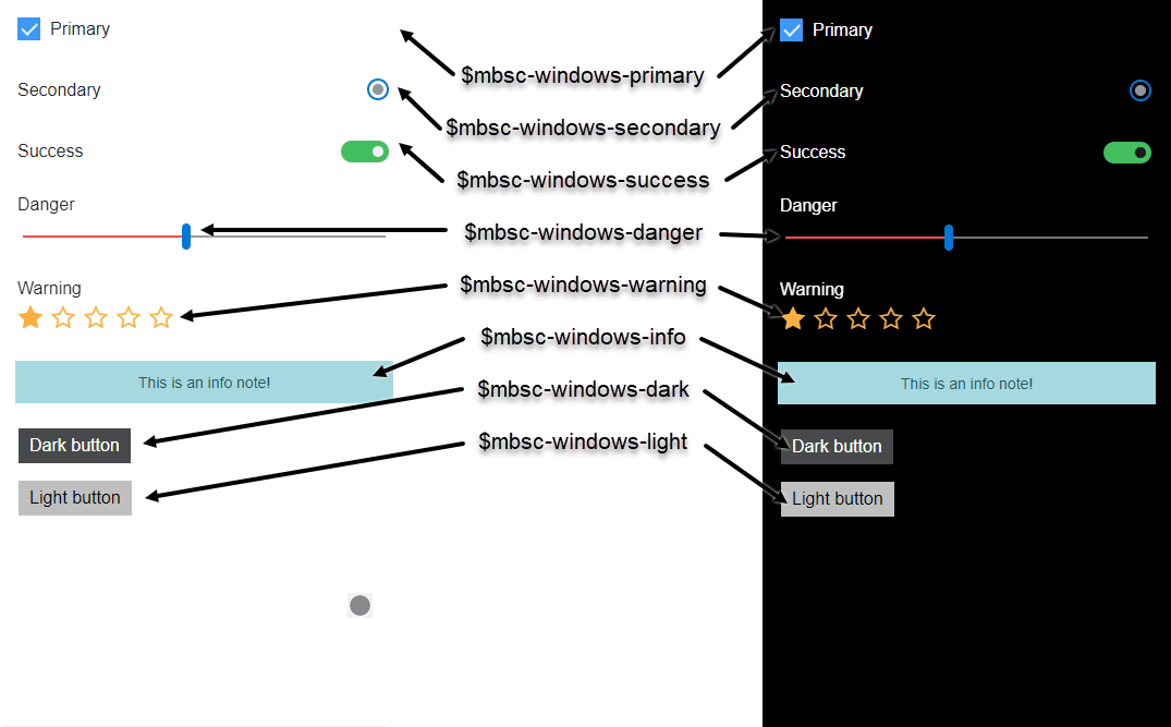
| $mbsc-windows-primary | #3f97f6 | Primary color |
| $mbsc-windows-secondary | #90979E | Secondary color |
| $mbsc-windows-success | #43BE5F | Success color |
| $mbsc-windows-danger | #f5504e | Danger color |
| $mbsc-windows-warning | #f8b042 | Warning color |
| $mbsc-windows-info | #5BB7C5 | Info color |
| $mbsc-windows-light | #ffffff | Light color |
| $mbsc-windows-dark | #47494A | Dark color |
|
||
Create Custom Themes Using Sass
If you'd like to use multiple color variations for the Mobiscroll components, the solution is to create one or more custom themes. A custom theme is a variation of one of the built in themes, referred as the base theme.
To create a custom theme using Sass, you can use the provided mbsc-custom-theme function,
which can be called after the mobiscroll scss file has been imported:
@import "~@mobiscroll/jquery/dist/css/mobiscroll.scss"
$colors-ios-custom: (
    button: #6D8764,
    accent: #6D8764,
    background: #F7F7F7,
    text: #000000
);
@include mbsc-custom-theme('ios-custom', 'ios', $colors-ios-custom);
| Function name | Description |
|---|---|
| mbsc-custom-theme($theme-name, $base-theme-name, $colors) |
A function which creates the styling for a custom theme, with the specified colors
Parameters
|
Before you can use the custom theme, you will also need to register it in your javascript / typescript code. This can be done after the mobiscroll resources has been loaded, but before using any of the components. Make sure to use the same name which was specified to the Sass function, and specify the same base theme as second parameter.
mobiscroll.createCustomTheme('ios-custom', 'ios');
You can now specify the newly created theme to any Mobiscroll component using the theme setting:
$('#my-calendar').mobiscroll().eventcalendar({
    theme: 'ios-custom'
}
Create Custom Themes Using the Theme Builder
If Sass support is not available in your project, or you prefer a visual theme editor, you can use our theme builder to create custom themes.
The theme builder is very easy to use, no coding is needed, you just choose the colors, and save the custom theme. Using our download builder you can select one or more custom themes to include in the package.
You can find more information on the theme builder features and usage here.
Custom Themes with Light and Dark variants
To use custom themes together with the themeVariant option (which controls whether the light or dark variant of a theme will be used),
make sure to create two custom themes, where the dark version has the same name as the light one, suffixed with '-dark',
e.g.: 'my-theme' and 'my-theme-dark'.
How to use custom themes with NPM packagess
Starting from version 4.7.0 the NPM packages are shipped with SCSS mixins which makes it possible to create custom themes programmatically. To create a custom theme, make sure to load the SCSS file from the NPM package. After that you can create a custom theme like this:
@include mbsc-custom-theme('ios-custom', 'ios', ('button': #6D8764, 'background': #f7f7f7, 'text': #000000, 'accent': #6D8764));Custom themes needs to be registered in the javascript / typescript code as well, once the Mobiscroll modules are loaded:
mobiscroll.createCustomTheme('ios-custom', 'ios');