Dropdown
The dropdown component uses the HTML select element and adds custom styling and additional functionality.
The following example will create a simple dropdown with a label.
<Dropdown label="Choose one">
  <option value="1">Option 1</option>
  <option value="2">Option 2</option>
  <option value="3">Option 3</option>
</Dropdown>
Value binding
Controlled component
The dropdown can be used as a controlled component by providing the value and the onChange props.
const App = () => {
    const [selectValue, setSelectValue] = useState();

    return <Dropdown label="Choose one" value={selectValue} onChange={setSelectValue}>
      <option value="" />
      <option value="1">Option 1</option>
      <option value="2">Option 2</option>
      <option value="3">Option 3</option>
    </Dropdown>;
}
Uncontrolled component
When using the Dropdown as an uncontrolled component, a ref prop can be used to have a reference to the component where you can access the underlying selectNode
const App = () => {
    const myRef = useRef(null);
    const saveChanges = () => {
        const select = myRef.current.selectNode;
        console.log(select.options[select.selectedIndex].value); // get the selected value
    };

    return <div className="App">
        <Dropdown ref={myRef} label="Choose one">
          <option value="1">Option 1</option>
          <option value="2">Option 2</option>
          <option value="3">Option 3</option>
        </Dropdown>
        <Button onClick={saveChanges}>Save the changes</Button>
    </div>;
}
For many more examples - simple and complex use-cases - check out the select demos for react.
Options
| Name | Type | Default value | Description |
|---|---|---|---|
| disabled | Boolean | false |
Initial disabled state of the component. This will take no effect in inline display mode. |
| endIcon | String | undefined |
Specify the icon name for the form components which will be displayed on the end of the component. Use startIcon option for specifying icon to the opposite side. |
| endIconSvg | String | undefined |
Specify the icon svg for the form components which will be displayed on the end of the component. Use startIconSvg option for specifying icon to the opposite side. |
| error | Boolean | undefined |
Controls the error state of the component. If true error styles will be displayed. |
| errorMessage | String | undefined |
Controls the error message of the component. If error option is set to true the error message will be displayed. |
| inputStyle | String | 'underline' |
Defines the input rendering mode. By default the input has the underline styling. Possible values:
|
| label | String | undefined |
Sets the label of component. |
| labelStyle | String | undefined |
Defines the position of the label. The default label style depends on the theme option.
With the 'ios' theme the inputs have inline labels, with 'mobiscroll', 'material' and 'windows' themes
the default label position is stacked. Possible values:
|
| onChange | Function | undefined |
An event handler that is called every time the input changes value. The event is passed as the first parameter and it's target checked property is set to the new value. Ex. |
| rtl | Boolean | false |
Right to left display. |
| startIcon | String | undefined |
Specify the icon name for the form component which will be displayed on the end of the component. Use endIcon option for specifying icon to the opposite side. |
| startIconSvg | String | undefined |
Specify the icon svg for the form component which will be displayed on the end of the component. Use endIconSvg option for specifying icon to the opposite side. |
| theme | String | undefined |
Sets the visual appearance of the component.
If it is
Make sure that the theme you set is included in the downloaded package.
|
| themeVariant | String | undefined |
Controls which variant of the theme will be used (light or dark). Possible values:
To use the option with custom themes, make sure to create two custom themes,
where the dark version has the same name as the light one, suffixed with |
Customizing the appearance
While the provided pre-built themes are enough in many use cases, most of the times on top of adapting to a specific platform, you'd also like to match a brand or color scheme. Mobiscroll provides various ways to achieve this:
- Create custom themes using the theme builder - the custom themes can be also built using out theme builder, on a graphical user interface, without any coding, or the need for Sass support in your project.
- Create custom themes using Sass - use this, if you need multiple themes with different color variatons, in case you have pages with different colors, or you'd like to users to customize the colors of your app.
- Override the Sass color variables - the straightforward way to change the colors in one place throughout the application.
Override the Sass Color Variables
A convenient way to customize the colors of the Mobiscroll components is to override the Sass color variables.
Let's say your branding uses a nice red accent color, and you'd like that color to appear on the Mobiscroll components as well,
while still using platform specific themes (e.g. ios on iOS devices, material on Android devices, and mobiscroll on desktop).
You can override the accent color for every theme:
$mbsc-ios-accent: #e61d2a;
$mbsc-material-accent: #e61d2a;
$mbsc-mobiscroll-accent: #e61d2a;

@import "~@mobiscroll/React/dist/css/mobiscroll.react.scss"
You can also customize the colors on many levels:
- Theme specific variables (ex.
$mbsc-material-background,$mbsc-ios-dark-text) are applied to all components in a theme. Complete list of variables here. - Component specific global variables (ex.
$mbsc-card-background-light,$mbsc-listview-text-dark) are applied to all themes for a specific component. - Component and theme specific variables (ex.
$mbsc-ios-dark-form-background,$mbsc-material-input-text) are applied to a specific theme and a specific component.
For many more examples - simple and complex use-cases - check out the select demos for react.
Dropdown theming
Global variables of the Dropdown, Input, Password and Textarea
| Variable name | Description |
|---|---|
| $mbsc-input-background-light | Sets the background color of the Dropdown, along with the Input, Password and Textarea fields. |
| $mbsc-input-background-dark | |
| $mbsc-input-text-light | Sets the text color of the Dropdown, along with the Input, Password and Textarea fields. |
| $mbsc-input-text-dark | |
| $mbsc-form-input-border-light | Sets the border color of the Dropdown, along with the Input, Password and Textarea fields. |
| $mbsc-form-input-border-dark | |
| $mbsc-input-accent-light | Sets the accent color of the Dropdown, along with the Input, Password and Textarea fields. |
| $mbsc-input-accent-dark | |
| $mbsc-form-error-light | Sets the error color of the Dropdown, along with the other form elements. |
| $mbsc-form-error-dark |
iOS theme
The following variables are specific to the iOS theme light variant:
| Variable name | Default value | Description |
|---|---|---|
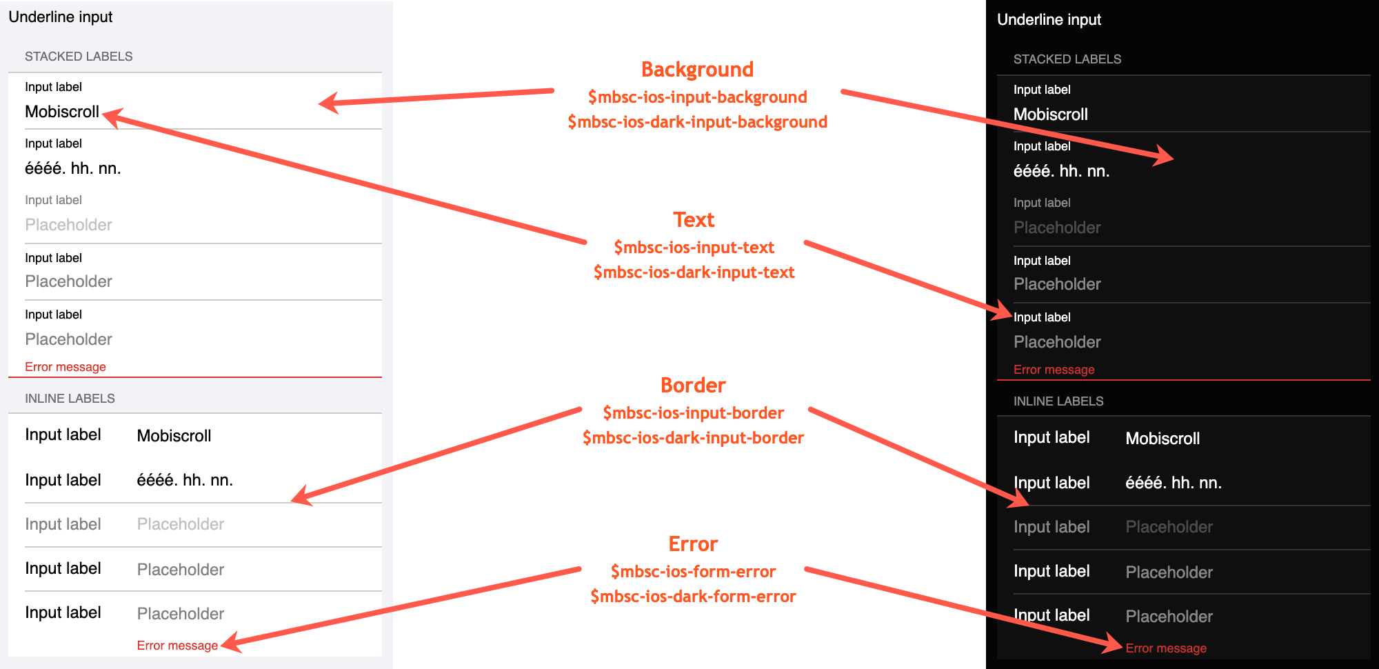
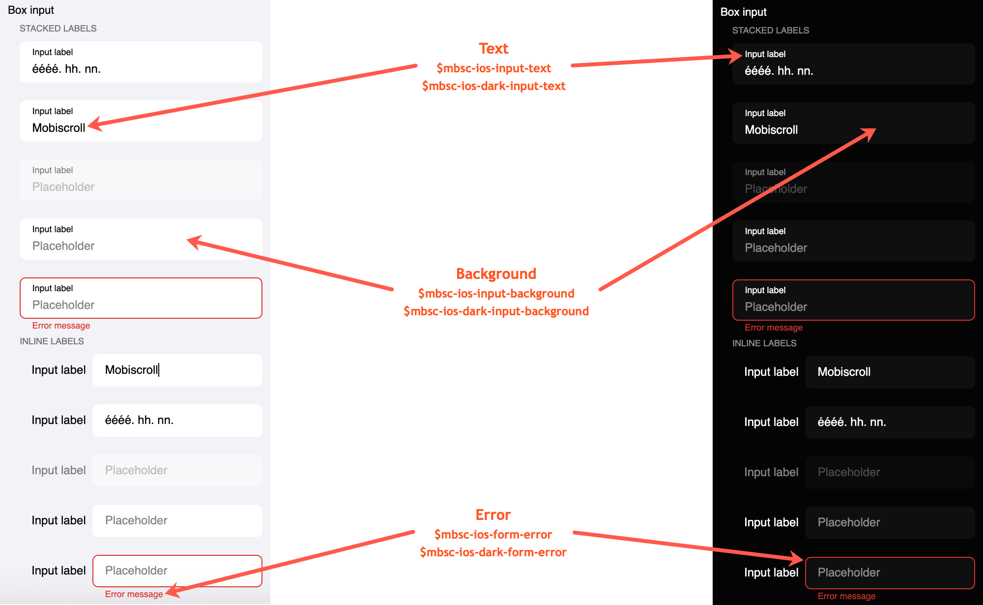
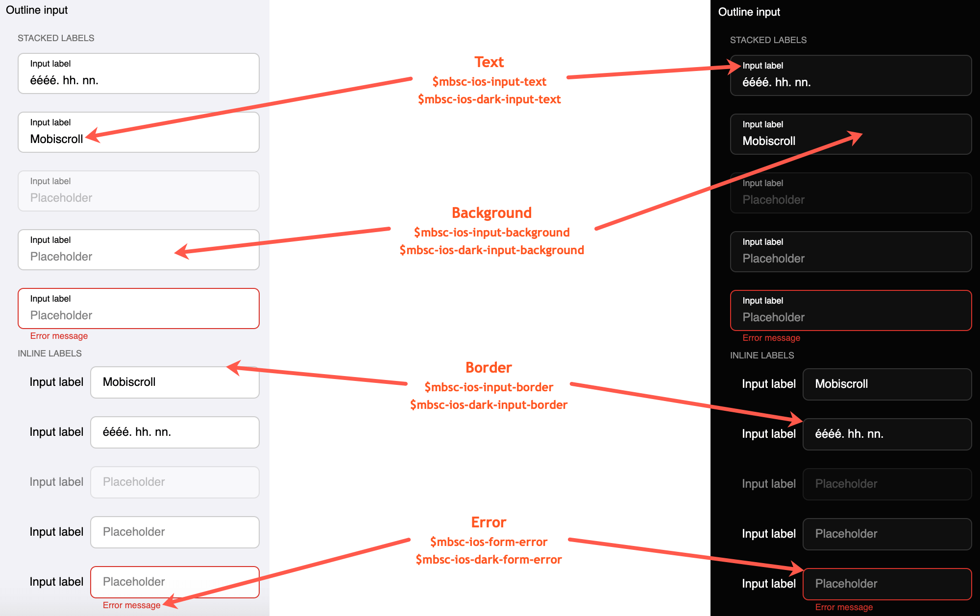
| $mbsc-ios-input-background | #ffffff | Sets the background color of the Dropdown, along with the Input, Password and Textarea fields. |
| $mbsc-ios-input-text | #000000 | Sets the text color of the Dropdown, along with the Input, Password and Textarea fields. |
| $mbsc-ios-input-border | #cccccc | Sets the border color of the Dropdown, along with the Input, Password and Textarea fields. |
| $mbsc-ios-form-error | #d8332a | Sets the error color of the Dropdown, along with the Input, Password and Textarea fields. |
iOS Dark theme
The following variables are specific to the iOS theme dark variant:
| Variable name | Default value | Description |
|---|---|---|
| $mbsc-ios-dark-input-background | #0f0f0f | Sets the background color of the Dropdown, along with the Input, Password and Textarea fields. |
| $mbsc-ios-dark-input-text | #ffffff | Sets the text color of the Dropdown, along with the Input, Password and Textarea fields. |
| $mbsc-ios-dark-input-border | #333333 | Sets the border color of the Dropdown, along with the Input, Password and Textarea fields. |
| $mbsc-ios-dark-form-error | #d8332a | Sets the error color of the Dropdown, along with the Input, Password and Textarea fields. |
Underline examples
Box examples
Outline examples
Windows theme
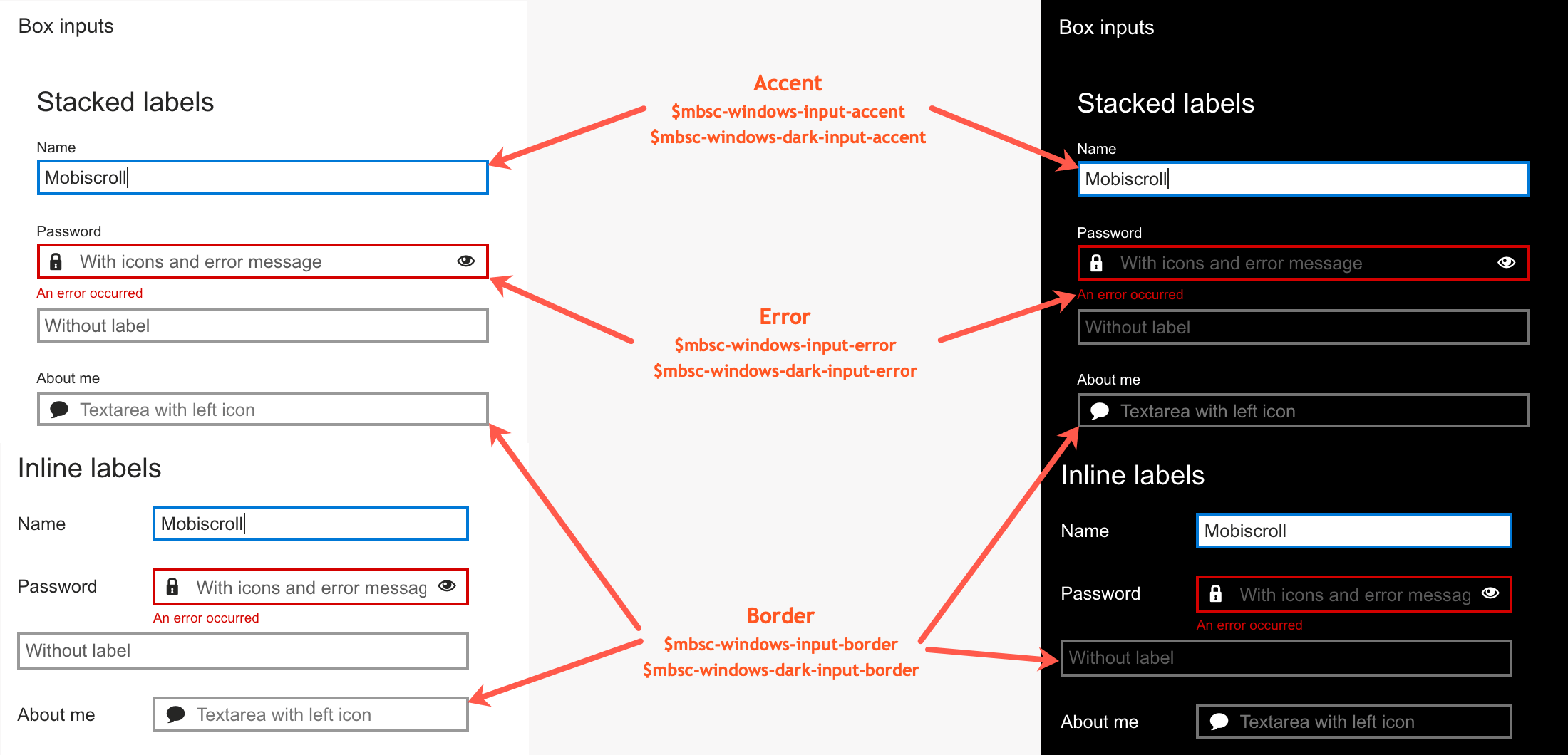
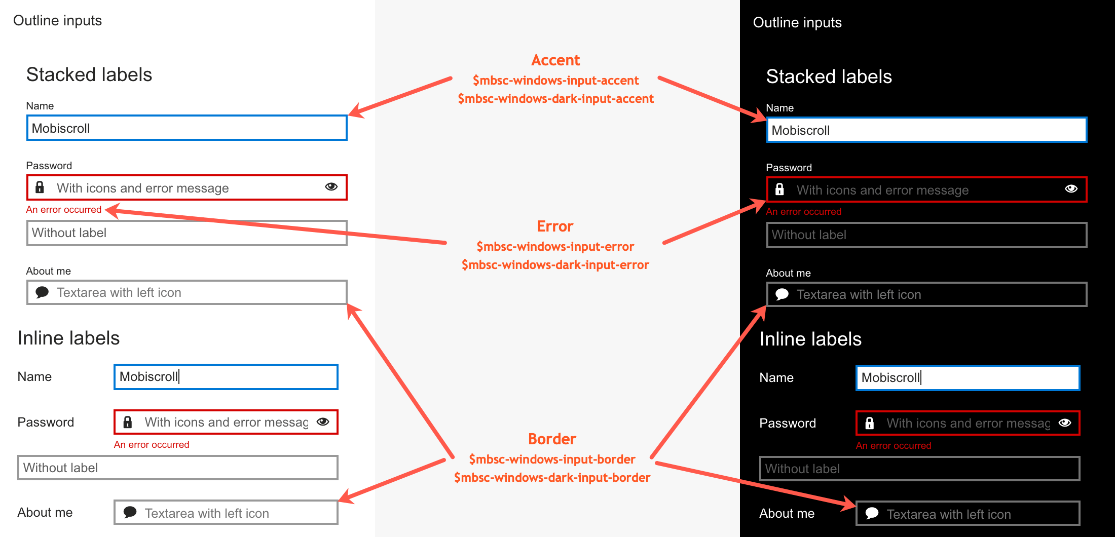
The following variables are specific to the Windows theme light variant:
| Variable name | Default value | Description |
|---|---|---|
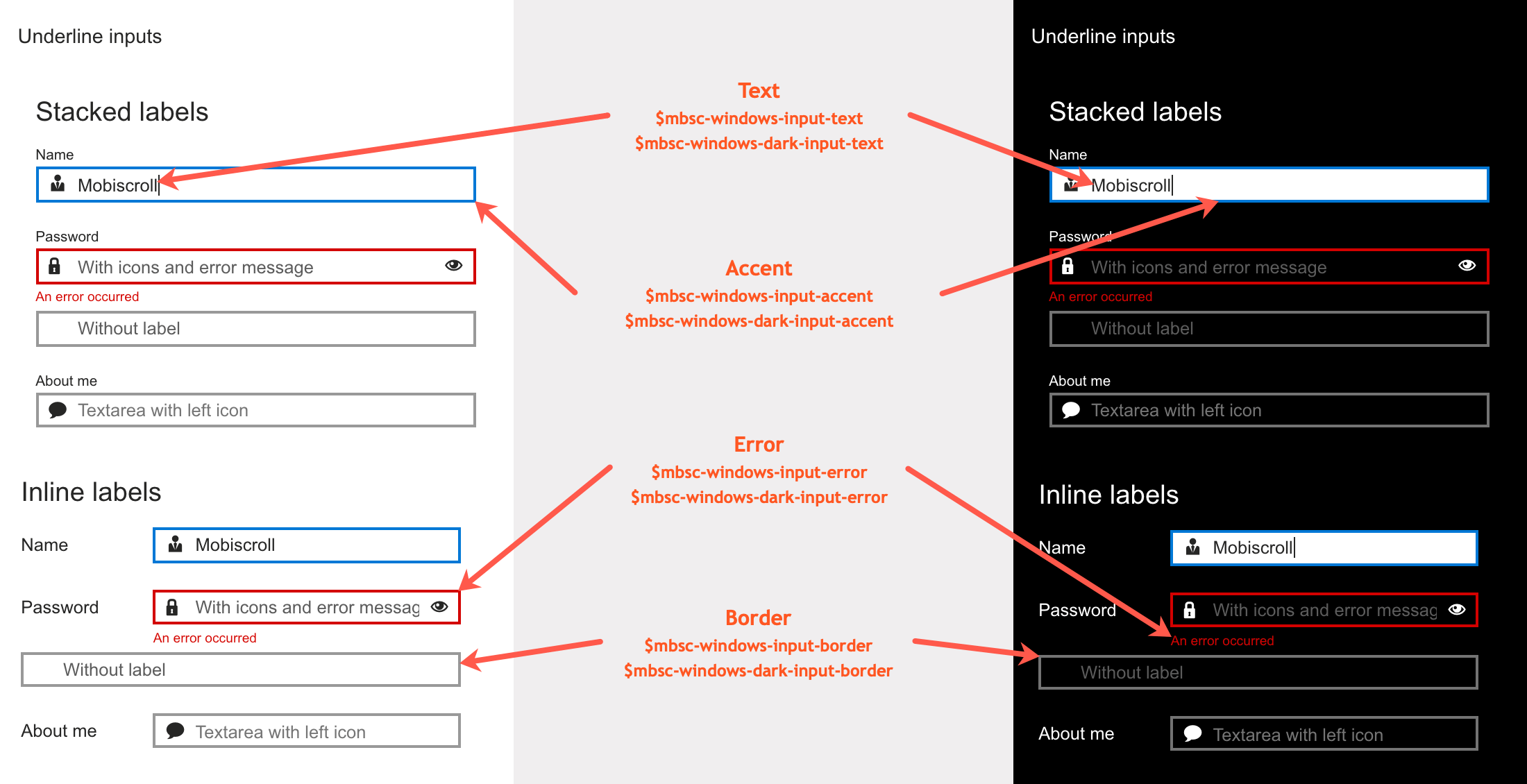
| $mbsc-windows-input-text | #262626 | Sets the text color of the Dropdown, along with the Input, Password and Textarea fields. |
| $mbsc-windows-input-border | #999999 | Sets the border color of the Dropdown, along with the Input, Password and Textarea fields. |
| $mbsc-windows-input-accent | #0078d7 | Sets the accent color of the Dropdown, along with the Input, Password and Textarea fields. |
| $mbsc-windows-form-error | #d30101 | Sets the error color of the Dropdown, along with the Input, Password and Textarea fields. |
Windows Dark theme
The following variables are specific to the Windows theme dark variant:
| Variable name | Default value | Description |
|---|---|---|
| $mbsc-windows-dark-input-text | #ffffff | Sets the text color of the Dropdown, along with the Input, Password and Textarea fields. |
| $mbsc-windows-dark-input-border | #737373 | Sets the border color of the Dropdown, along with the Input, Password and Textarea fields. |
| $mbsc-windows-dark-input-accent | #0078d7 | Sets the accent color of the Dropdown, along with the Input, Password and Textarea fields. |
| $mbsc-windows-dark-form-error | #d30101 | Sets the error color of the Dropdown, along with the Input, Password and Textarea fields. |
Underline examples
Box examples
Outline examples
Material theme
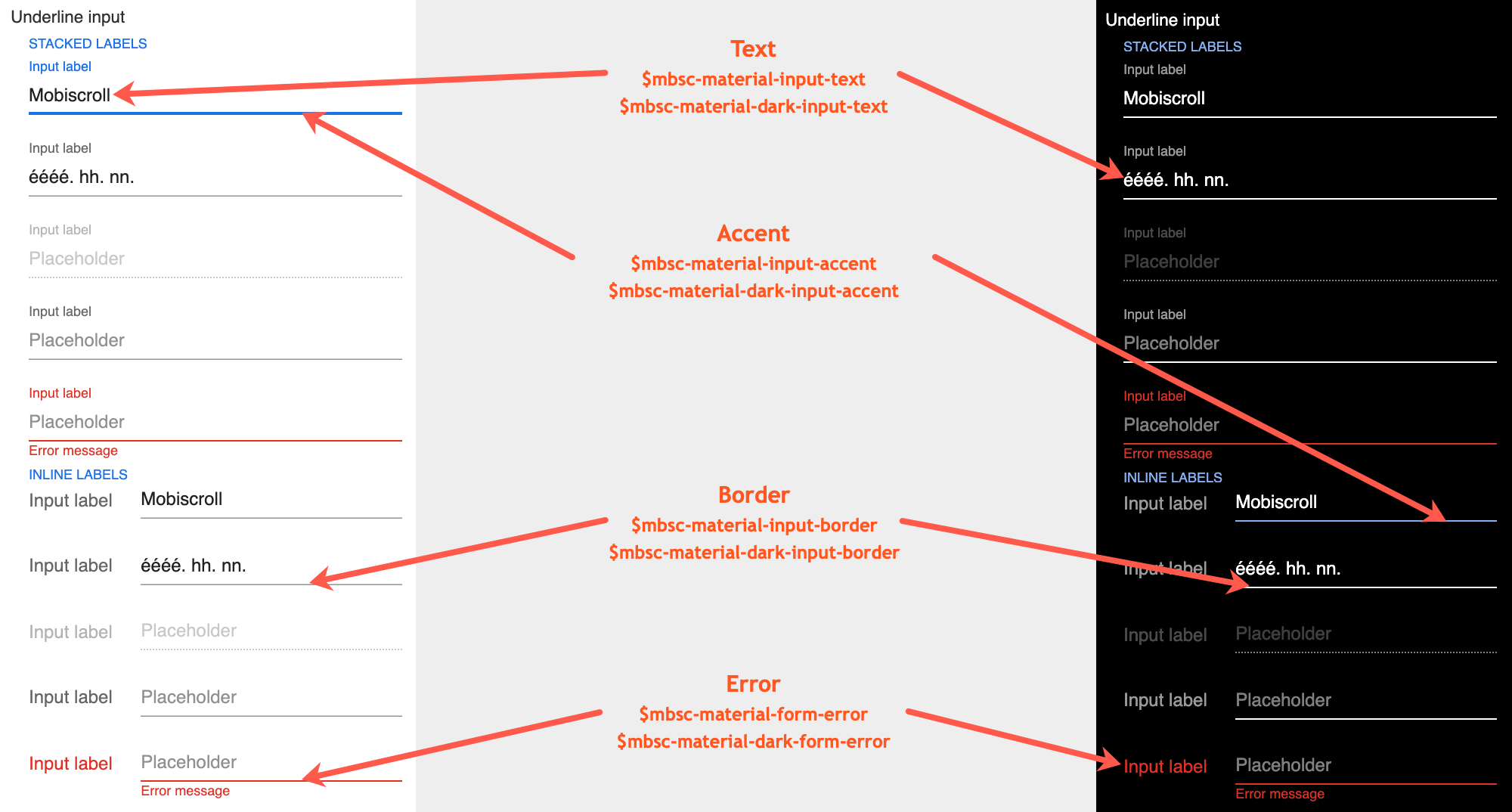
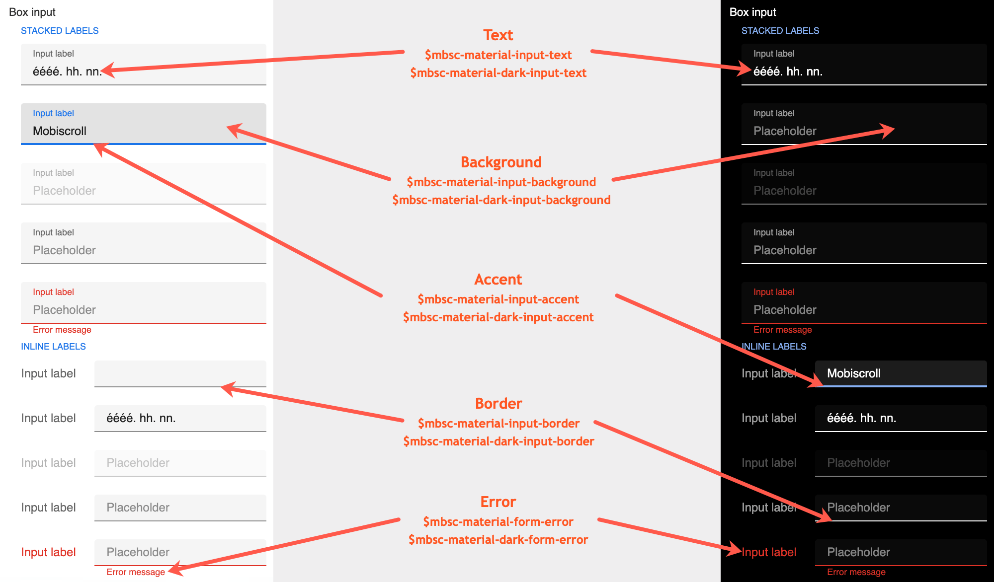
The following variables are specific to the Material theme light variant:
| Variable name | Default value | Description |
|---|---|---|
| $mbsc-material-input-background | #eeeeee | Sets the background color of the Dropdown, along with the Input, Password and Textarea fields. |
| $mbsc-material-input-text | #6d6d6d | Sets the text color of the Dropdown, along with the Input, Password and Textarea fields. |
| $mbsc-material-input-border | #6d6d6d | Sets the border color of the Dropdown, along with the Input, Password and Textarea fields. |
| $mbsc-material-input-accent | #009688 | Sets the accent color of the Dropdown, along with the Input, Password and Textarea fields. |
| $mbsc-material-form-error | #de3226 | Sets the error color of the Dropdown, along with the Input, Password and Textarea fields. |
Material Dark theme
The following variables are specific to the Material theme dark variant:
| Variable name | Default value | Description |
|---|---|---|
| $mbsc-material-dark-input-background | #303030 | Sets the background color of the Dropdown, along with the Input, Password and Textarea fields. |
| $mbsc-material-dark-input-text | #d4d4d4 | Sets the text color of the Dropdown, along with the Input, Password and Textarea fields. |
| $mbsc-material-dark-input-border | #d4d4d4 | Sets the border color of the Dropdown, along with the Input, Password and Textarea fields. |
| $mbsc-material-dark-input-accent | #81ccc4 | Sets the accent color of the Dropdown, along with the Input, Password and Textarea fields. |
| $mbsc-material-dark-form-error | #de3226 | Sets the error color of the Dropdown, along with the Input, Password and Textarea fields. |
Underline examples
Box examples
Outline examples
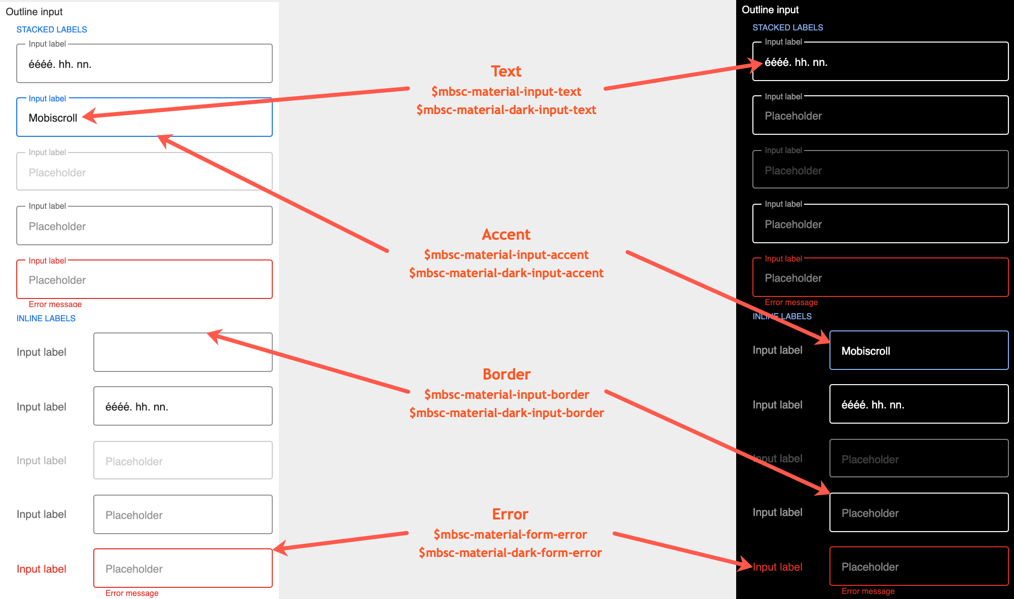
If you are looking for the generic Form variables, check out the tables here.