<mobiscroll.Dropdown />
<mobiscroll.Dropdown label="My select" value={myValue} onChange={myChange}>
    <option value="1">One</option>
    <option value="2">Two</option>
    <option value="3">Three</option>
</mobiscroll.Dropdown>
<mobiscroll.Dropdown value={myValue} onChange={myChange}>
    <option value="1">One</option>
    <option value="2">Two</option>
    <option value="3">Three</option>
</mobiscroll.Dropdown>
| Prop | Type | Description |
|---|---|---|
| disabled | PropTypes.bool | Disables the textfield when true. |
| errorMessage | PropTypes.string | Shown error message when the field is invalid. |
| icon | PropTypes.string |
Specify icon for the field. A font-icon name should be passed.
Icon alignment can be controlled with the iconAlign attribute. Icons can be displayed on both sides by passing a JSON string with left and right properties containing icon names,
e.g.: icon='{ "right": "plus", "left": "minus" }'.
You can build your custom icon set on our download page ("Choose Icon Set" section). See the full list of available icons here. The default icon pack contains the following icons: You can use the icons anywhere in your app using thembsc-ic mbsc-ic-{iconName} classes, e.g.:
|
| iconAlign | PropTypes.string |
Controls icon alignment. Icons can be displayed on both sides by passing a JSON string with left and right properties containing icon names,
e.g.: icon='{ "right": "plus", "left": "minus" }'.
|
| inputStyle | PropTypes.string | Defines the input rendering mode. Possible values: "underline", "box", "outline". |
| labelStyle | PropTypes.string | Defines the position of the label. Possible values: "stacked", "inline", "floating". |
| label | PropTypes.string | Shows a label for the dropdown. |
| name | PropTypes.string | Specify name attribute of the input. |
| valid | PropTypes.bool | Specify the valid state of the input. When false, the input will be styled as invalid. |
Icons
<mobiscroll.Dropdown icon="line-note" value={myValue} onChange={myChange}>
    <option value="1">One</option>
    <option value="2">Two</option>
    <option value="3">Three</option>
</mobiscroll.Dropdown>
<mobiscroll.Dropdown icon="line-note" iconAlign="right" value={myValue} onChange={myChange}>
    <option value="1">One</option>
    <option value="2">Two</option>
    <option value="3">Three</option>
</mobiscroll.Dropdown>
Input style
This attribute can be used for customizing your form input rendering.
<mobiscroll.Dropdown inputStyle="underline" label="My select" value={myValue} onChange={myChange}>
    <option value="1">One</option>
    <option value="2">Two</option>
    <option value="3">Three</option>
</mobiscroll.Dropdown>
<mobiscroll.Dropdown inputStyle="box" label="My select" value={myValue} onChange={myChange}>
    <option value="1">One</option>
    <option value="2">Two</option>
    <option value="3">Three</option>
</mobiscroll.Dropdown>
<mobiscroll.Dropdown inputStyle="outline" label="My select" value={myValue} onChange={myChange}>
    <option value="1">One</option>
    <option value="2">Two</option>
    <option value="3">Three</option>
</mobiscroll.Dropdown>
Label style
With this attribute you can define the position of the label.
<mobiscroll.Dropdown labelStyle="stacked" label="My select" value={myValue} onChange={myChange}>
    <option value="1">One</option>
    <option value="2">Two</option>
    <option value="3">Three</option>
</mobiscroll.Dropdown>
<mobiscroll.Dropdown labelStyle="inline" label="My select" value={myValue} onChange={myChange}>
    <option value="1">One</option>
    <option value="2">Two</option>
    <option value="3">Three</option>
</mobiscroll.Dropdown>
<mobiscroll.Dropdown labelStyle="floating" label="My select" value={myValue} onChange={myChange}>
    <option value="1">One</option>
    <option value="2">Two</option>
    <option value="3">Three</option>
</mobiscroll.Dropdown>
For many more examples - simple and complex use-cases - check out the select demos for react.
Dropdown theming
Global variables of the Dropdown, Input, Password and Textarea
| Variable name | Description |
|---|---|
| $mbsc-input-background-light | Sets the background color of the Dropdown, along with the Input, Password and Textarea fields. |
| $mbsc-input-background-dark | |
| $mbsc-input-text-light | Sets the text color of the Dropdown, along with the Input, Password and Textarea fields. |
| $mbsc-input-text-dark | |
| $mbsc-form-input-border-light | Sets the border color of the Dropdown, along with the Input, Password and Textarea fields. |
| $mbsc-form-input-border-dark | |
| $mbsc-input-accent-light | Sets the accent color of the Dropdown, along with the Input, Password and Textarea fields. |
| $mbsc-input-accent-dark | |
| $mbsc-input-error-light | Sets the error color of the Dropdown, along with the Input, Password and Textarea fields. |
| $mbsc-input-error-dark |
iOS theme
The following variables are specific to the iOS theme light variant:
| Variable name | Default value | Description |
|---|---|---|
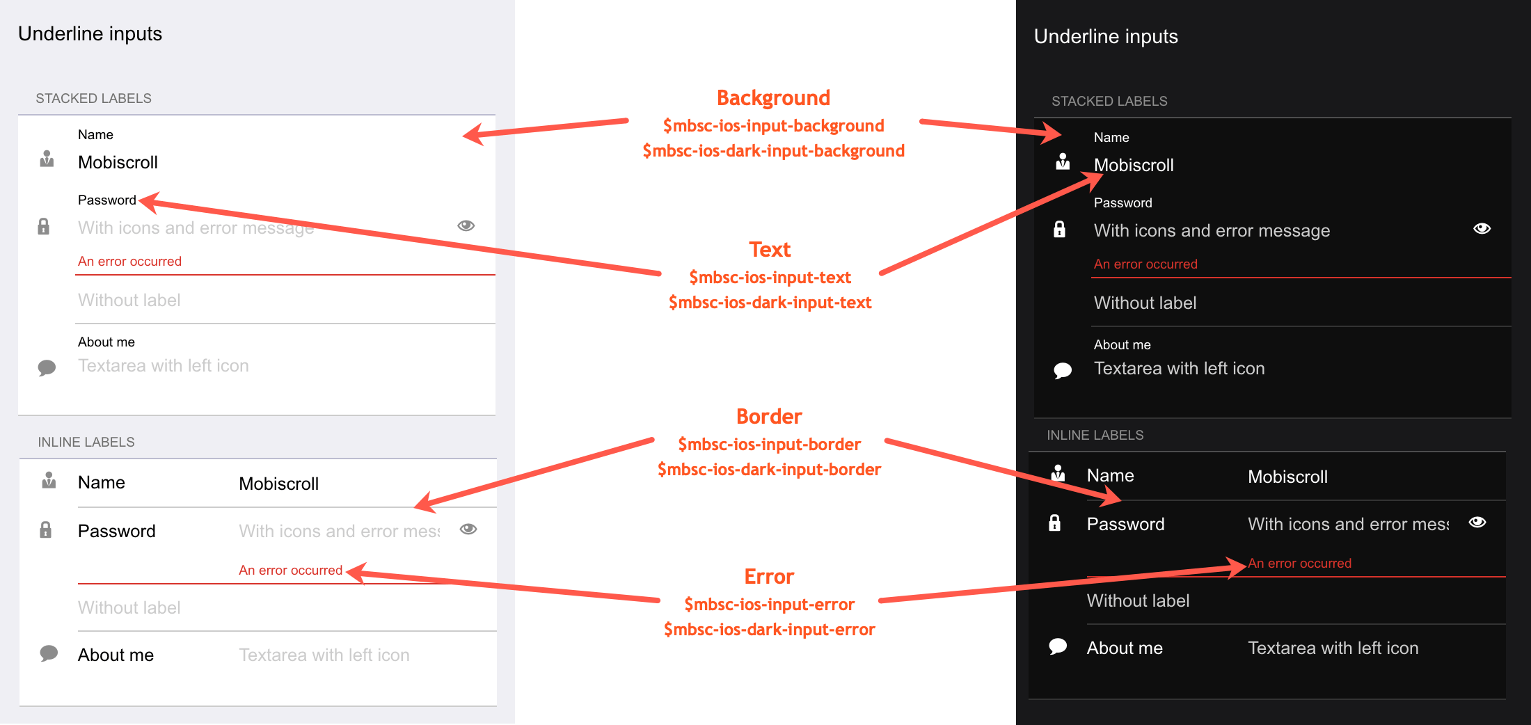
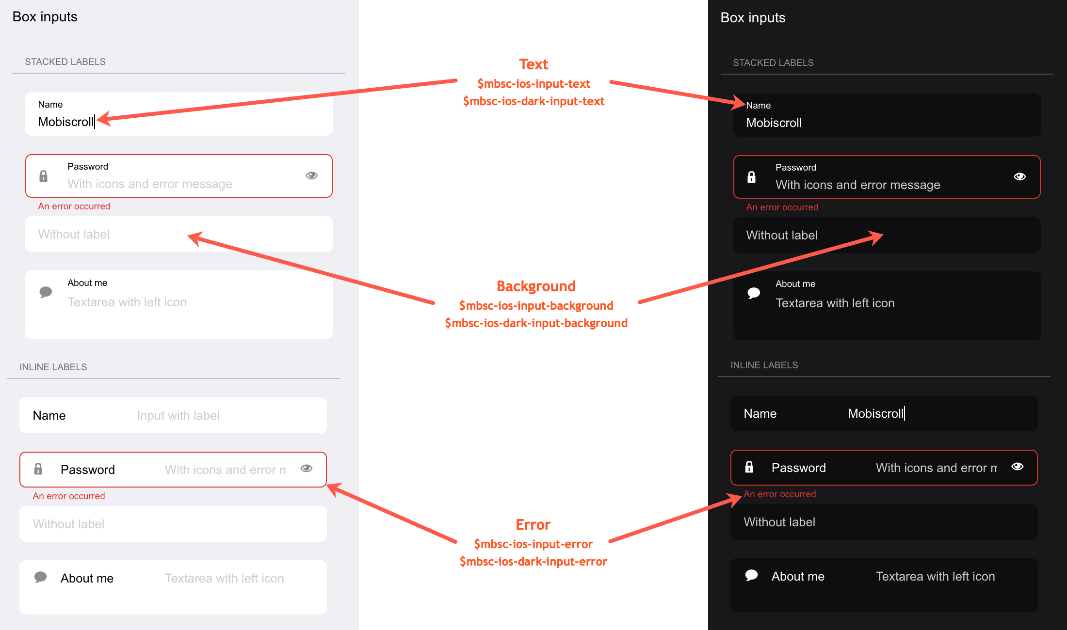
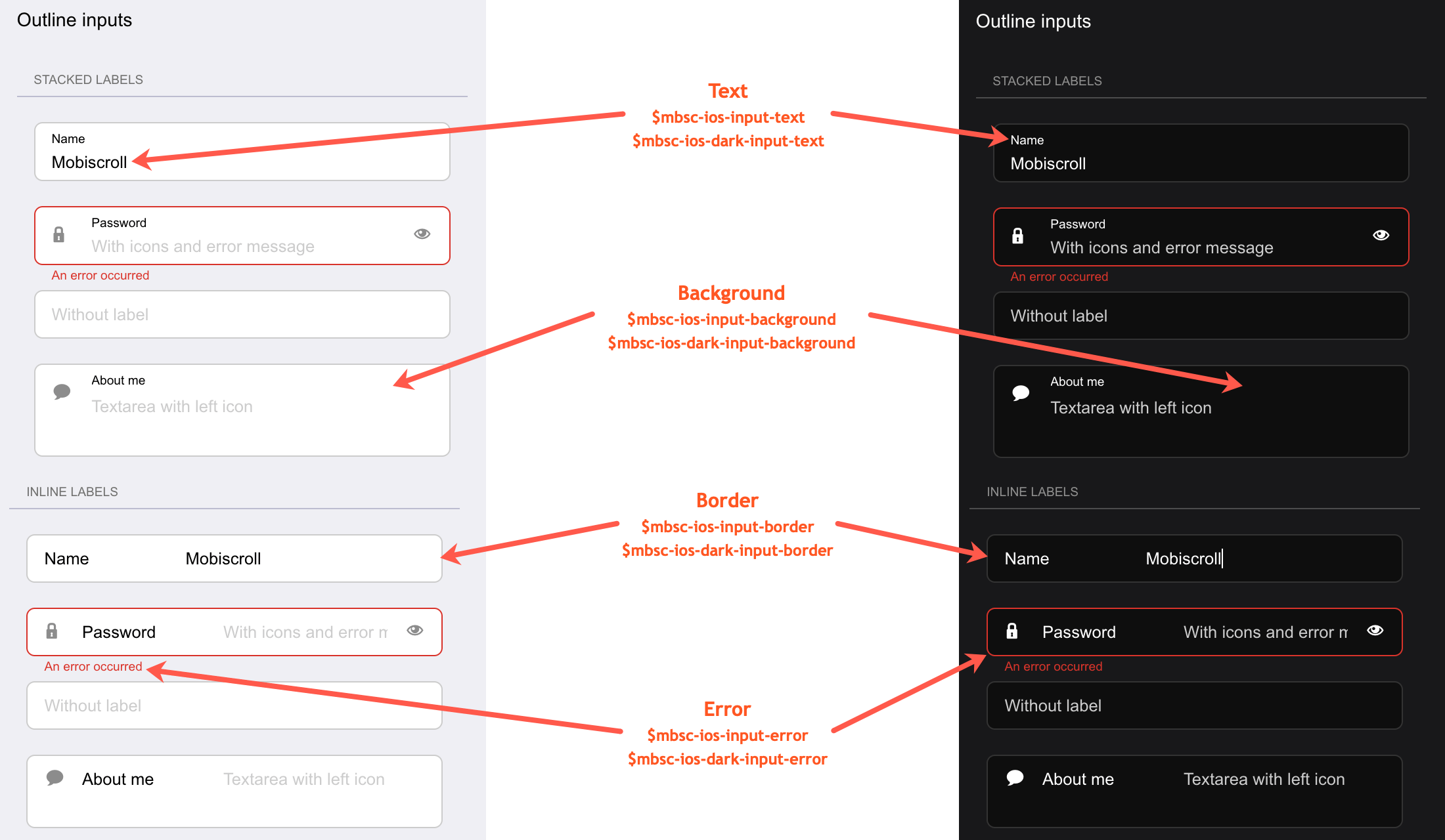
| $mbsc-ios-input-background | #ffffff | Sets the background color of the Dropdown, along with the Input, Password and Textarea fields. |
| $mbsc-ios-input-text | #000000 | Sets the text color of the Dropdown, along with the Input, Password and Textarea fields. |
| $mbsc-ios-input-border | #cccccc | Sets the border color of the Dropdown, along with the Input, Password and Textarea fields. |
| $mbsc-ios-input-error | #d8332a | Sets the error color of the Dropdown, along with the Input, Password and Textarea fields. |
iOS Dark theme
The following variables are specific to the iOS theme dark variant:
| Variable name | Default value | Description |
|---|---|---|
| $mbsc-ios-dark-input-background | #0f0f0f | Sets the background color of the Dropdown, along with the Input, Password and Textarea fields. |
| $mbsc-ios-dark-input-text | #ffffff | Sets the text color of the Dropdown, along with the Input, Password and Textarea fields. |
| $mbsc-ios-dark-input-border | #333333 | Sets the border color of the Dropdown, along with the Input, Password and Textarea fields. |
| $mbsc-ios-dark-input-error | #d8332a | Sets the error color of the Dropdown, along with the Input, Password and Textarea fields. |
Underline examples
Box examples
Outline examples
Windows theme
The following variables are specific to the Windows theme light variant:
| Variable name | Default value | Description |
|---|---|---|
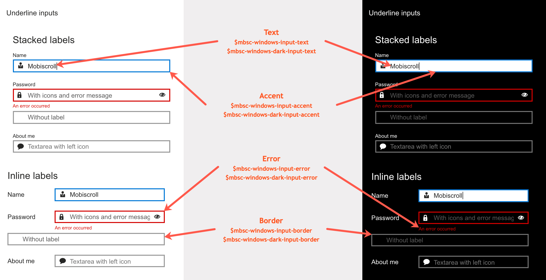
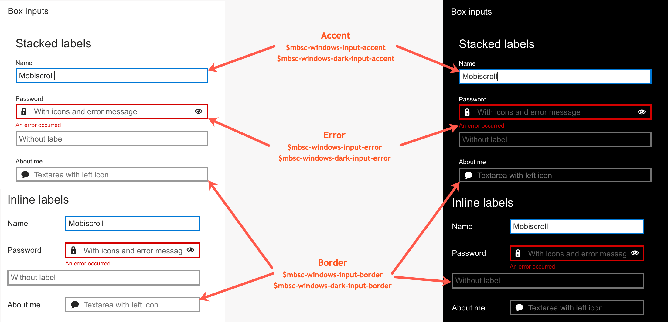
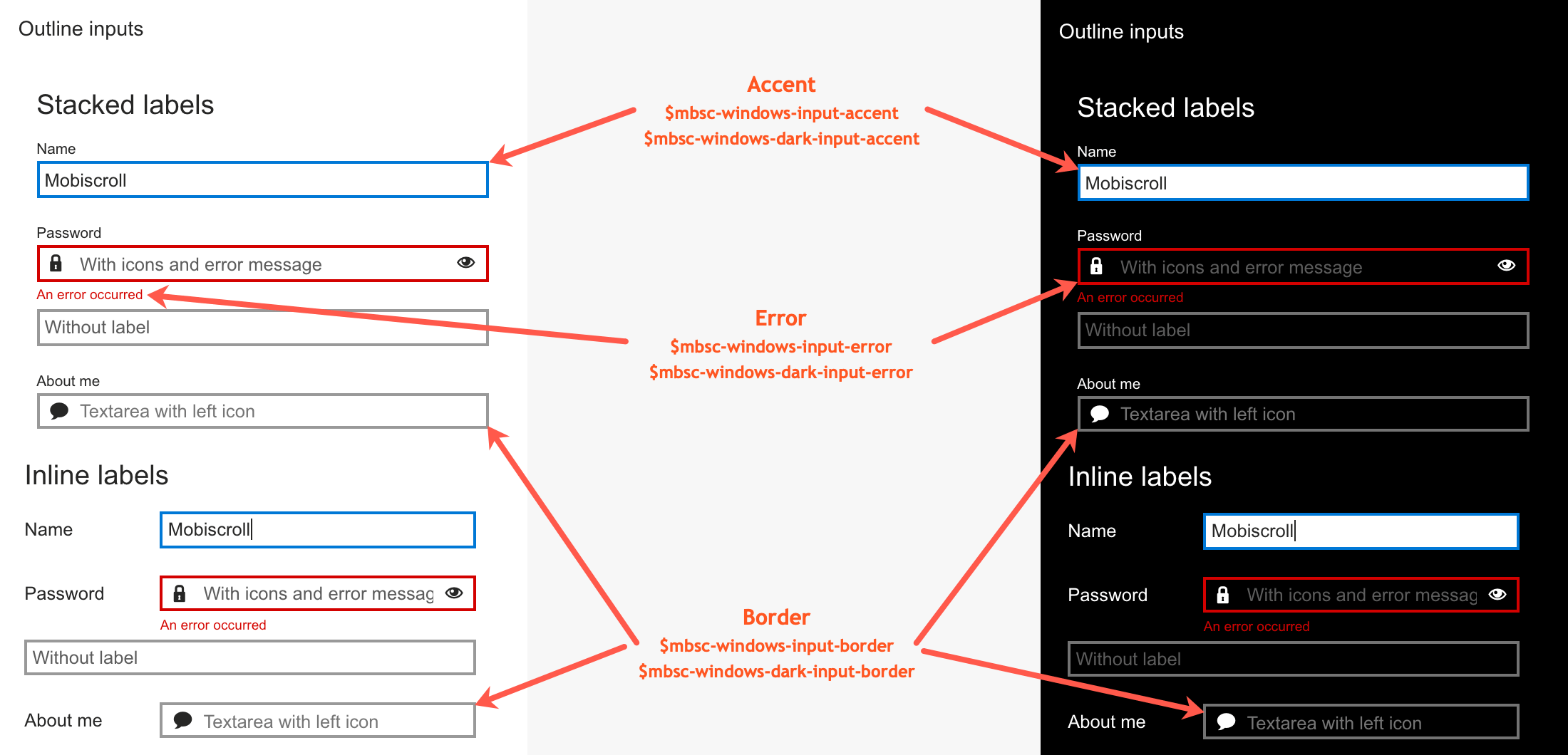
| $mbsc-windows-input-text | #262626 | Sets the text color of the Dropdown, along with the Input, Password and Textarea fields. |
| $mbsc-windows-input-border | #999999 | Sets the border color of the Dropdown, along with the Input, Password and Textarea fields. |
| $mbsc-windows-input-accent | #0078d7 | Sets the accent color of the Dropdown, along with the Input, Password and Textarea fields. |
| $mbsc-windows-input-error | #d30101 | Sets the error color of the Dropdown, along with the Input, Password and Textarea fields. |
Windows Dark theme
The following variables are specific to the Windows theme dark variant:
| Variable name | Default value | Description |
|---|---|---|
| $mbsc-windows-dark-input-text | #ffffff | Sets the text color of the Dropdown, along with the Input, Password and Textarea fields. |
| $mbsc-windows-dark-input-border | #737373 | Sets the border color of the Dropdown, along with the Input, Password and Textarea fields. |
| $mbsc-windows-dark-input-accent | #0078d7 | Sets the accent color of the Dropdown, along with the Input, Password and Textarea fields. |
| $mbsc-windows-dark-input-error | #d30101 | Sets the error color of the Dropdown, along with the Input, Password and Textarea fields. |
Underline examples
Box examples
Outline examples
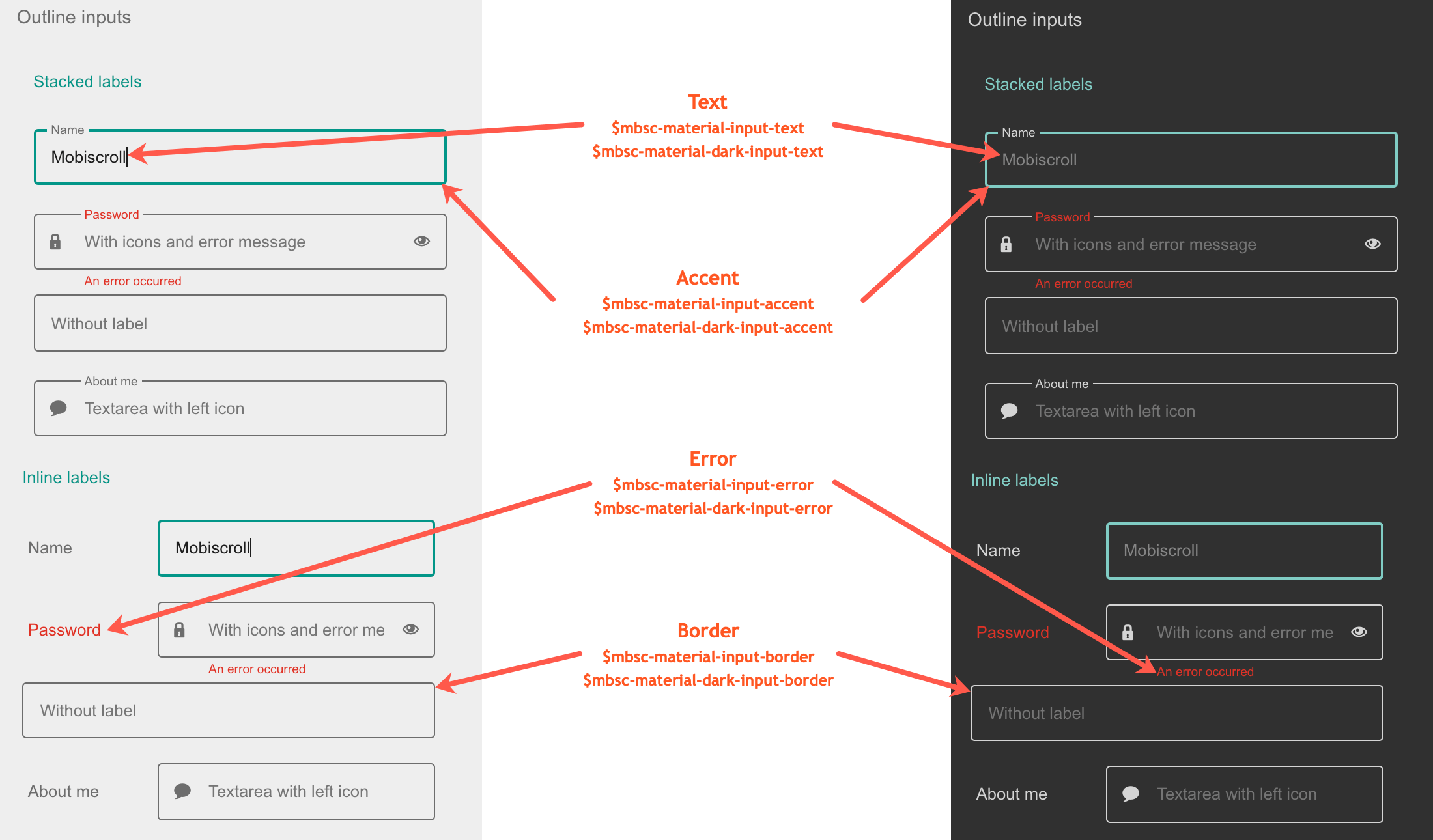
Material theme
The following variables are specific to the Material theme light variant:
| Variable name | Default value | Description |
|---|---|---|
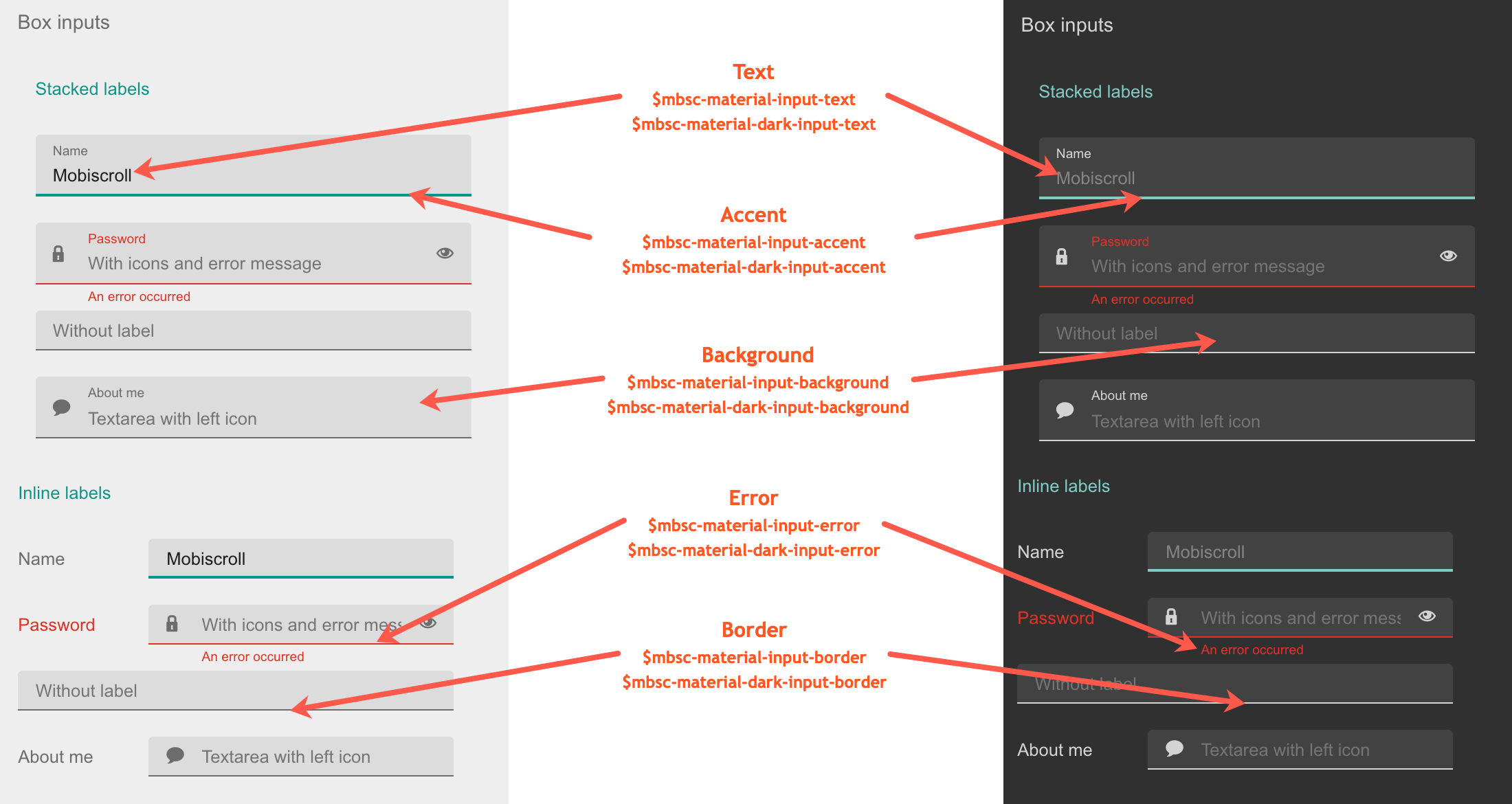
| $mbsc-material-input-background | #eeeeee | Sets the background color of the Dropdown, along with the Input, Password and Textarea fields. |
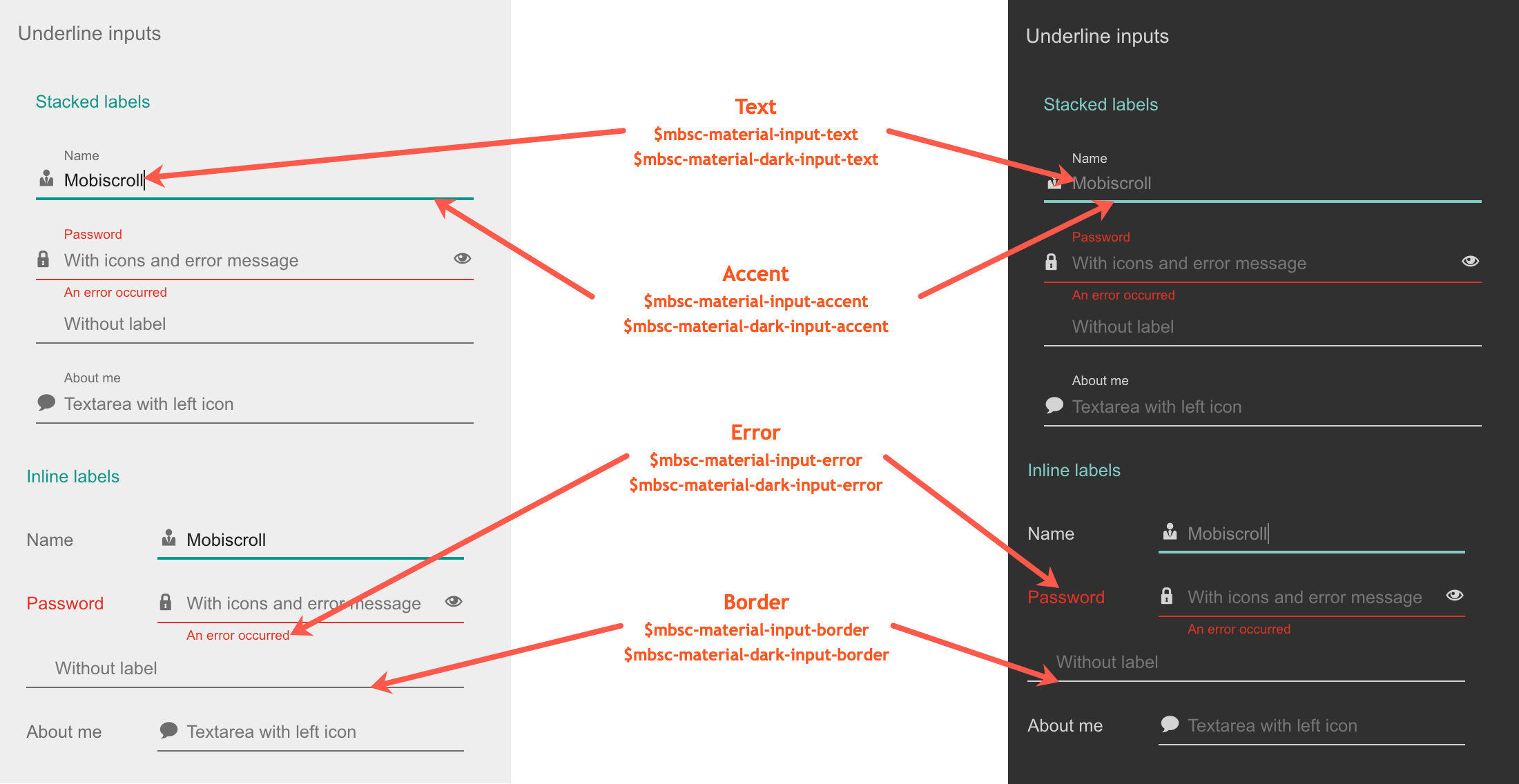
| $mbsc-material-input-text | #6d6d6d | Sets the text color of the Dropdown, along with the Input, Password and Textarea fields. |
| $mbsc-material-input-border | #6d6d6d | Sets the border color of the Dropdown, along with the Input, Password and Textarea fields. |
| $mbsc-material-input-accent | #009688 | Sets the accent color of the Dropdown, along with the Input, Password and Textarea fields. |
| $mbsc-material-input-error | #de3226 | Sets the error color of the Dropdown, along with the Input, Password and Textarea fields. |
Material Dark theme
The following variables are specific to the Material theme dark variant:
| Variable name | Default value | Description |
|---|---|---|
| $mbsc-material-dark-input-background | #303030 | Sets the background color of the Dropdown, along with the Input, Password and Textarea fields. |
| $mbsc-material-dark-input-text | #d4d4d4 | Sets the text color of the Dropdown, along with the Input, Password and Textarea fields. |
| $mbsc-material-dark-input-border | #d4d4d4 | Sets the border color of the Dropdown, along with the Input, Password and Textarea fields. |
| $mbsc-material-dark-input-accent | #81ccc4 | Sets the accent color of the Dropdown, along with the Input, Password and Textarea fields. |
| $mbsc-material-dark-input-error | #de3226 | Sets the error color of the Dropdown, along with the Input, Password and Textarea fields. |
Underline examples
Box examples
Outline examples
Mobiscroll theme
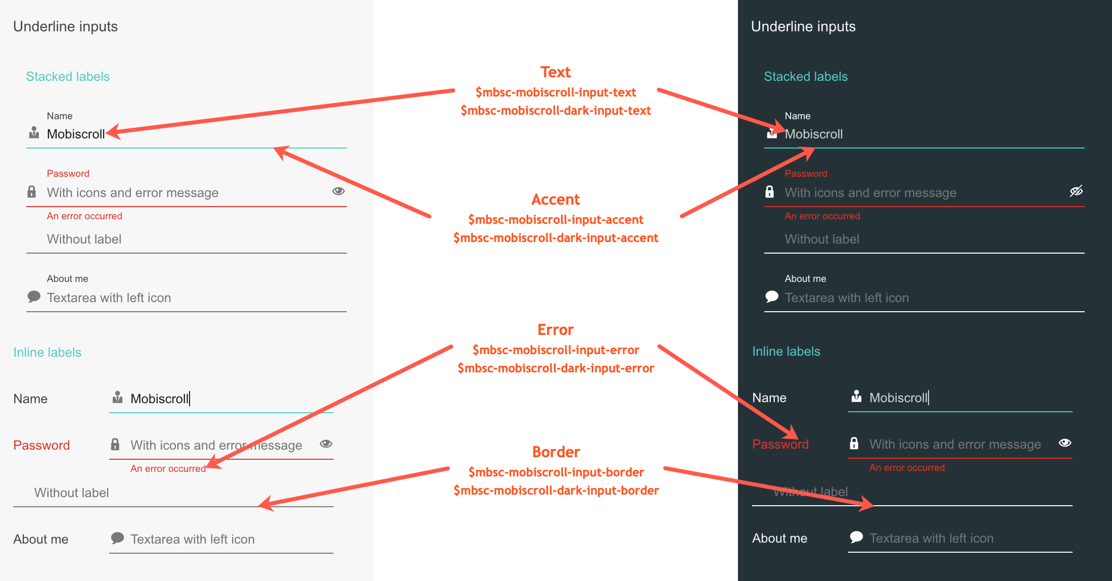
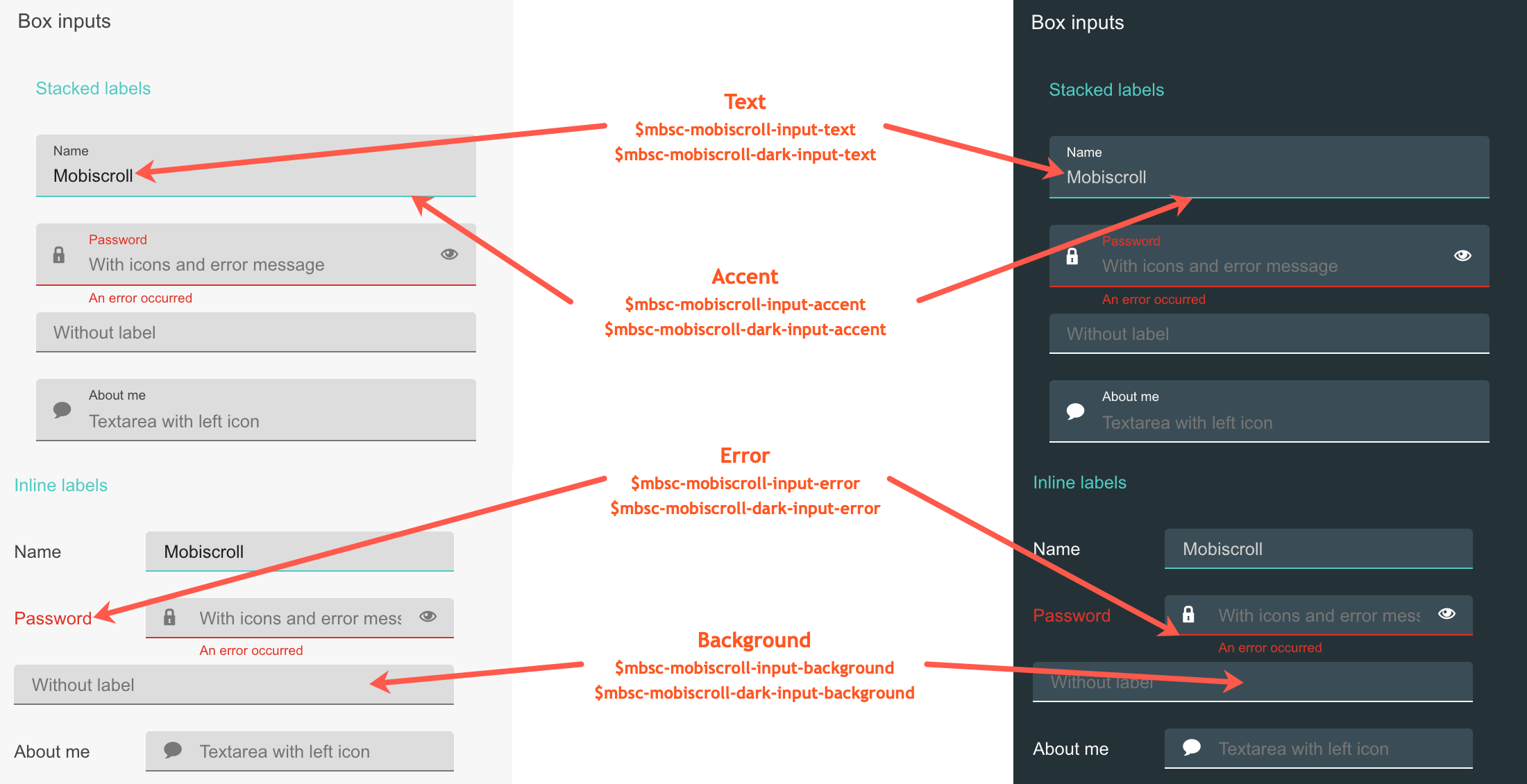
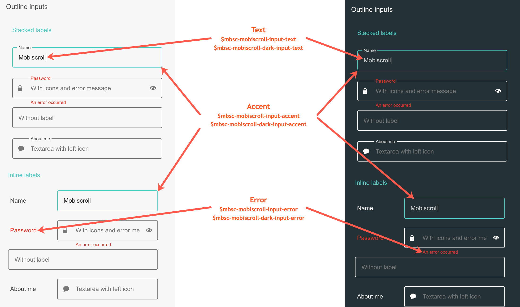
The following variables are specific to the Mobiscroll theme light variant:
| Variable name | Default value | Description |
|---|---|---|
| $mbsc-mobiscroll-input-text | #454545 | Sets the text color of the Dropdown, along with the Input, Password and Textarea fields. |
| $mbsc-mobiscroll-input-border | #787878 | Sets the border color of the Dropdown, along with the Input, Password and Textarea fields. |
| $mbsc-mobiscroll-input-accent | #4eccc4 | Sets the accent color of the Dropdown, along with the Input, Password and Textarea fields. |
| $mbsc-mobiscroll-input-error | #de3226 | Sets the error color of the Dropdown, along with the Input, Password and Textarea fields. |
Mobiscroll Dark theme
The following variables are specific to the Mobiscroll theme dark variant:
| Variable name | Default value | Description |
|---|---|---|
| $mbsc-mobiscroll-dark-input-text | #f7f7f7 | Sets the text color of the Dropdown, along with the Input, Password and Textarea fields. |
| $mbsc-mobiscroll-dark-input-border | #ffffff | Sets the border color of the Dropdown, along with the Input, Password and Textarea fields. |
| $mbsc-mobiscroll-dark-input-accent | #4fccc4 | Sets the accent color of the Dropdown, along with the Input, Password and Textarea fields. |
| $mbsc-mobiscroll-dark-input-error | #de3226 | Sets the error color of the Dropdown, along with the Input, Password and Textarea fields. |
Underline examples
Box examples
Outline examples
If you are looking for the generic Form variables, check out the tables here.