Textfields
Textbox
<mbsc-input>Username</mbsc-input>
<mbsc-input [(ngModel)]="userName">Username</mbsc-input>
<mbsc-input placeholder="Username"></mbsc-input>
<!-- change on blur -->
<mbsc-input (change)="myChangeHandler()">Username</mbsc-input>

<!-- each input -->
<mbsc-input (input)="myInputHandler()">Username</mbsc-input><mbsc-input [error]="true" errorMessage="Text not valid">
Username
</mbsc-input>
<mbsc-input [error]="isMyTextInvalid" [errorMessage]="myErrorMessage">
    Username
</mbsc-input>
Icons
<mbsc-input icon="ion-ios7-email">
    Email
</mbsc-input>
<mbsc-input icon="ion-ios7-email" icon-align="right">
    Email
</mbsc-input>
Input style
This attribute can be used for customizing your form input rendering.
<mbsc-input input-style="underline">
    Username
</mbsc-input>
<mbsc-input input-style="box">
    Username
</mbsc-input>
<mbsc-input input-style="outline">
    Username
</mbsc-input>
Label style
With this attribute you can define the position of the label.
<mbsc-input label-style="stacked">
    Username
</mbsc-input>
<mbsc-input label-style="inline">
    Username
</mbsc-input>
<mbsc-input label-style="floating">
    Username
</mbsc-input>
Password
The password toggle can be used to hide or show the entered password using icons
<mbsc-input type="password" placeholder="Password"></mbsc-input>

<!-- bound to a variable with ngModel -->
<mbsc-input type="password" placeholder="Password" [(ngModel)]="myPassword"></mbsc-input>

<!-- with change events -->
<mbsc-input type="password" placeholder="Password" (change)="myPasswordChanged()"></mbsc-input>
<mbsc-input type="password" placeholder="Password" (input)="myPasswordChanged()"></mbsc-input><mbsc-input type="text" placeholder="Password" [password-toggle]="true"></mbsc-input><mbsc-input type="text" placeholder="Password" [password-toggle]="true" icon-show="my-show-icon" icon-hide="my-hide-icon"></mbsc-input>File upload input
You can change the file type input icon with the data-upload attribute.
<mbsc-input type="file" placeholder="Select file..." icon-upload="cloud-upload">Upload</mbsc-input>Textarea
Textareas will auto-grow based on the entered content up until to 10 lines. After 10 lines scroll is enabled.
<mbsc-textarea>
    About me
</mbsc-textarea>
<mbsc-textarea placeholder="About me">
</mbsc-textarea>
Using with Ionic
The textfield components can be used tha same way with Ionic, as any other angular component.
Attributes
| Name | Description |
|---|---|
| icon |
Specify icons for a form component. A font-icon name should be passed.
Icon alignment can be controlled with the icon-align attribute. Icons can be displayed on both sides by passing and object with left and right properties containing icon names,
e.g.: icon='{ "right": "plus", "left": "minus" }'.
You can build your custom icon set on our download page ("Choose Icon Set" section).
See the full list of available icons here. The default icon pack contains the following icons: You can use the icons anywhere in your app using thembsc-ic mbsc-ic-{iconName} classes, e.g.:
|
| icon-align |
Specify icon alignment. It can be "left" or "right", it defaults to "left" if not specified.
|
| icon-hide |
Specify icon for hide password. It can be any valid icon name, it defaults to "eye-blocked" if not specified.
|
| icon-show |
Specify icon for show password. It can be any valid icon name, it defaults to "eye" if not specified.
|
| icon-upload | Specify icon for file type input. It can be any valid icon name, it defaults to "upload" if not specified. |
| input-style | Defines the input rendering mode. Possible values: "underline", "box", "outline". |
| label-style | Defines the position of the label. Possible values: "stacked", "inline", "floating". |
| [password-toggle] |
If the input of a password field has the data-password-toggle="true" attribute, the visibility of the password can be toggled.
|
| [disabled] | If an element has the disabled attribute, the element will be disabled. |
| [name] | Name attribute for the text field. |
| [placeholder] | Placeholder for the field |
| [error] | When true, the text field will be rendered with invalid styling |
| [errorMessage] | The error message, that will be shown when the field is invalid. |
| [readonly] | If an element has the readonly attribute, the element won't change it's value on user input. |
Icons
<mbsc-textarea icon="line-note">
    About me
</mbsc-textarea>
<mbsc-textarea icon="line-note" icon-align="right">
    About me
</mbsc-textarea>
Input style
This attribute can be used for customizing your form input rendering.
<mbsc-textarea input-style="underline">
    About me
</mbsc-textarea>
<mbsc-textarea input-style="box">
    About me
</mbsc-textarea>
<mbsc-textarea input-style="outline">
    About me
</mbsc-textarea>
Label style
With this attribute you can define the position of the label.
<mbsc-textarea label-style="stacked">
    About me
</mbsc-textarea>
<mbsc-textarea label-style="inline">
    About me
</mbsc-textarea>
<mbsc-textarea label-style="floating">
    About me
</mbsc-textarea>
Textfields theming
Global variables of the Input, Password, Textarea and Dropdown
| Variable name | Description |
|---|---|
| $mbsc-input-background-light | Sets the background color of the Input, along with the Password, Textarea and Dropdown fields. |
| $mbsc-input-background-dark | |
| $mbsc-input-text-light | Sets the text color of the Input, along with the Password, Textarea and Dropdown fields. |
| $mbsc-input-text-dark | |
| $mbsc-form-input-border-light | Sets the border color of the Input, along with the Password, Textarea and Dropdown fields. |
| $mbsc-form-input-border-dark | |
| $mbsc-input-accent-light | Sets the accent color of the Input, along with the Password, Textarea and Dropdown fields. |
| $mbsc-input-accent-dark | |
| $mbsc-input-error-light | Sets the error color of the Input, along with the Password, Textarea and Dropdown fields. |
| $mbsc-input-error-dark |
iOS theme
The following variables are specific to the iOS theme light variant:
| Variable name | Default value | Description |
|---|---|---|
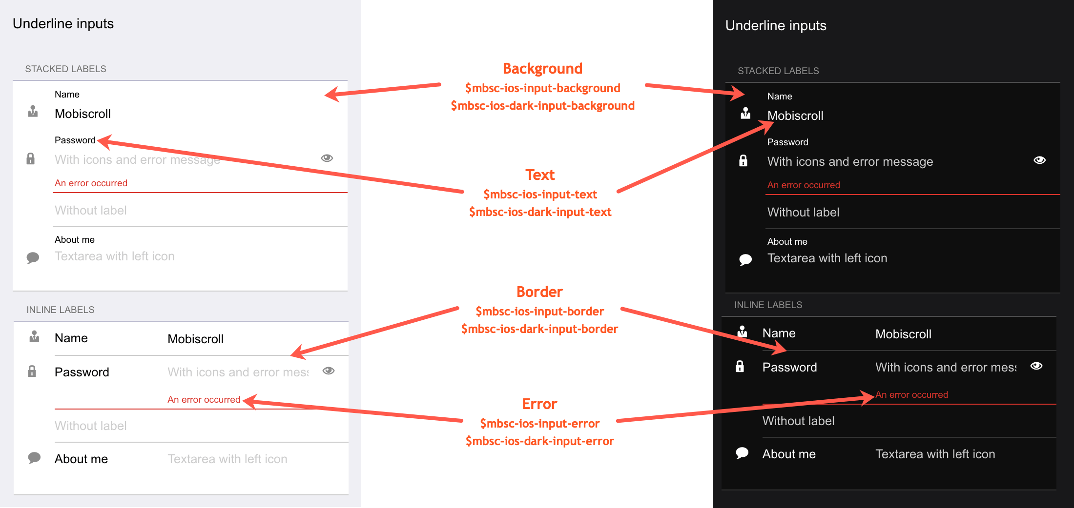
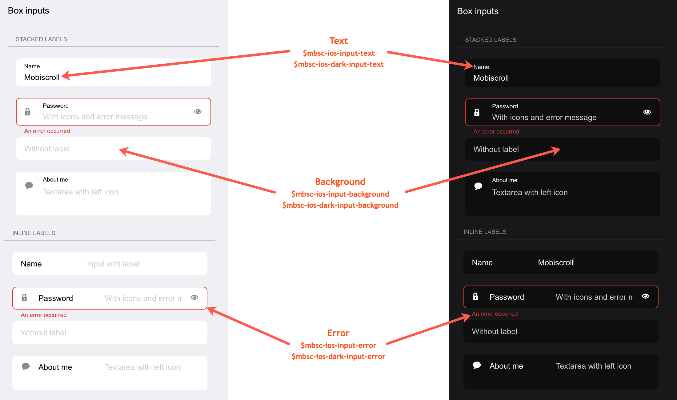
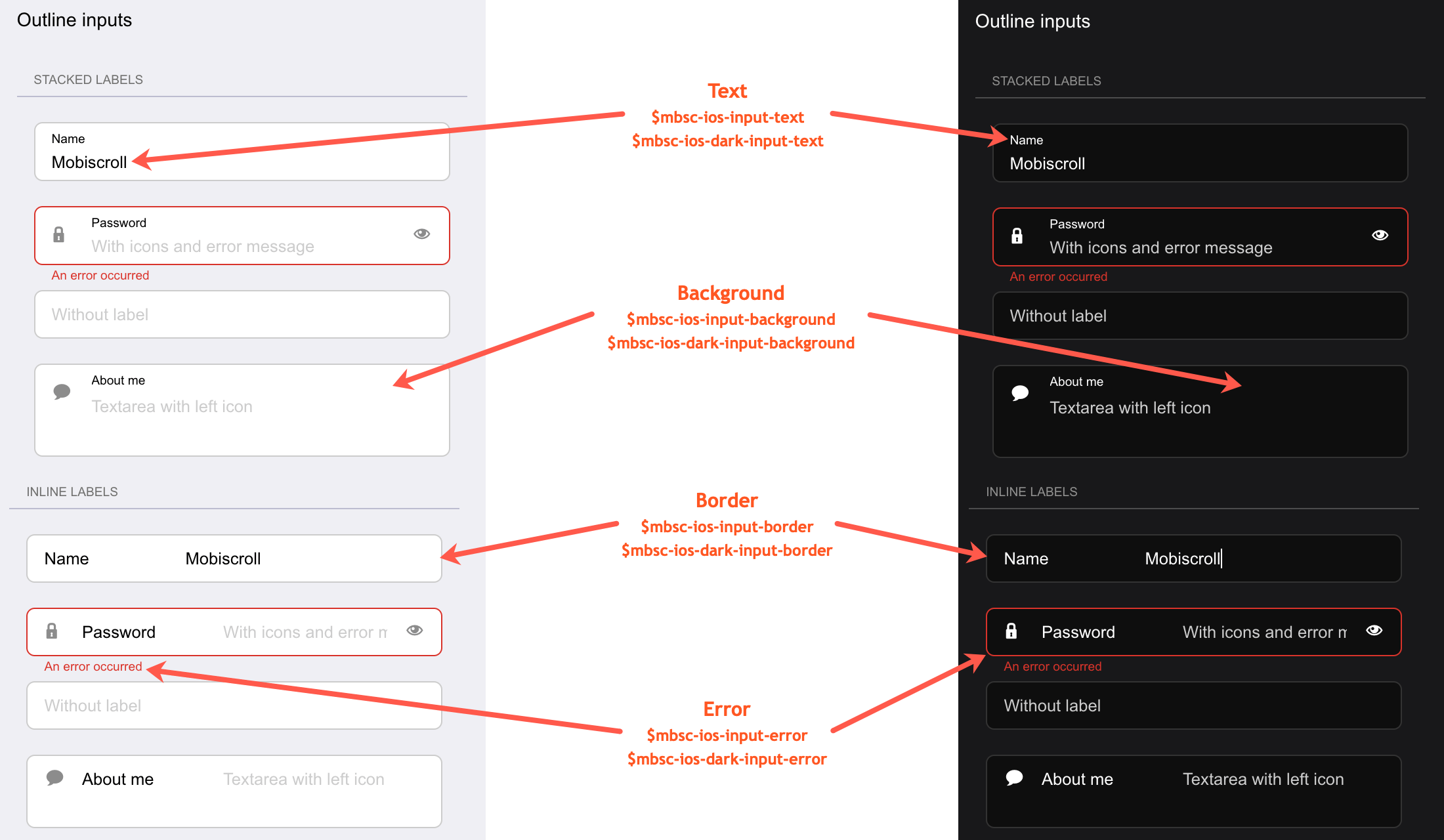
| $mbsc-ios-input-background | #ffffff | Sets the background color of the Input, along with the Password, Textarea and Dropdown fields. |
| $mbsc-ios-input-text | #000000 | Sets the text color of the Input, along with the Password, Textarea and Dropdown fields. |
| $mbsc-ios-input-border | #cccccc | Sets the border color of the Input, along with the Password, Textarea and Dropdown fields. |
| $mbsc-ios-input-error | #d8332a | Sets the error color of the Input, along with the Password, Textarea and Dropdown fields. |
iOS Dark theme
The following variables are specific to the iOS theme dark variant:
| Variable name | Default value | Description |
|---|---|---|
| $mbsc-ios-dark-input-background | #0f0f0f | Sets the background color of the Input, along with the Password, Textarea and Dropdown fields. |
| $mbsc-ios-dark-input-text | #ffffff | Sets the text color of the Input, along with the Password, Textarea and Dropdown fields. |
| $mbsc-ios-dark-input-border | #333333 | Sets the border color of the Input, along with the Password, Textarea and Dropdown fields. |
| $mbsc-ios-dark-input-error | #d8332a | Sets the error color of the Input, along with the Password, Textarea and Dropdown fields. |
Underline examples
Box examples
Outline examples
Windows theme
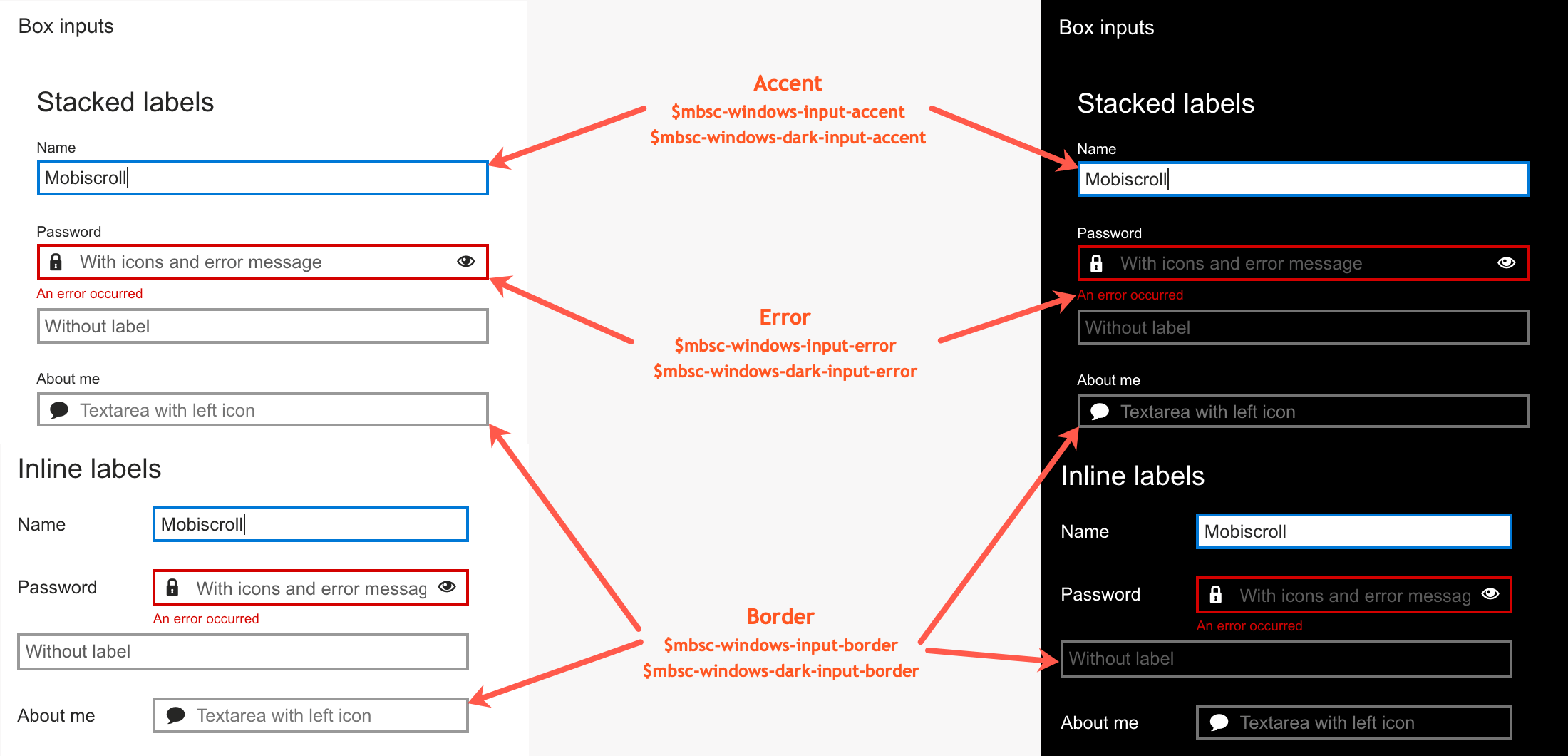
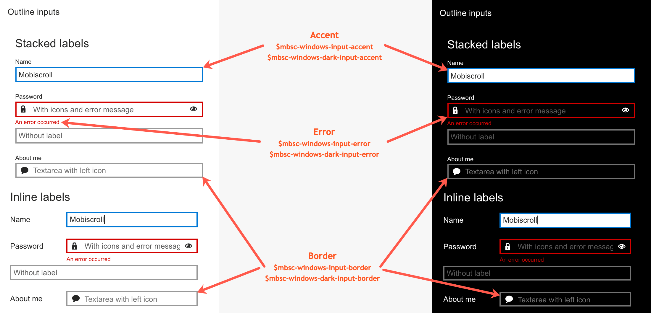
The following variables are specific to the Windows theme light variant:
| Variable name | Default value | Description |
|---|---|---|
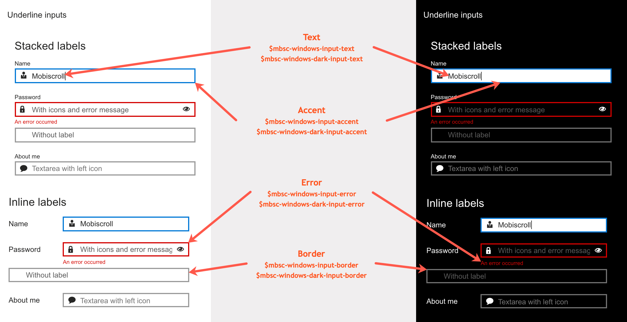
| $mbsc-windows-input-text | #262626 | Sets the text color of the Input, along with the Password, Textarea and Dropdown fields. |
| $mbsc-windows-input-border | #999999 | Sets the border color of the Input, along with the Password, Textarea and Dropdown fields. |
| $mbsc-windows-input-accent | #0078d7 | Sets the accent color of the Input, along with the Password, Textarea and Dropdown fields. |
| $mbsc-windows-input-error | #d30101 | Sets the error color of the Input, along with the Password, Textarea and Dropdown fields. |
Windows Dark theme
The following variables are specific to the Windows theme dark variant:
| Variable name | Default value | Description |
|---|---|---|
| $mbsc-windows-dark-input-text | #ffffff | Sets the text color of the Input, along with the Password, Textarea and Dropdown fields. |
| $mbsc-windows-dark-input-border | #737373 | Sets the border color of the Input, along with the Password, Textarea and Dropdown fields. |
| $mbsc-windows-dark-input-accent | #0078d7 | Sets the accent color of the Input, along with the Password, Textarea and Dropdown fields. |
| $mbsc-windows-dark-input-error | #d30101 | Sets the error color of the Input, along with the Password, Textarea and Dropdown fields. |
Underline examples
Box examples
Outline examples
Material theme
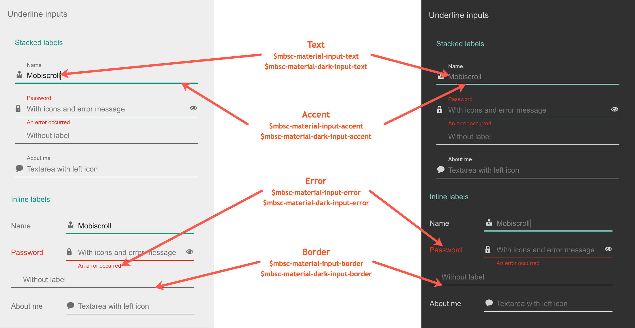
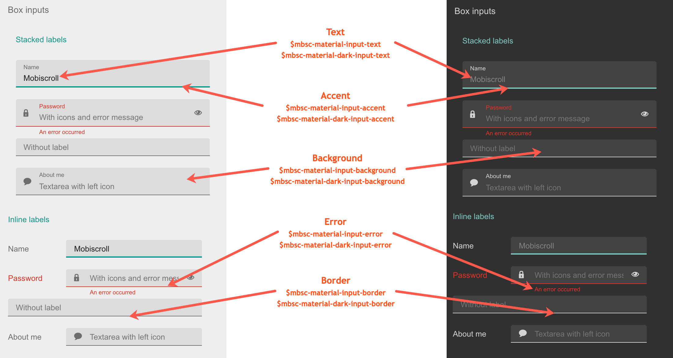
The following variables are specific to the Material theme light variant:
| Variable name | Default value | Description |
|---|---|---|
| $mbsc-material-input-background | #eeeeee | Sets the background color of the Input, along with the Password, Textarea and Dropdown fields. |
| $mbsc-material-input-text | #6d6d6d | Sets the text color of the Input, along with the Password, Textarea and Dropdown fields. |
| $mbsc-material-input-border | #6d6d6d | Sets the border color of the Input, along with the Password, Textarea and Dropdown fields. |
| $mbsc-material-input-accent | #009688 | Sets the accent color of the Input, along with the Password, Textarea and Dropdown fields. |
| $mbsc-material-input-error | #de3226 | Sets the error color of the Input, along with the Password, Textarea and Dropdown fields. |
Material Dark theme
The following variables are specific to the Material theme dark variant:
| Variable name | Default value | Description |
|---|---|---|
| $mbsc-material-dark-input-background | #303030 | Sets the background color of the Input, along with the Password, Textarea and Dropdown fields. |
| $mbsc-material-dark-input-text | #d4d4d4 | Sets the text color of the Input, along with the Password, Textarea and Dropdown fields. |
| $mbsc-material-dark-input-border | #d4d4d4 | Sets the border color of the Input, along with the Password, Textarea and Dropdown fields. |
| $mbsc-material-dark-input-accent | #81ccc4 | Sets the accent color of the Input, along with the Password, Textarea and Dropdown fields. |
| $mbsc-material-dark-input-error | #de3226 | Sets the error color of the Input, along with the Password, Textarea and Dropdown fields. |
Underline examples
Box examples
Outline examples
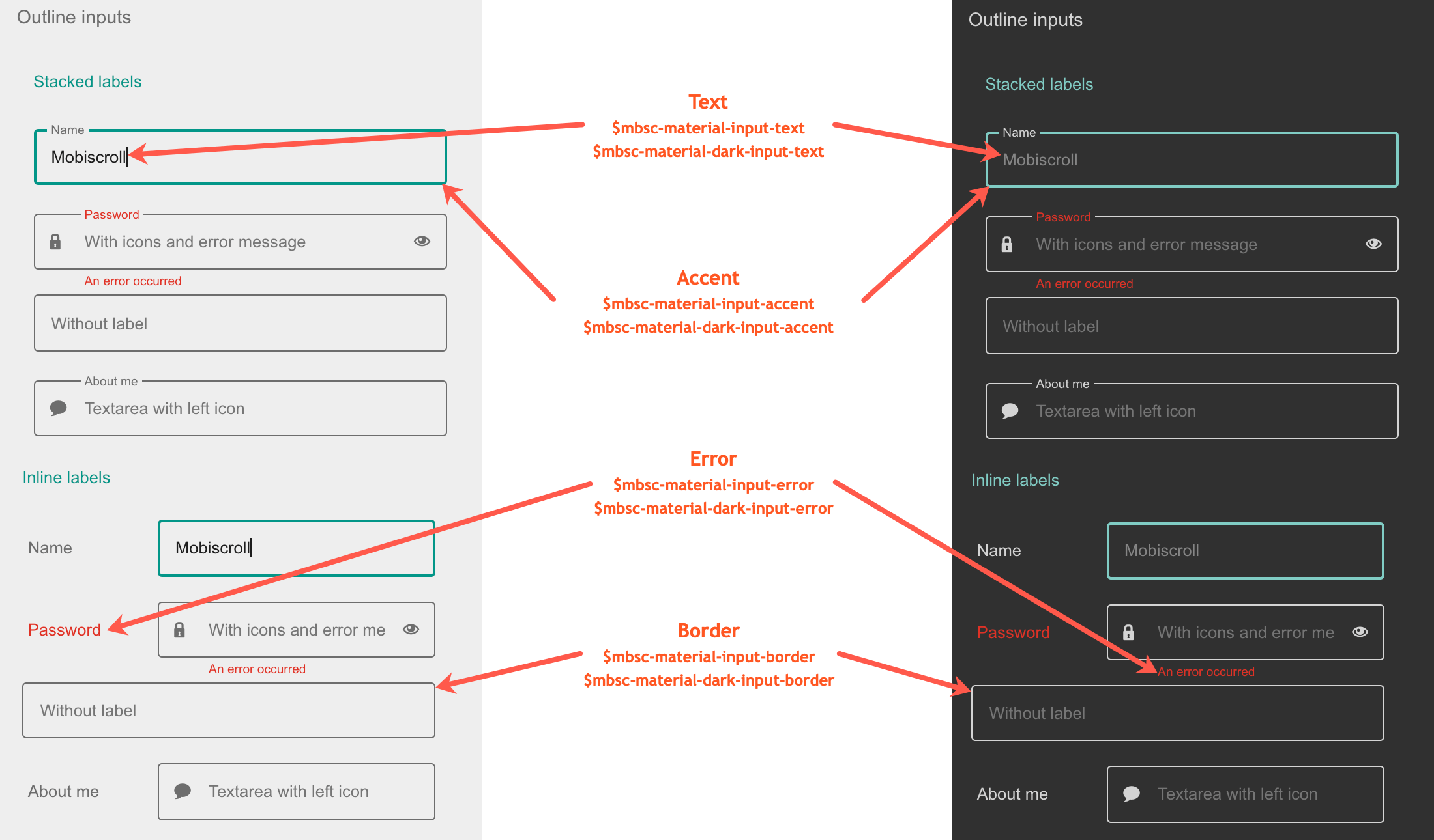
Mobiscroll theme
The following variables are specific to the Mobiscroll theme light variant:
| Variable name | Default value | Description |
|---|---|---|
| $mbsc-mobiscroll-input-text | #454545 | Sets the text color of the Input, along with the Password, Textarea and Dropdown fields. |
| $mbsc-mobiscroll-input-border | #787878 | Sets the border color of the Input, along with the Password, Textarea and Dropdown fields. |
| $mbsc-mobiscroll-input-accent | #4eccc4 | Sets the accent color of the Input, along with the Password, Textarea and Dropdown fields. |
| $mbsc-mobiscroll-input-error | #de3226 | Sets the error color of the Input, along with the Password, Textarea and Dropdown fields. |
Mobiscroll Dark theme
The following variables are specific to the Mobiscroll theme dark variant:
| Variable name | Default value | Description |
|---|---|---|
| $mbsc-mobiscroll-dark-input-text | #f7f7f7 | Sets the text color of the Input, along with the Password, Textarea and Dropdown fields. |
| $mbsc-mobiscroll-dark-input-border | #ffffff | Sets the border color of the Input, along with the Password, Textarea and Dropdown fields. |
| $mbsc-mobiscroll-dark-input-accent | #4fccc4 | Sets the accent color of the Input, along with the Password, Textarea and Dropdown fields. |
| $mbsc-mobiscroll-dark-input-error | #de3226 | Sets the error color of the Input, along with the Password, Textarea and Dropdown fields. |
Underline examples
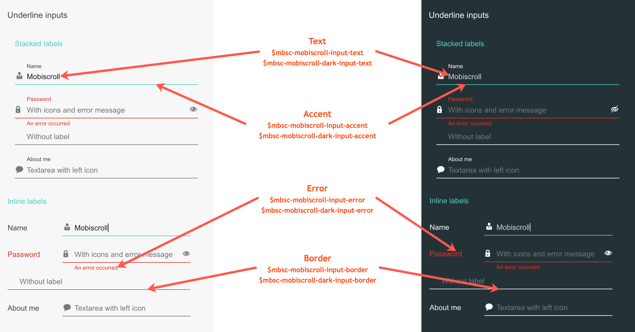
Box examples
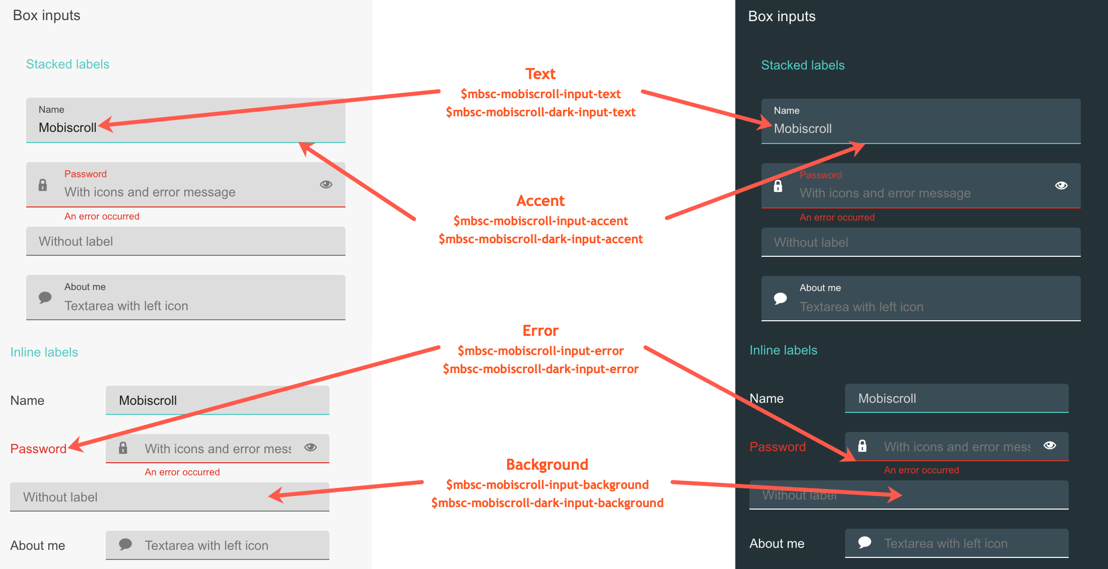
Outline examples
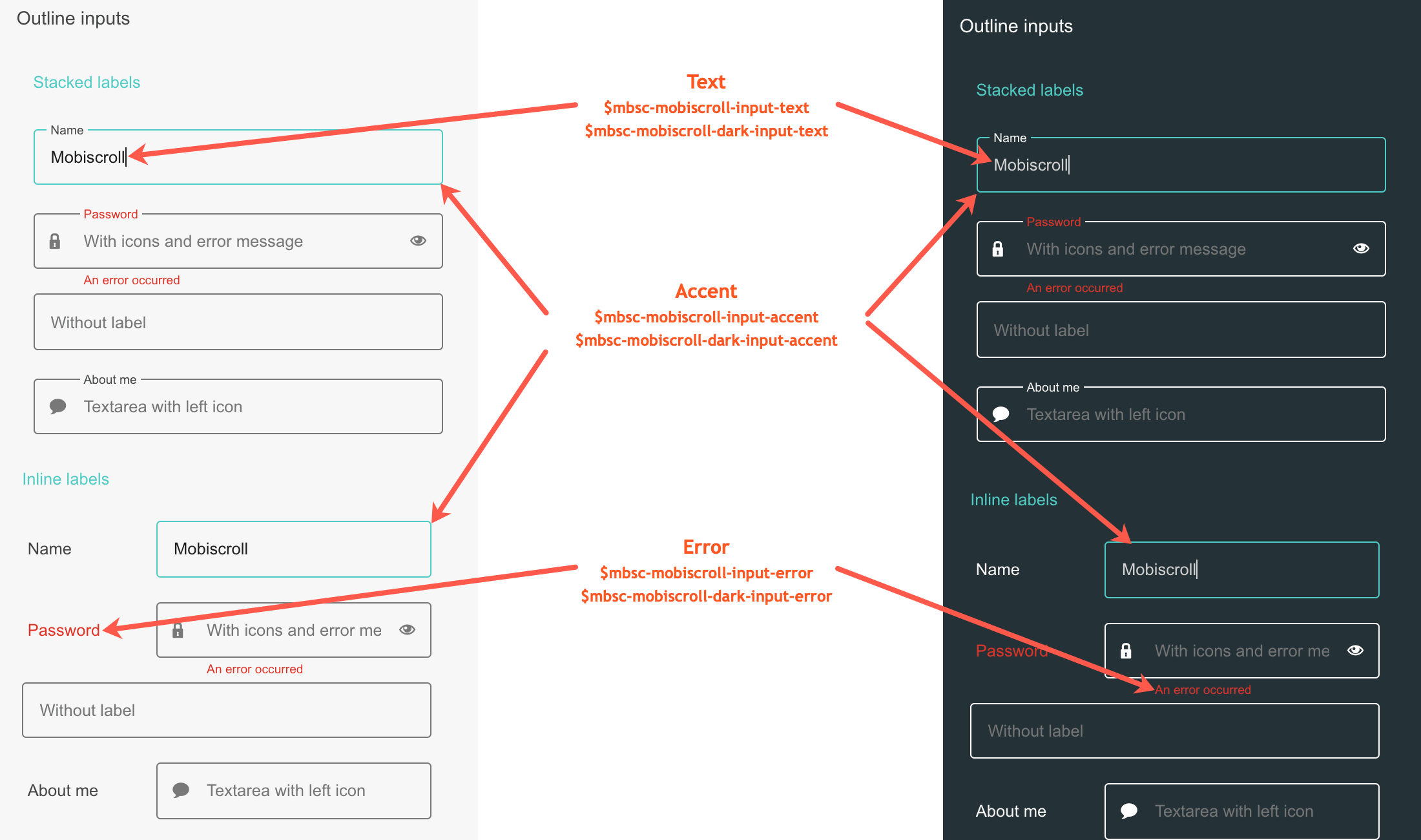
If you are looking for the generic Form variables, check out the tables here.