Slider
The slider control can be used to select one or more numeric value.
<mbsc-slider [(ngModel)]="mySlide">
    Label
</mbsc-slider><mbsc-slider tooltip="true" [(ngModel)]="mySlide">
Label
</mbsc-slider><mbsc-slider val="left" template="{value}/{max}" [(ngModel)]="mySlide">
Label
</mbsc-slider><mbsc-slider tooltip="true" step="25" step-labels="[0, 25, 50, 75, 100]" [(ngModel)]="mySlide">
Label
</mbsc-slider><mbsc-slider icon="plus" min="22" step="10" max="119" val="right" template="${value}" [(ngModel)]="mySlide">
Icon and value
</mbsc-slider>If the bound value is an array of numbers, multiple handles will be displayed, based on the array's length
<mbsc-slider [(value)]="myRange" >
    Two handles
</mbsc-slider><mbsc-slider [(ngModel)]="myrange" >
Two handles
</mbsc-slider>Using with Ionic
The Slider component can be used tha same way with Ionic, as any other angular component.
Attributes
| Name | Description |
|---|---|
| highlight | If an input has the highlight="false" attribute, only the handles are highlighted and the progress bar is not. |
| icon |
Specify icons for the slider. A font-icon name should be passed.
Icons can be displayed on both sides by passing and object with left and right properties containing icon names,
e.g.: icon='{ "right": "plus", "left": "minus" }'.
You can build your custom icon set on our download page ("Choose Icon Set" section).
See the full list of available icons here. The default icon pack contains the following icons: You can use the icons anywhere in your app using thembsc-ic mbsc-ic-{iconName} classes, e.g.:
|
| live | If an input has the live="true" attribute, the value will be updated while the slider handle is moved. If live="false", the value will be updated when the handle is released. |
| step-labels | Values to display under the slider track. Should be passed as an array, e.g. step-labels="[0, 25, 50, 75, 100]". |
| target | Specify a target element, where the slider value will be displayed. The string should be a CSS selector, e.g. #slider_value |
| value-template | Template for the slider value. '{value}' stands for the slider current value, and '{max}' stands for the slider maximum value. Any other character in the template will be handled as literal string. |
| tooltip | If true, a tooltip with the current value will be displayed above the slider handle while moving. |
| val |
Specify the value position. It can be "left" or "right", it defaults to "left" if not specified.
|
| [disabled] | If an element has the disabled attribute, the element will be disabled. |
| max | Specify the maximum value that can be selected. |
| min | Specify the minimum value that can be selected. |
| step | Specify the step between values. |
| [(value)] | Specify the value of the slider. |
| color | Sets the color preset of the slider. Can be one of "primary", "secondary", "success", "warning", "danger" or "info" |
For many more examples - simple and complex use-cases - check out the slider demos for angular.
Methods
| Name | Description | |
|---|---|---|
| getVal() |
Returns the slider value.
Returns: Number
ExampleMethods can be called on an instance. For more details see calling methods |
|
| setVal(value) |
Sets the slider value.
Parameters
ExampleMethods can be called on an instance. For more details see calling methods |
|
Slider theming
Global variables of the Slider
Below you will find a list of SASS variables that affect the Slider:
| Variable name | Description |
|---|---|
| $mbsc-form-background-light | Affects the background color of the Slider along with the Checkbox, Switch, Radio button, Button, Progress, Segmented, Stepper, Rating and Groups |
| $mbsc-form-background-dark | |
| $mbsc-form-text-light |
Affects the label
color of the Slider. It also affects other components: Checkbox, Switch, Radio button, Button, Progress, Segmented, Stepper, Rating and Groups |
| $mbsc-form-text-dark | |
| $mbsc-form-accent-light | Affects the accent color of the Slider along with the Checkbox, Switch, Radio button, Button, Progress, Segmented, Stepper, Rating and Groups controls. |
| $mbsc-form-accent-dark |
If you really want to get sophisticated or if a color doesn't look good on a specific theme and you want to overwrite it, you can fine tune all of the above variables individually for each theme. Below are the complete list of variables broken down to themes:
Windows theme
The following variables are specific to the Windows theme light variant:
| Variable name | Default value | Description |
|---|---|---|
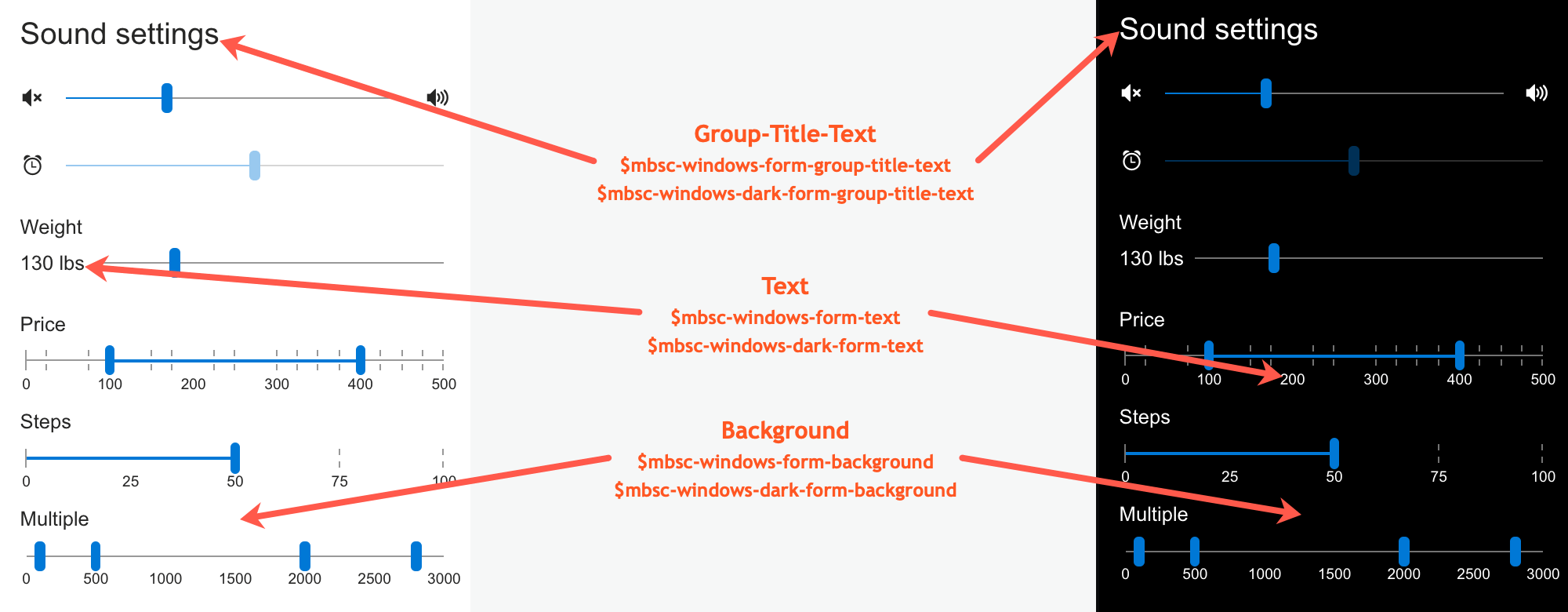
| $mbsc-windows-form-background | #ffffff | Affects the background color of the Slider along with the Checkbox, Switch, Radio button, Button, Progress, Segmented, Stepper, Rating and Groups |
| $mbsc-windows-form-text | #262626 | Affects the label color of the Slider. It also affects other components: Checkbox, Switch, Radio button, Button, Progress, Segmented, Stepper, Rating and Groups |
| $mbsc-windows-form-accent | #0078d7 | Affects the accent color of the Slider along with the Checkbox, Switch, Radio button, Button, Progress, Segmented, Stepper, Rating and Groups controls. |
Windows Dark theme
The following variables are specific to the Windows theme dark variant:
| Variable name | Default value | Description |
|---|---|---|
| $mbsc-windows-dark-form-background | #000000 | Affects the background color of the Slider along with the Checkbox, Switch, Radio button, Button, Progress, Segmented, Stepper, Rating and Groups |
| $mbsc-windows-dark-form-text | #ffffff | Affects the label color of the Slider. It also affects other components: Checkbox, Switch, Radio button, Button, Progress, Segmented, Stepper, Rating and Groups |
| $mbsc-windows-dark-form-accent | #0078d7 | Affects the accent color of the Slider along with the Checkbox, Switch, Radio button, Button, Progress, Segmented, Stepper, Rating and Groups controls. |

Material theme
The following variables are specific to the Material theme light variant:
| Variable name | Default value | Description |
|---|---|---|
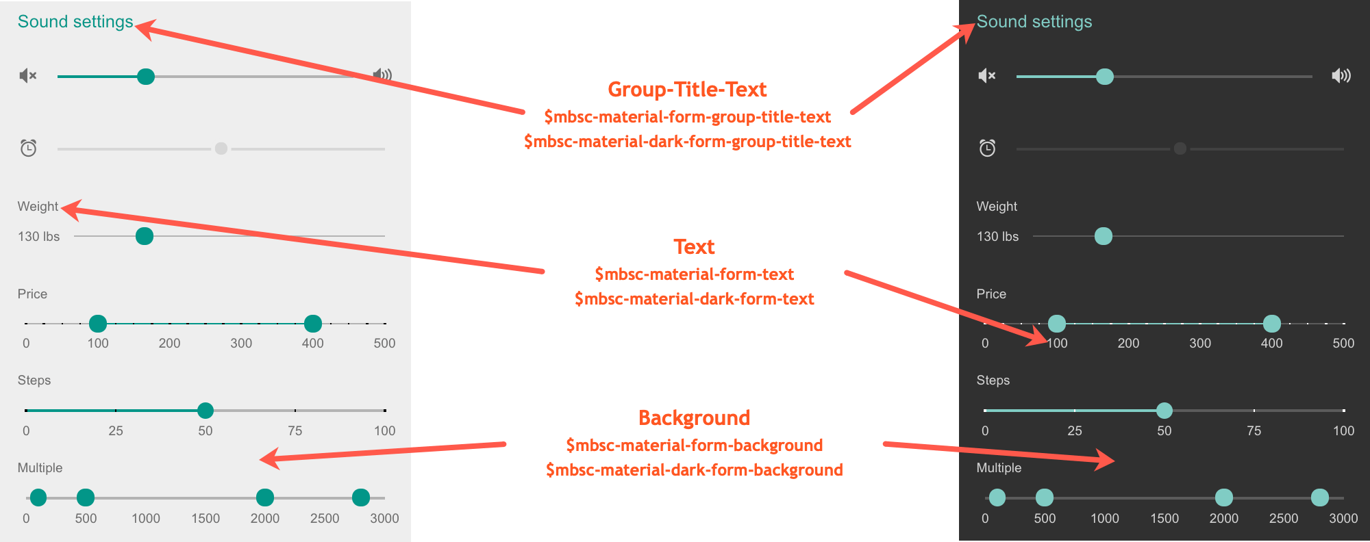
| $mbsc-material-form-background | #eeeeee | Affects the background color of the Slider along with the Checkbox, Switch, Radio button, Button, Progress, Segmented, Stepper, Rating and Groups |
| $mbsc-material-form-text | #6d6d6d | Affects the label color of the Slider. It also affects other components: Checkbox, Switch, Radio button, Button, Progress, Segmented, Stepper, Rating and Groups |
| $mbsc-material-form-accent | #019687 | Affects the accent color of the Slider along with the Checkbox, Switch, Radio button, Button, Progress, Segmented, Stepper, Rating and Groups controls. |
Material Dark theme
The following variables are specific to the Material theme dark variant:
| Variable name | Default value | Description |
|---|---|---|
| $mbsc-material-dark-form-background | #303030 | Affects the background color of the Slider along with the Checkbox, Switch, Radio button, Button, Progress, Segmented, Stepper, Rating and Groups |
| $mbsc-material-dark-form-text | #d4d4d4 | Affects the label color of the Slider. It also affects other components: Checkbox, Switch, Radio button, Button, Progress, Segmented, Stepper, Rating and Groups |
| $mbsc-material-dark-form-accent | #81ccc4 | Affects the accent color of the Slider along with the Checkbox, Switch, Radio button, Button, Progress, Segmented, Stepper, Rating and Groups controls. |

Mobiscroll theme
The following variables are specific to the Mobiscroll theme light variant:
| Variable name | Default value | Description |
|---|---|---|
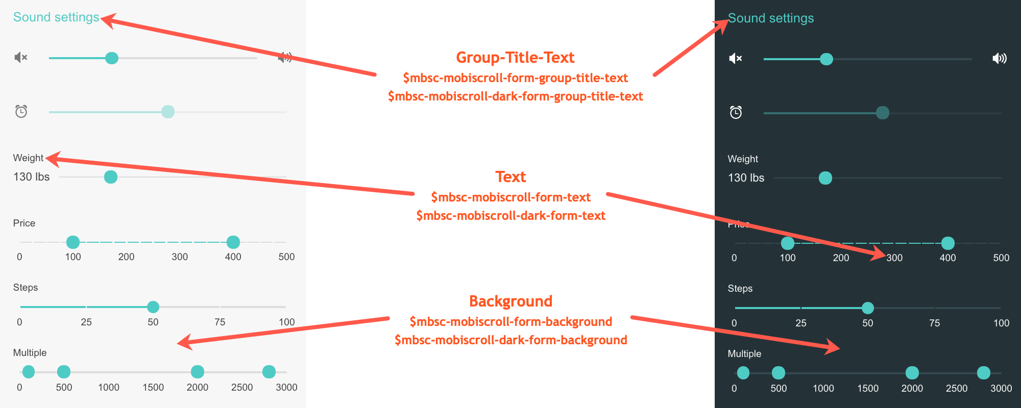
| $mbsc-mobiscroll-form-background | #f7f7f7 | Affects the background color of the Slider along with the Checkbox, Switch, Radio button, Button, Progress, Segmented, Stepper, Rating and Groups |
| $mbsc-mobiscroll-form-text | #454545 | Affects the label color of the Slider. It also affects other components: Checkbox, Switch, Radio button, Button, Progress, Segmented, Stepper, Rating and Groups |
| $mbsc-mobiscroll-form-accent | #4fccc5 | Affects the accent color of the Slider along with the Checkbox, Switch, Radio button, Button, Progress, Segmented, Stepper, Rating and Groups controls. |
Mobiscroll Dark theme
The following variables are specific to the Mobiscroll theme dark variant:
| Variable name | Default value | Description |
|---|---|---|
| $mbsc-mobiscroll-dark-form-background | #263239 | Affects the background color of the Slider along with the Checkbox, Switch, Radio button, Button, Progress, Segmented, Stepper, Rating and Groups |
| $mbsc-mobiscroll-dark-form-text | #f7f7f7 | Affects the label color of the Slider. It also affects other components: Checkbox, Switch, Radio button, Button, Progress, Segmented, Stepper, Rating and Groups |
| $mbsc-mobiscroll-dark-form-accent | #4fccc5 | Affects the accent color of the Slider along with the Checkbox, Switch, Radio button, Button, Progress, Segmented, Stepper, Rating and Groups controls. |

If you are looking for the generic Form variables and how they affect the form in general, check out the tables and pictures here.