Alerts
Alerts are urgent interruptions that inform the user about a situation. May also collect information from the user. It appears on top of the app's content, and must be manually dismissed before resuming interaction with the app.
Alert
mobiscroll.alert(config)
Description
An alert dialog notifies or warns the user about something. It contains a single button which closes the alert.
mobiscroll.alert({
    title: 'Cellular Data is Turned Off for "Safari"',
    message: 'You can turn on cellular data for this app in Settings.'
});
For many more examples - simple and complex use-cases - check out the alert and notification demos for angular.
Parameters
The configuration object for the alert dialog can have the following properties:
Returns: Promise
A promise which is resolved when the popup is closed.
undefined.
If you'd like to use the Promise syntax and also support older browsers (IE 10, IE11, Android 4.1, 4.2, 4.3 stock browser),
please use a polyfill,
otherwise use the callback function from the config object.
Confirm
mobiscroll.confirm(config)
Description
A confirm dialog is used when it is required to confirm an action. It has two buttons, one of which confirms the action, and the other rejects it.
// Using callback function
mobiscroll.confirm({
    title: 'Use location service?',
    message: 'Help apps determine the location. This means sending anonymous location data, even when no apps are running.',
    okText: 'Agree',
    cancelText: 'Disagree',
    callback: function (result) {
        console.log(result ? 'Agreed.' : 'Disagreed.');
    }
});

// Using promise
mobiscroll.confirm({
    title: 'Use location service?',
    message: 'Help apps determine the location. This means sending anonymous location data, even when no apps are running.',
    okText: 'Agree',
    cancelText: 'Disagree'
}).then(function (result) {
    console.log(result ? 'Agreed.' : 'Disagreed.');
});
For many more examples - simple and complex use-cases - check out the alert and notification demos for angular.
Parameters
The configuration object for the confirm dialog can have the following properties:
Returns: Promise
A promise which is resolved when the popup is closed.
undefined.
If you'd like to use the Promise syntax and also support older browsers (IE 10, IE11, Android 4.1, 4.2, 4.3 stock browser),
please use a polyfill,
otherwise use the callback function from the config object.
Prompt
mobiscroll.prompt(config)
Description
A prompt dialog is used when it is required to get some data from the user, e.g. a password confirmation. It has two buttons, one of which submits the entered data, the other one cancels the dialog.
// Using callback function
mobiscroll.prompt({
    title: 'Sign in to iTunes Store',
    message: 'Enter the Apple ID password for "hello@mobiscroll.com".',
    placeholder: 'Password',
    inputType: 'password',
    callback: function (value) {
        console.log('The password is: ' + value);
    }
});

// Using promise
mobiscroll.prompt({
    title: 'Sign in to iTunes Store',
    message: 'Enter the Apple ID password for "hello@mobiscroll.com".',
    placeholder: 'Password',
    inputType: 'password'
}).then(function (value) {
    console.log('The password is: ' + value);
});
For many more examples - simple and complex use-cases - check out the alert and notification demos for angular.
Parameters
The configuration object for the prompt dialog can have the following properties:
Returns: Promise
A promise which is resolved when the popup is closed.
undefined.
If you'd like to use the Promise syntax and also support older browsers (IE 10, IE11, Android 4.1, 4.2, 4.3 stock browser),
please use a polyfill,
otherwise use the callback function from the config object.
Alert, Confirm and Prompt theming
Global variables
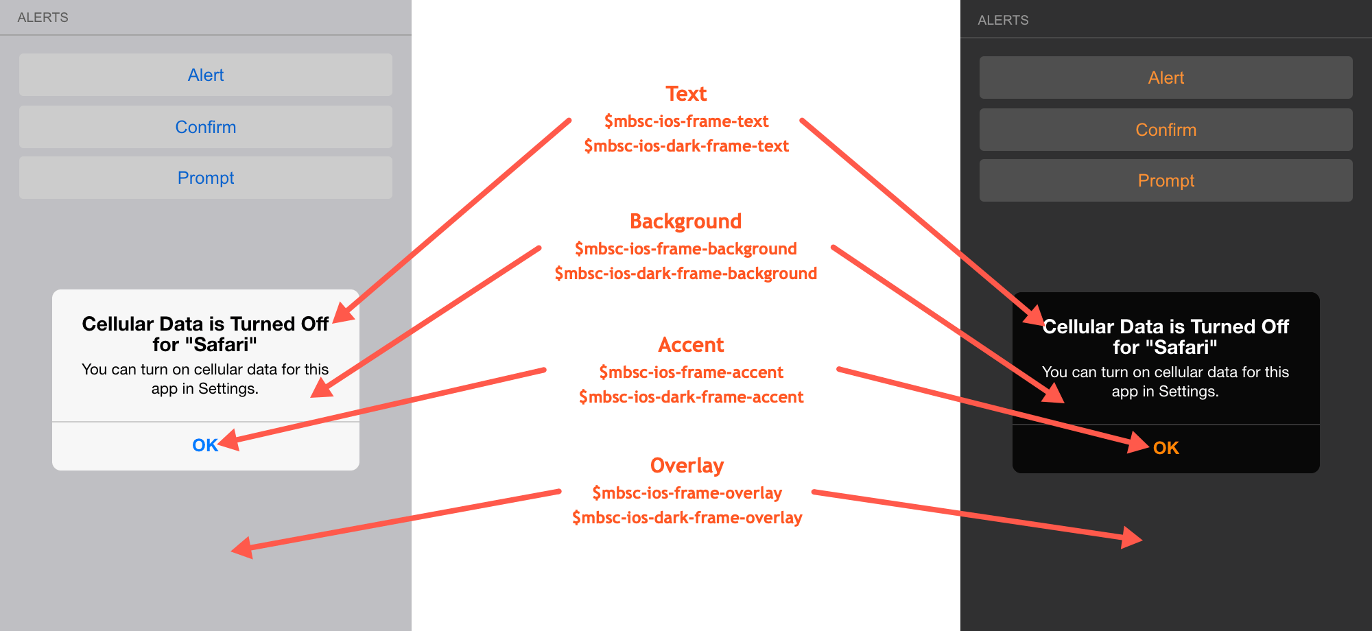
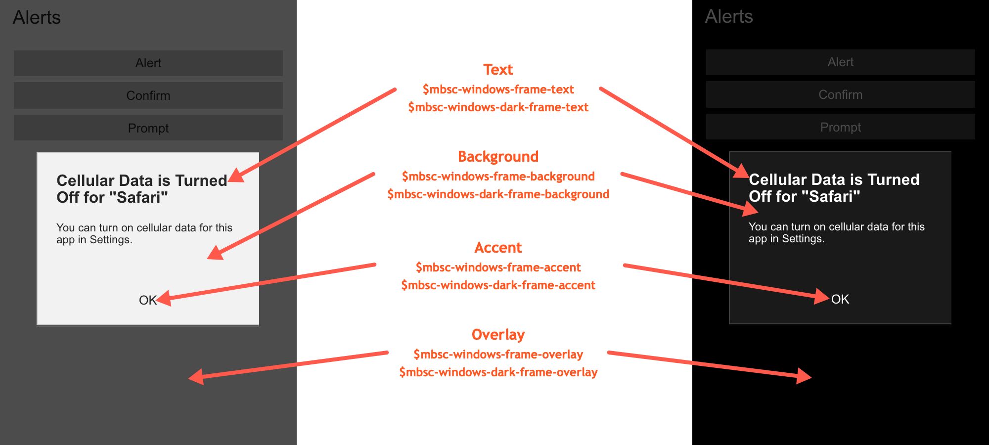
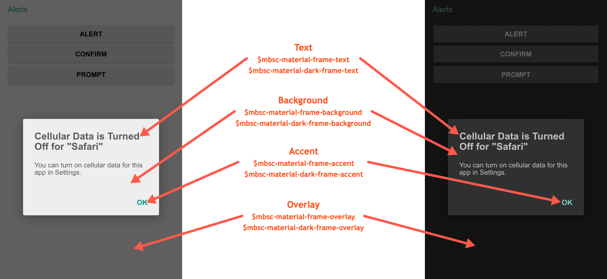
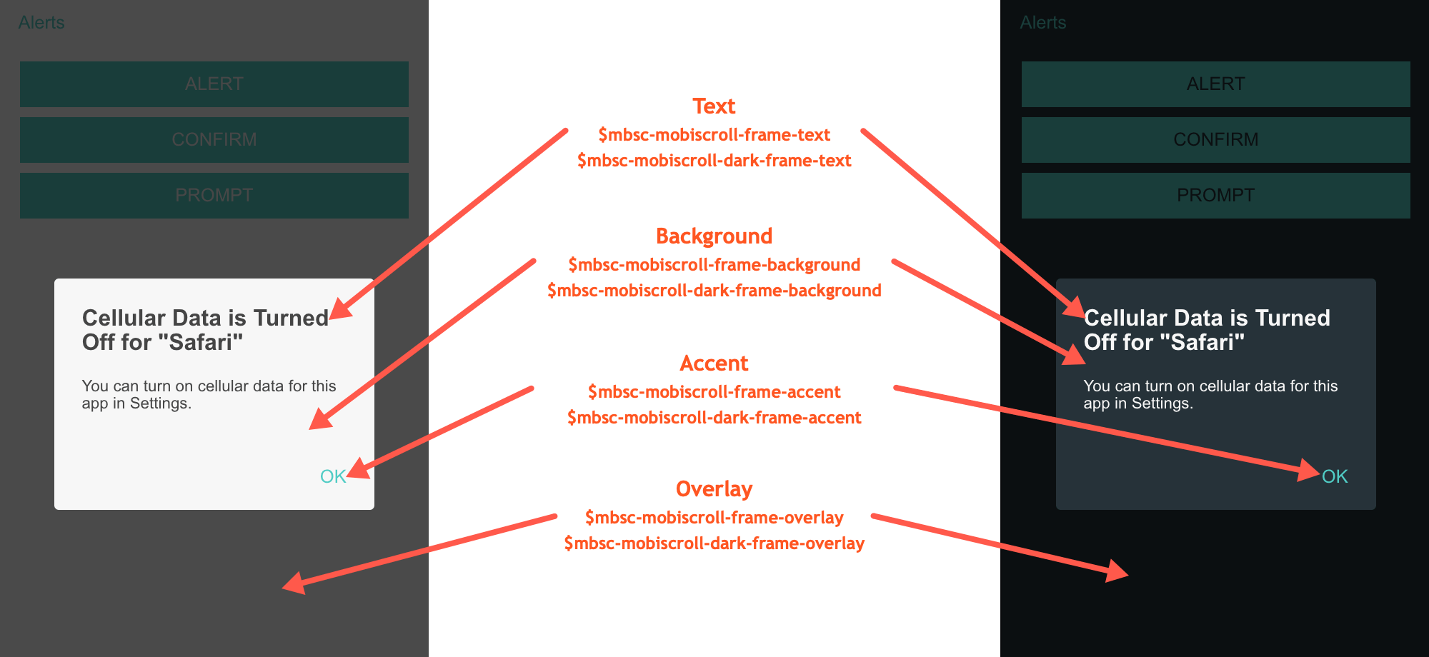
These variables are applied to all base themes: iOS, material, windows and mobiscroll.
They all come in pairs. One for the light and one for the dark variant in each theme.
| Variable name | Description |
|---|---|
| $mbsc-frame-background-light | Sets the background color of the Alert, Confirm and Prompt |
| $mbsc-frame-background-dark | |
| $mbsc-frame-text-light | Sets the text color of the Alert, Confirm and Prompt |
| $mbsc-frame-text-dark | |
| $mbsc-frame-accent-light | Sets the accent color of the Alert, Confirm and Prompt |
| $mbsc-frame-accent-dark | |
| $mbsc-frame-overlay-light | Sets the color of the overlay |
| $mbsc-frame-overlay-dark |
If you really want to get sophisticated or if a color doesn't look good on a specific theme and you want to overwrite it, you can fine tune all of the above variables individually for each theme. Below are the complete list of variables broken down to themes:
iOS theme
| Variable name | Default value | Description |
|---|---|---|
| $mbsc-ios-frame-background | #ffffff | The Alert, Confirm and Prompt background color |
| $mbsc-ios-frame-text | #000000 | The Alert, Confirm and Prompt text color |
| $mbsc-ios-frame-accent | #007bff | The Alert, Confirm and Prompt accent color |
| $mbsc-ios-frame-overlay | rgba(0, 0, 0, 0.2) | Sets the color of the overlay |
iOS Dark theme
| $mbsc-ios-dark-frame-background | #0f0f0f | The Alert, Confirm and Prompt background color |
| $mbsc-ios-dark-frame-text | #ffffff | The Alert, Confirm and Prompt text color |
| $mbsc-ios-dark-frame-accent | #ff8400 | The Alert, Confirm and Prompt accent color |
| $mbsc-ios-dark-frame-overlay | rgba(255, 255, 255, .1) | Sets the color of the overlay |

Windows theme
| Variable name | Default value | Description |
|---|---|---|
| $mbsc-windows-frame-background | #1a1a1a | The Alert, Confirm and Prompt background color |
| $mbsc-windows-frame-text | #262626 | The Alert, Confirm and Prompt text color |
| $mbsc-windows-frame-accent | #0078d7 | The Alert, Confirm and Prompt accent color |
| $mbsc-windows-frame-overlay | rgba(0, 0, 0, .7) | Sets the color of the overlay |
Windows Dark theme
| Variable name | Default value | Description |
|---|---|---|
| $mbsc-windows-dark-frame-background | #191919 | The Alert, Confirm and Prompt background color |
| $mbsc-windows-dark-frame-text | #ffffff | The Alert, Confirm and Prompt text color |
| $mbsc-windows-dark-frame-accent | #0078d7 | The Alert, Confirm and Prompt accent color |
| $mbsc-windows-dark-frame-overlay | rgba(0, 0, 0, .7) | Sets the color of the overlay |

Material theme
| Variable name | Default value | Description |
|---|---|---|
| $mbsc-material-frame-background | #eeeeee | The Alert, Confirm and Prompt background color |
| $mbsc-material-frame-text | #5b5b5b | The Alert, Confirm and Prompt text color |
| $mbsc-material-frame-accent | #009688 | The Alert, Confirm and Prompt accent color |
| $mbsc-material-frame-overlay | rgba(0, 0, 0, .6) | Sets the color of the overlay |
Material Dark theme
| Variable name | Default value | Description |
|---|---|---|
| $mbsc-material-dark-frame-background | #303030 | The Alert, Confirm and Prompt background color |
| $mbsc-material-dark-frame-text | #c2c2c2 | The Alert, Confirm and Prompt text color |
| $mbsc-material-dark-frame-accent | #81ccc4 | The Alert, Confirm and Prompt accent color |
| $mbsc-material-dark-frame-overlay | rgba(0, 0, 0, .6) | Sets the color of the overlay |

Mobiscroll theme
| Variable name | Default value | Description |
|---|---|---|
| $mbsc-mobiscroll-frame-background | #f7f7f7 | The Alert, Confirm and Prompt background color |
| $mbsc-mobiscroll-frame-text | #454545 | The Alert, Confirm and Prompt text color |
| $mbsc-mobiscroll-frame-accent | #4eccc4 | The Alert, Confirm and Prompt accent color |
| $mbsc-mobiscroll-frame-overlay | rgba(0, 0, 0, .7) | Sets the color of the overlay |
Mobiscroll Dark theme
| Variable name | Default value | Description |
|---|---|---|
| $mbsc-mobiscroll-dark-frame-background | #263238 | The Alert, Confirm and Prompt background color |
| $mbsc-mobiscroll-dark-frame-text | #f7f7f7 | The Alert, Confirm and Prompt text color |
| $mbsc-mobiscroll-dark-frame-accent | #4fccc4 | The Alert, Confirm and Prompt accent color |
| $mbsc-mobiscroll-dark-frame-overlay | rgba(0, 0, 0, .7) | Sets the color of the overlay |

Notifications
Toast
mobiscroll.toast(config)
Description
Toasts are simple text only notifications informing the user. They should be primarly used to display messages not necessarily related to a user action, such as background synchronization or similar. Toasts don't lock the app's main interface and are automatically dismissed after a while.
mobiscroll.toast({
    message: '39 files synchronized successfully.'
});
For many more examples - simple and complex use-cases - check out the alert and notification demos for angular.
Parameters
Returns: Promise
A promise which is resolved when the toast hides.
undefined.
If you'd like to use the Promise syntax and also support older browsers (IE 10, IE11, Android 4.1, 4.2, 4.3 stock browser),
please use a polyfill,
otherwise use the callback function from the config object.
Snackbar
mobiscroll.snackbar(config)
Description
Snackbars provide brief feedback after an action through a message at the bottom of the screen. A snackbar may contain an action, such as "Undo" or "Retry". Snackbars don't lock the app's main interface and are automatically dismissed after a while.
mobiscroll.snackbar({
    message: 'Connection timed out. Showing limited messages.',
    button: {
        text: 'Retry',
        action: function () {
            console.log('Retrying...');
        }
    }
});
For many more examples - simple and complex use-cases - check out the alert and notification demos for angular.
Parameters
The configuration object for the snackbar can have the following properties:
Returns: Promise
A promise which is resolved when the snackbar hides.
undefined.
If you'd like to use the Promise syntax and also support older browsers (IE 10, IE11, Android 4.1, 4.2, 4.3 stock browser),
please use a polyfill,
otherwise use the callback function from the config object.
Dismiss
To dismiss the currently displayed notification (toast or snackbar), use the mobiscroll.notification.dismiss function:
mobiscroll.notification.dismiss();
Notes
Provide inline feedback messages for typical user actions. The notes include several predefined colors, each serving its own semantic purpose.
<mbsc-page>
    <mbsc-note color="primary">This is a primary note</mbsc-note>
    <mbsc-note color="secondary">This is a secondary note</mbsc-note>
    <mbsc-note color="success">This is a success note</mbsc-note>
    <mbsc-note color="danger">This is a danger note</mbsc-note>
    <mbsc-note color="warning">This is a warning note</mbsc-note>
    <mbsc-note color="info">This is a info note</mbsc-note>
    <mbsc-note color="light">This is a light note</mbsc-note>
    <mbsc-note color="dark">This is a dark note</mbsc-note>
</mbsc-page>
Using with Ionic
The Note component can be used tha same way with Ionic, as any other angular component.
Attributes
| Name | Description |
|---|---|
| [color] | Color of the note component. Can be 'primary', 'secondary', 'success', 'warning', 'danger', 'info', 'light', 'dark' |
For many more examples - simple and complex use-cases - check out the alert and notification demos for angular.