Navigation
The navigation component is a UI tool that helps you easily implement common navigation patterns.
Simple navigation
The Mobiscroll Navigation components can be used along with angular's built in routerLink directive.
When the routerLink is placed on a Mobiscroll Nav Item component, it will automatically become active, when the associated route is activated.
Configuration
To turn on the automatic route recognition, the angular Router needs to be passed to the MbscModule. In the root app.module.ts file, after the mobiscroll module is imported,
the forRoot method must be called and passed a configuration object. Here's an example:
For complete development packages, where the uncompressed source code is set up to the project, the MbscNavigationModule can be used the same way as the MbscModule.
It makes possible to only import the module that is truly needed.
import { MbscModule } from 'path to library';
import { Router } from '@angular/router';

@NgModule({
  imports:      [ BrowserModule, MbscModule.forRoot({ angularRouter: Router }), FormsModule ],
  declarations: [ AppComponent ],
  bootstrap:    [ AppComponent ]
})
export class AppModule { }
Here are some examples using the mobiscroll navigation components with the routerLink directive:
<!-- Navigation rendered at the bottom -->
<mbsc-bottom-nav>
    <mbsc-nav-item routerLink="home">Home</mbsc-nav-item>
    <mbsc-nav-item routerLink="feed" badge="2">Feed</mbsc-nav-item>
    <mbsc-nav-item routerLink="settings">Settings</mbsc-nav-item>
</mbsc-bottom-nav>

<!-- Hamburger navigation menu -->
<mbsc-hamburger-nav>
    <mbsc-nav-item [routerLink]="['home']">Home</mbsc-nav-item>
    <mbsc-nav-item [routerLink]="['feed']">Feed</mbsc-nav-item>
    <mbsc-nav-item [routerLink]="['settings']">Settings</mbsc-nav-item>
</mbsc-hamburger-nav>

<!-- Tab navigation menu -->
<mbsc-tab-nav>
    <mbsc-nav-item [routerLink]="['home', {outlets: { message: null}}]">Home</mbsc-nav-item>
    <mbsc-nav-item [routerLink]="['feed', {outlets: { message: ['empty'] }}]">Feed</mbsc-nav-item>
    <mbsc-nav-item [routerLink]="['settings', {outlets: { message: null }}]">Settings</mbsc-nav-item>
</mbsc-tab-nav>
Custom use-cases
The navigation components can be used without the angular router by binding the selected attribute to any expression. Here are a few examples:
<!-- Navigation rendered at the bottom -->
<mbsc-bottom-nav>
    <mbsc-nav-item [selected]="currentNav == 'home'">Home</mbsc-nav-item>
    <mbsc-nav-item [selected]="currentNav == 'feed'" badge="2">Feed</mbsc-nav-item>
    <mbsc-nav-item [selected]="currentNav == 'settings'">Settings</mbsc-nav-item>
</mbsc-bottom-nav>

<!-- Hamburger navigation menu -->
<mbsc-hamburger-nav>
    <mbsc-nav-item [selected]="currentNav == 'home'">Home</mbsc-nav-item>
    <mbsc-nav-item [selected]="currentNav == 'feed'">Feed</mbsc-nav-item>
    <mbsc-nav-item [selected]="currentNav == 'settings'">Settings</mbsc-nav-item>
</mbsc-hamburger-nav>

<!-- Tab navigation menu -->
<mbsc-tab-nav>
    <mbsc-nav-item id="home" [selected]="currentNav == 'home'">Home</mbsc-nav-item>
    <mbsc-nav-item id="feed" [selected]="currentNav == 'feed'">Feed</mbsc-nav-item>
    <mbsc-nav-item id="settings" [selected]="currentNav == 'settings'">Settings</mbsc-nav-item>
</mbsc-tab-nav><!-- Navigation rendered inline -->
<mbsc-bottom-nav display="inline">
<mbsc-nav-item>Home</mbsc-nav-item>
<mbsc-nav-item>Feed</mbsc-nav-item>
<mbsc-nav-item>Settings</mbsc-nav-item>
</mbsc-bottom-nav>
<!-- custom menu text -->
<mbsc-hamburger-nav menuText="Main menu">
<mbsc-nav-item>Home</mbsc-nav-item>
<mbsc-nav-item>Feed</mbsc-nav-item>
<mbsc-nav-item>Settings</mbsc-nav-item>
</mbsc-hamburger-nav>
<!-- fixed item width -->
<mbsc-tab-nav display="inline" itemWidth="100">
<mbsc-nav-item>Home</mbsc-nav-item>
<mbsc-nav-item>Feed</mbsc-nav-item>
<mbsc-nav-item>Settings</mbsc-nav-item>
</mbsc-tab-nav>Passing events
All events can be used inline with the component. When passing event handlers inline, the instance of the component becomes the inst property of the event object.
<!-- simple handler -->
<mbsc-bottom-nav (onItemTap)="itemTapped()">
    ...
</mbsc-bottom-nav>

<!-- with default parameters -->
<mbsc-bottom-nav (onItemTap)="withDefaultEvent($event)">
    ...
</mbsc-bottom-nav>

<!-- with additional parameters -->
<mbsc-bottom-nav (onItemTap)="withAdditionalEvent($event, 'myAddition')">
    ...
</mbsc-bottom-nav>
export class MyExampleClass {
// simple handler without any parameters
itemTapped() {
console.log('simple handler'); // prints 'simple handler'
}
// event handler with the default event parameter
withDefaultEvent(event: any) {
console.log(event, event.inst); // prints the event object and the mobiscroll navigation control instance
}
// event handler with additional parameters
withAdditionalEvent(event: any, addition: string) {
console.log(addition); // prints 'myAddition'
}
}<!-- theme, icons and disabled state -->
<mbsc-bottom-nav theme="ios">
<mbsc-nav-item icon="home">Home</mbsc-nav-item>
<mbsc-nav-item icon="user4" [disabled]="!userLoggedIn">Feed</mbsc-nav-item>
<mbsc-nav-item icon="pencil">Settings</mbsc-nav-item>
</mbsc-bottom-nav>
<!-- fixed item width -->
<mbsc-tab-nav itemWidth="100">
<mbsc-nav-item>Home</mbsc-nav-item>
<mbsc-nav-item>Feed</mbsc-nav-item>
<mbsc-nav-item>Settings</mbsc-nav-item>
</mbsc-tab-nav>
<mbsc-tab-nav display="top">
<mbsc-nav-item id="home" [selected]="currentNav == 'home'" (click)="currentNav = 'home'">Home</mbsc-nav-item>
<mbsc-nav-item id="feed" [selected]="currentNav == 'feed'" (click)="currentNav = 'feed'">Feed</mbsc-nav-item>
<mbsc-nav-item id="settings" [selected]="currentNav == 'settings'" (click)="currentNav = 'settings'">Settings</mbsc-nav-item>
</mbsc-tab-nav>
@Component({
    selector: 'my-example',
    template: `<mbsc-bottom-nav display="inline">
        <mbsc-nav-item *ngFor="let item of items" [badge]="item.badge" [(selected)]="item.selected" [disabled]="item.disabled" [icon]="item.icon">{{item.text}}</mbsc-nav-item>
    </mbsc-bottom-nav>`
})
export class MyExampleComponent {
    items = [{
        selected: true,
        icon: 'home',
        text: 'Home'
    }, {
        selected: false,
        icon: 'pencil',
        text: 'Feed',
        badge: '5'
    }, {
        selected: false,
        disabled: true,
        icon: 'office',
        text: 'Office'
    }];
}
Using with Ionic
The Navigation components can be used the same way with Ionic, as any other angular component.
Modules
The MbscNavigationModule can be used to import all the components from below.
Components
Attributes
Attributes for the items
Attributes for the components
| Attribute | Data type | Description |
|---|---|---|
| [options] | MbscNavOptions | Attribute used to pass the options as one object |
The following options can be used as attributes to customize the navigation components further:
For many more examples - simple and complex use-cases - check out the navigation demos for angular.
Options
| Name | Type | Default value | Description |
|---|---|---|---|
| context | String, HTMLElement | 'body' |
The DOM element in which the component is appended and positioned (if not inline). Can be a selector string or a DOM element. |
| display | String | depends on the type setting |
Controls the position of the navigation. Possible values:
Bottom navigation defaults to bottom. Hamburger navigation defaults to inline. |
| itemWidth | Number | undefined |
If layout is 'fixed', it represents the exact witdh of the items in pixels,
otherwise the minimum width of the items, and the items will be stretched to fill the container width.
|
| layout |
String Number |
'liquid' |
Possible values:
|
| mousewheel | Boolean | false |
Enables mousewheel / touchpad scroll. |
| paging | Boolean | false |
Scroll one page at a time. The page size will be the width of the container. |
| responsive | Object | undefined |
Specify different settings for different container widths, in a form of an object,
where the keys are the name of the breakpoints, and the values are objects containing
the settings for the given breakpoint.
The available width is queried from the container element of the component and not the browsers viewport like in css media queries
There are five predefined breakpoints:
breakpoint
property specifying the min-width in pixels.
Example:
|
| snap | Boolean | false |
When the navigation is scrolled it snaps to the edge of the last visible item which is at the opposite direction of the scroll. |
| theme | String | undefined |
Sets the visual appearance of the component.
If it is If the theme for the specific platform is not present, it will default to the Mobiscroll theme. Supplied themes:
Starting from v4.9.0 setting directly the dark version of the theme is deprecated.
Use the themeVariant option instead to control the light / dark appearance of the theme.
Make sure that the theme you set is included in the downloaded package.
|
| themeVariant | String | undefined |
Controls which variant of the theme will be used (light or dark). Possible values:
If not set, only the theme setting will determine which theme to use.
To use the option with custom themes, make sure to create two custom themes,
where the dark version has the same name as the light one, suffixed with
The option will not have any effect if the theme option explicitly
sets the dark version of a theme, e.g.
theme: 'ios-dark'.
|
| threshold | Number | 10 |
Minimum horizontal movement in pixels before the scrolling starts. |
| type | String | 'bottom' |
Define the appearance and functionality of the navigation. Possible values:
|
Setting options dynamically
There are two ways to modify options after initalization
-
Using the option method.
The option method always triggers reinitialization. Most of the settings can be updated only this way, updating without initialization has no effect, because the markup is already generated. If the scroller was visible, the reinitialization hides it and it's not shown again automatically (except in inline display mode).
Here is an example for the dynamic option changeimport { ViewChild } from '@angular/core'; @Component({ selector: 'my-example', template: ` <input mbsc-navigation #myVariable="mobiscroll" [(ngModel)]="myExample"/> <button (click)="changeOptions()">Change theme and language</button> ` }) export class MyExample { @ViewChild('myVariable') myRef: any; // Modify options changeOptions() { this.myRef.instance.option({ theme: 'mobiscroll', lang: 'de' }); } } -
Modify directly the
settingsobject.
Useful when changing dynamic settings, which do not need redraw (e.g. readonly, calendar marked days).
Exampleimport { ViewChild } from '@angular/core'; @Component({ selector: 'my-example', template: ` <input mbsc-navigation #myVariable="mobiscroll" [mbsc-options]="myOptions"/> <button (click)="changeOptions()">Change readonly</button> ` }) export class MyExample { @ViewChild('myVariable') myRef: any; // get instance and modify a setting changeOptions() { this.myRef.instance.settings.readonly = true; } // Modify settings in an event myOptions: any = { onBeforeShow: (event, inst) => { inst.settings.readonly = true; } } }
Events
this reference.inst parameter is passed as a property to the event.| Name | Description | |
|---|---|---|
| onAnimationEnd(event, inst) | Gets fired when an autonomous scrolling/sliding ends.
Parameters
Example |
|
| onAnimationStart(event, inst) | Gets fired when an autonomous scrolling/sliding is starts.
Parameters
Example |
|
| onGestureEnd(event, inst) | Gets fired when the user ends the scrolling gesture.
Parameters
Example |
|
| onGestureStart(event, inst) | Gets fired when the user ends the scrolling(swiping) gesture.
Parameters
Example |
|
| onInit(event, inst) |
Triggered when the component is initialized.
Parameters
Example |
|
| onItemTap(event, inst) |
Triggered when an item is tapped.
Parameters
Example |
|
| onMarkupReady(event, inst) |
Triggered when the html markup of the component is generated, but it is not yet shown.
It is useful, if you want to make modifications to the markup (e.g. add custom elements), before the positioning runs.
Parameters
Example |
|
| onMenuHide(event, inst) | Gets fired when the popup containing the menu items closes. Close can be prevented by returning false from the handler function.
Parameters
Example |
|
| onMenuShow(event, inst) |
Gets fired when the popup containing the menu items is shown. Show can be prevented by returning false from the handler function.
Parameters
Example |
|
| onMove(event, inst) | Gets fired when an autonomous scrolling/sliding ends.
Parameters
Example |
|
Methods
| Name | Description | |
|---|---|---|
| deselect(item) | Deselects the specified item.
Parameters
ExampleMethods can be called on an instance. For more details see calling methods |
|
| disable(item) |
Disables the specified item.
Parameters
ExampleMethods can be called on an instance. For more details see calling methods |
|
| enable(item) |
Enables the specified item
Parameters
ExampleMethods can be called on an instance. For more details see calling methods |
|
| navigate(item [, toggle ] [, animTime]) |
Scrolls the navigation to the specified item.
Parameters
ExampleMethods can be called on an instance. For more details see calling methods |
|
| next([toggle]) | Scrolls the navigation to the next item.
Parameters
ExampleMethods can be called on an instance. For more details see calling methods |
|
| option(options) |
Sets one or more options for the component.
Parameters
ExampleMethods can be called on an instance. For more details see calling methods |
|
| prev([toggle]) | Scrolls the navigation to the previous item.
Parameters
ExampleMethods can be called on an instance. For more details see calling methods |
|
| refresh() |
Recalculate dimensions needed for scrolling.
ExampleMethods can be called on an instance. For more details see calling methods |
|
| select(item) |
Selects the specified item.
Parameters
ExampleMethods can be called on an instance. For more details see calling methods |
|
| setBadge(item, content) | Sets the badge of the navigation item.
Parameters
ExampleMethods can be called on an instance. For more details see calling methods |
|
| tap(el, handler) |
Attaches the handler function to the tap event of element el.
Parameters
ExampleMethods can be called on an instance. For more details see calling methods |
|
Localization
| Name | Type | Default value | Description |
|---|---|---|---|
| lang | String | 'en-US' |
Language of the component. Based on the language string the component loads the language based default settings from the
language modules.
Supported languages:
|
| menuIcon | String | 'material-menu' |
Icon for the hamburger menu item |
| menuText | String | '' |
Text for the hamburger menu item |
| moreIcon | String | 'material-more-horiz' |
Icon for the show more menu item |
| moreText | String | 'More' |
Text for the show more menu item |
| rtl | Boolean | false |
Right to left display. |
Navigation item attributes
| Name | Description |
|---|---|
| [disabled] | If true the navigation item will be disabled. |
| [icon] |
With this attribute item icons can be defined. It needs a font-icon name.
You can build your custom icon set on our download page ("Choose Icon Set" section). See the full list of available icons here. The default icon pack contains the following icons: You can use the icons anywhere in your app using thembsc-ic mbsc-ic-{iconName} classes, e.g.:
|
| [(selected)] | If true the navigation item will be selected. |
Customizing the appearance
While the provided pre-built themes are enough in many use cases, most of the times on top of adapting to a specific platform, you'd also like to match a brand or color scheme. Mobiscroll provides various ways to achieve this:
- Create custom themes using the theme builder - the custom themes can be also built using out theme builder, on a graphical user interface, without any coding, or the need for Sass support in your project.
- Create custom themes using Sass - use this, if you need multiple themes with different color variatons, in case you have pages with different colors, or you'd like to users to customize the colors of your app.
- Override the Sass color variables - the straightforward way to change the colors in one place throughout the application.
Override the Sass Color Variables
A convenient way to customize the colors of the Mobiscroll components is to override the Sass color variables.
Let's say your branding uses a nice red accent color, and you'd like that color to appear on the Mobiscroll components as well,
while still using platform specific themes (e.g. ios on iOS devices, material on Android devices, and mobiscroll on desktop).
You can override the accent color for every theme:
$mbsc-ios-accent: #e61d2a;
$mbsc-material-accent: #e61d2a;
$mbsc-mobiscroll-accent: #e61d2a;

@import "~@mobiscroll/Angular/dist/css/mobiscroll.angular.scss"
You can also customize the colors on many levels:
- Theme specific variables (ex.
$mbsc-material-background,$mbsc-ios-dark-text) are applied to all components in a theme. Complete list of variables here. - Component specific global variables (ex.
$mbsc-card-background-light,$mbsc-listview-text-dark) are applied to all themes for a specific component. - Component and theme specific variables (ex.
$mbsc-ios-dark-form-background,$mbsc-material-input-text) are applied to a specific theme and a specific component.
Global variables
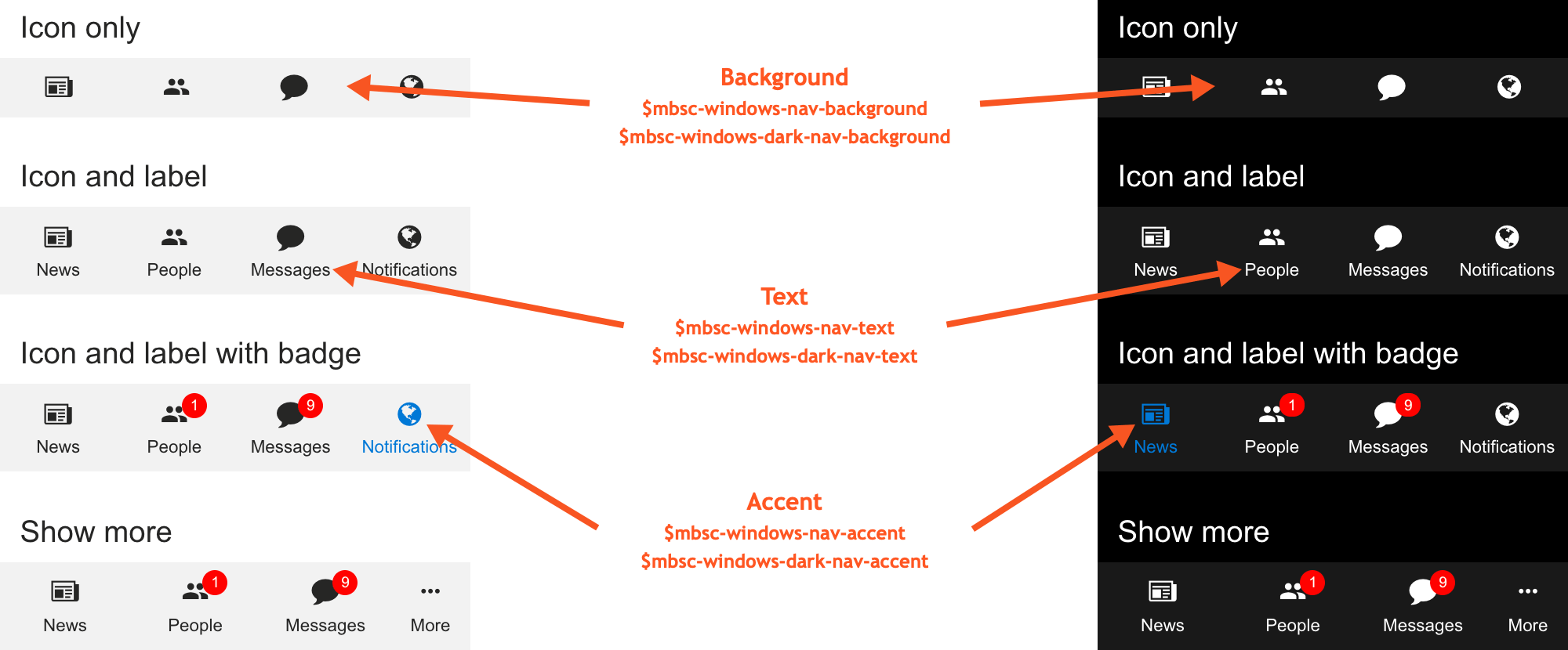
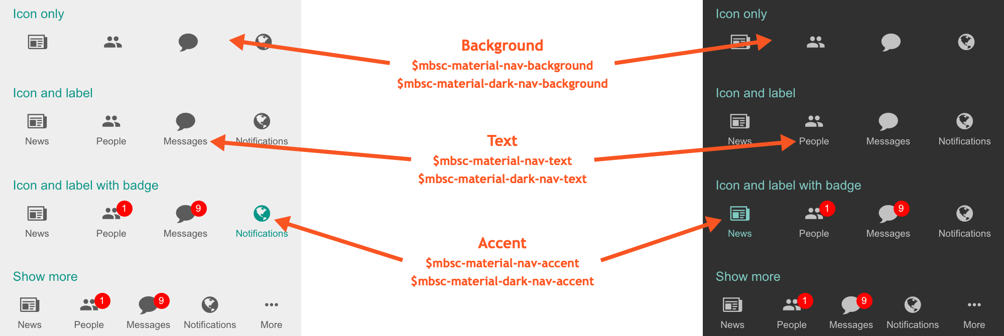
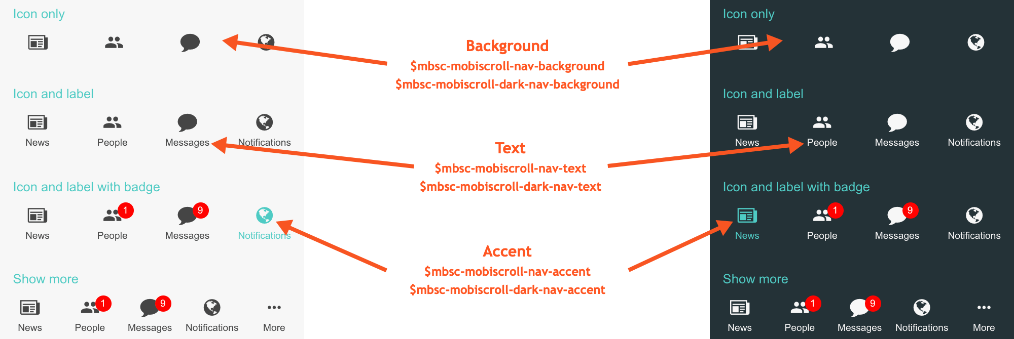
These variables are applied to all base themes: iOS, material, windows and mobiscroll.
They all come in pairs. One for the light and one for the dark variant in each theme.
| Variable name | Description |
|---|---|
| $mbsc-nav-background-light | Sets the background color of the navigation |
| $mbsc-nav-background-dark | |
| $mbsc-nav-text-light | Sets the text color of the navigation |
| $mbsc-nav-text-dark | |
| $mbsc-nav-accent-light | Sets the accent color of the navigation |
| $mbsc-nav-accent-dark |
If you really want to get sophisticated or if a color doesn't look good on a specific theme and you want to overwrite it,
you can fine tune all of the above variables individually for each theme.
Below are the complete list of variables broken down to themes:
iOS theme
| Variable name | Default value | Description |
|---|---|---|
| $mbsc-ios-nav-background | #f7f7f7 | The navigation background color |
| $mbsc-ios-nav-text | #878787 | The navigation text color |
| $mbsc-ios-nav-accent | #007bff | The navigation accent color |
iOS Dark theme
| Variable name | Default value | Description |
|---|---|---|
| $mbsc-ios-dark-nav-background | #000000 | The navigation background color |
| $mbsc-ios-dark-nav-text | #ababab | The navigation text color |
| $mbsc-ios-dark-nav-accent | #ff8400 | The navigation accent color |

Windows theme
| Variable name | Default value | Description |
|---|---|---|
| $mbsc-windows-nav-background | #f2f2f2 | The navigation background color |
| $mbsc-windows-nav-text | #262626 | The navigation text color |
| $mbsc-windows-nav-accent | #0078d7 | The navigation accent color |
Windows Dark theme
| Variable name | Default value | Description |
|---|---|---|
| $mbsc-windows-dark-nav-background | #191919 | The navigation background color |
| $mbsc-windows-dark-nav-text | #ffffff | The navigation text color |
| $mbsc-windows-dark-nav-accent | #0078d7 | The navigation accent color |

Material theme
| Variable name | Default value | Description |
|---|---|---|
| $mbsc-material-nav-background | #eeeeee | The navigation background color |
| $mbsc-material-nav-text | #5b5b5b | The navigation text color |
| $mbsc-material-nav-accent | #009688 | The navigation accent color |
Material Dark theme
| Variable name | Default value | Description |
|---|---|---|
| $mbsc-material-dark-nav-background | #303030 | The navigation background color |
| $mbsc-material-dark-nav-text | #c2c2c2 | The navigation text color |
| $mbsc-material-dark-nav-accent | #81ccc4 | The navigation accent color |

Mobiscroll theme
| Variable name | Default value | Description |
|---|---|---|
| $mbsc-mobiscroll-nav-background | #f7f7f7 | The navigation background color |
| $mbsc-mobiscroll-nav-text | #454545 | The navigation text color |
| $mbsc-mobiscroll-nav-accent | #4eccc4 | The navigation accent color |
Mobiscroll Dark theme
| Variable name | Default value | Description |
|---|---|---|
| $mbsc-mobiscroll-dark-nav-background | #253238 | The navigation background color |
| $mbsc-mobiscroll-dark-nav-text | #f7f7f7 | The navigation text color |
| $mbsc-mobiscroll-dark-nav-accent | #4fccc4 | The navigation accent color |
